Nicolas Jenson: c. 1420 – 1480

Artist Robert Thom’s depiction of Nicolas Jenson at his engraving bench

The term incunabula (Latin for “cradle”) is used to denote the earliest period of printing from its birth in 1450 up to January 1, 1501. The books, pamphlets and broadsides printed with the movable metal type method associated with Gutenberg during these first fifty years are also commonly called incunabulum.

It is estimated that 35,000 editions were printed throughout Europe—over two-thirds from Germany and Italy—during the second half of the fifteenth century. Remarkably, nearly 80% of these volumes still exist today, most of which are held in large public collections such as the Bavarian State Library in Munich, the Vatican Library in Vatican City and the British Library in London.

The Lenox copy of the Gutenberg Bible on display at the New York Public Library. It was the first complete set brought to the US in 1847.

The most famous incunabulum, of course, is the 42-line bible printed by Johannes Gutenberg in Mainz, Germany in the 1450s of which there are 48 copies remaining. Since they were printed in two volumes, many of these copies are incomplete. James Lenox brought the first complete set of the Gutenberg Bible to the US in 1847 after he bought it for $2,500; it now sits on display at the New York Public Library. The last sale of a complete Gutenberg Bible took place in 1978 and went for $2.2 million; it is estimated that one would sell for $25-$35 million today.

The British Library maintains an international electronic bibliographic database of extant incunabulum. Called the Incunabula Short Title Catalogue (ISTC), the database was begun in 1980 and currently contains 27,460 records. The ISTC is an extraordinary merger of modern and Renaissance information technology. That anyone can peruse these records—many of which have links to high-resolution images of 500-year old incunabulum—is a testament to both the lasting achievement of print and the significance of its electronic descendent, the World Wide Web.

* * * * *

Next to Gutenberg himself, Nicolas Jenson is recognized as the most important figure of the incunabula. Despite limited records of his life—his last will and testament, a few book introductions written by others and some document fragments—the legacy of Nicholas Jenson survives through his printed works.

According to Martin Lowry, the printing scholar and author of “Nicholas Jenson and Rise of Venetian Publishing in Renaissance Europe,” the first official biography of Jenson was written in the late 1700s and amounted to “a two-volume potpourri of erudition and fantasy.” While arguing that Nicolas Jenson has become something of a printing cult-figure, Lowry does conclude that Jenson’s “place at the very beginning of the typographic age gives him a special importance.”

It is known that Nicolas Jenson was born in Sommevoire, France, a town about 150 miles southeast of Paris. However, after reviewing Lowry’s research, it is difficult to simply repeat here the many other “facts” that are frequently given of Jenson’s early life: his date of birth, his employment experience and the origin of his metal working skills, the means by which he became familiar with the printing methods of Gutenberg and his route from France to Italy. The things that are repeated in many accounts of Jenson’s life are derived from murky historical anecdotes that are contradicted by other important facts.

An engraving depicting an early Venetian printing shop

Jenson is known to have begun printing in Venice in the late 1460s or early 1470s. Prior to his arrival in Venice, it appears that he spent some time in Vicenza, a mainland town about 30 miles to the west, where he developed his printing skills. Jenson’s arrival in Venice, the first non-German printer in recorded history, coincided with the establishment of several important printing firms in the Italian island city. The most notable of these was the enterprise of John and Wendelin of Speyer who arrived in Venice from Germany in 1468 and were granted a five year monopoly on printing by the city authorities.

Nicolas Jenson’s printer’s mark

The Venetian patrician class of scholar-statesmen considered the arrival of printing a major cultural development. It meant that the works of classical humanist teachings could be reproduced at rates that were inconceivable with the handwritten process of the scribes. The ruling elites encouraged the development of print and by the end of the century there were 150 firms operating in the highly competitive Venetian printing market.

Alongside of print’s cultural impact, there was a considerable business opportunity to be exploited. It was to this side of the incunabula that Jenson devoted most of his efforts. During the ten years that he was a printer in Venice, more than anyone else, Jenson brought investment into the printing industry. His businesses were very successful and he made a considerable fortune before his death in 1480.

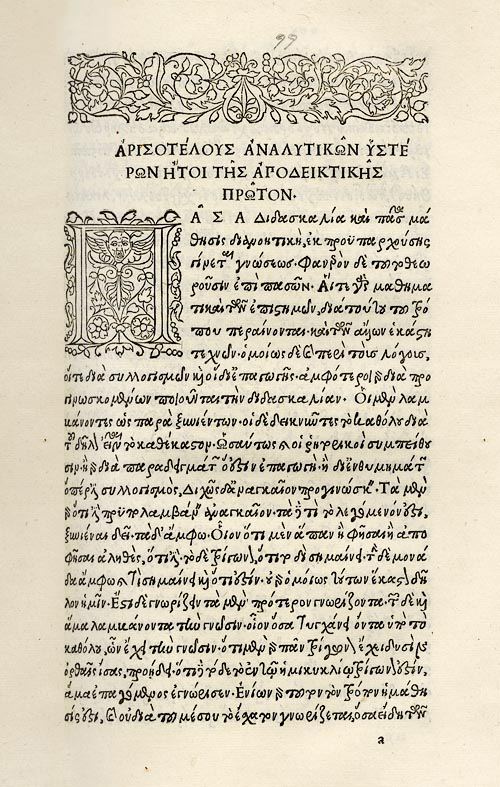
However, the most important—and universally recognized—contribution of Nicolas Jenson to the development of printing was his design of an early roman typeface. Prior to Jenson, the style of print typography followed the blackletter example set by Gutenberg, i.e. heavy gothic forms that emulated the dominant pen and ink script of the monks of fifteenth century Germany.

The first page of Eusebius’ "Preparation for the Gospel" printed by Nicolas Jenson in 1470. It is thought to be the first appearance of a roman typeface.
The first page of Eusebius’ Preparation for the Gospel printed by Nicolas Jenson in 1470. It is thought to be the first appearance of a roman typeface.

Such were Nicolas Jenson’s metal working skills that he cut a groundbreaking roman type in 1470. Roman type is distinct from blackletter in that it emulates the square capital letters used in ancient Rome combined with the Carolingian minuscule (lowercase) used during the Holy Roman Empire. The first book to appear with Jenson’s new design was an edition of Eusebius’ Preparation for the Gospel originally written in 313 A.D.

The word roman, without a capital R, has come to denote Italian typefaces used during the Renaissance as well as later fonts derived from them such as Times Roman, for example. Although Jenson’s design was quite different in appearance from Gutenberg’s blackletter, it was also modeled on the scribal manuscript style that was popular in fifteenth century Italy.

A comparison of blackletter script (upper left) with Gutenberg’s blackletter type (lower left) and roman/Carolingian script (upper right) with Jenson’s roman type (lower right)

It is a remarkable phenomenon of printing history that the essential forms of Jenson’s roman typeface designed more than 500 years ago are those that we continue to use most often and recognize today as the best and most readable typography. Of course, the characters in the alphabet of the Latin languages are those associated with Jenson’s contribution. But it should also be noted that Jenson designed and cut a Greek alphabet of a similar style.

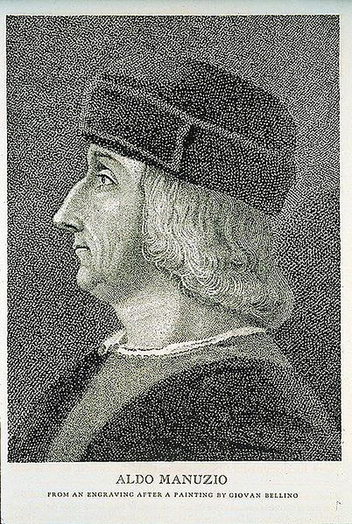
Throughout the subsequent history of printing, many have noted the beauty and balance of Jenson’s roman type design. In particular, William Morris and the arts and crafts movement of the late nineteenth century focused upon Jenson’s creative genius. According to Lowry, Morris’ romantic affinity for medievalism led to an unjustified elevation of the contribution of Nicolas Jenson alongside those of Johannes Gutenberg and Aldus Manutius.

* * * * *

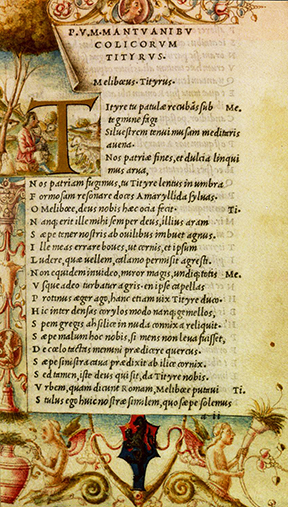
A search of the British Library’s ISTC for the term “Jenson” results in 113 hits. Many of the items in the database contain links to images of the pages printed by Nicolas Jenson himself on a Gutenberg-style printing press in Venice in the 1470s. A review of these entries shows that—despite language challenges—Jenson’s books appear very similar to those found today in our libraries and book stores. While some of them are adorned with ornate case bound covers and others include hand-illuminated art alongside the printed text, the essential elements of the book are very familiar to any modern reader.

Historians have strictly defined the incunabula as the first fifty years of the printing revolution beginning with Gutenberg. The incunabulum produced by the pioneers of print—including Nicolas Jenson—were devoted to a recreation of scribes’ handwriting such that the reading audience could understand and relate to the new media form.

The questions that arise naturally are: should we consider the early years of the digital revolution to be our modern “incunabula” in which the previous media generation is being replicated in electronic form? Or is the digital age leading to a new media that represents a departure from the forms that were developed and enriched during the Renaissance?

Aldus Manutius: 1449/1450 – 1515

The great cultural movement called the Renaissance (rebirth) spanned the fourteenth to the seventeenth centuries. This places Johannes Gutenberg’s 1450 invention of printing early in that era. As is widely acknowledged by historians, printing was not only the most important technological achievement of the Renaissance; it was also its greatest catalyst.

Aldus Manutius
Aldus Manutius: 1449/1450 – 1515

Along with the expansion of world trade and the circumnavigation of the globe—combined with enthusiasm for Gutenberg’s innovation—printing spread rapidly from Germany to destinations across Europe and elsewhere. And, as the business and products of “mechanical writing” proliferated, the knowledge that came along with it multiplied exponentially.

Eventually, like so many printing press pebbles tossed into the global pond, the ripple waves of literacy and democracy spread and connected with one another. By the eighteenth century, the achievements of the Renaissance led to the age of Enlightenment. And so, one of the most remarkable end results of this technical and cultural transformation was the American Revolution of 1776 … but that takes us a long way from the subject of this review.

The Renaissance, especially in Italy, was shaped by humanist teachings, i.e. the notion that citizens should be educated in the humanities (language, literature, philosophy, religion and the arts). Florence, Naples, Rome, Venice and Genoa were among the centers of Italian humanism. Great collections of antique hand written manuscripts and also printed books were assembled in libraries and made available for study primarily for those of wealth and means.

It was within this environment that Aldo Manuzio (Aldus Manutius is Latinized) was born in Bassiano, Italy about 100 kilometers south of Rome. The precise date of his birth is not known. It has been surmised that he was born in 1449 or 1450 from the preface to a book published by Aldus’ grandson, Aldus, The Younger, in 1597.

Very little is known about Aldus’ early life. In his The Rudiments of Latin Grammar published in 1501, Aldus mentions he was trained in Latin at a young age. This information—along with the fact that he had an ancestor that was a Bishop—indicates that his family was well off.

Aldus left Bassiano for Rome, perhaps as young as 15 years of age, to be educated as a humanist scholar. His classical studies in Latin continued in Rome for eight years at which time he moved to Ferrara to conduct studies in Greek. Sometime around 1479 or 1480, having established himself as a scholar of the highest quality, the King of Carpi hired Aldus to become the teacher of his nephews. It was during his time in Carpi that Aldus developed his interest in publishing and printing.

By the 1400s, Venice was a center of world commerce much like New York City might be considered today; everything important was happening there. And so, it was to this Italian center of so many things that Aldus, at the time in his late 30s, decided to relocate and start a publishing enterprise.

There is almost no information available about Aldus’ activity during his first five years in Venice. It has been deduced that he spent this time preparing and setting up a viable publishing business—learning the book market and printing technique—in a very competitive environment. Printing arrived in Venice by way of Germany twenty years earlier and there were well-known firms already operating by the time Aldus launched his enterprise.

A page from Aldus printing of Aristotle
A page from one of the 5 volume set of “Aristotle” published by Aldus between 1495 and 1499

Aldus’ initial activity—and this would prove to be his most important accomplishment—was to edit and republish authoritative editions of the classics of literature. The initial project, a reissue of the Greek Grammar of Constantine Liscaris in 1495, was the first volume to be published under Aldus’ name although Andrea Torresani’s press likely did the printing.

A big breakthrough came in that same year with the publication in Greek of the first of a five-volume folio edition of the works of Aristotle. It would take four years to complete the project. This work has been referred to as the “greatest scholarly and printing achievement of the fifteenth century.” Aldus then went on to edit and publish Thucydides, Sophocles and Herodotus in 1502, Xenophon’s Hellenics and Euripides in 1503 and Demosthenes in 1504. In the decade before his death, Aldus also published editions of Latin and Italian classics. 

Aldine Press printers mark
The Aldine Press trademark symbolizing the adage “Festina lente” (Make haste slowly)

By 1496, had his own printing operation and began using various forms of “at Aldo’s” to signify the source of his publications as what later became known as the Aldine Press. In 1498, Aldus began using the Aldine Press trademark—the emblem of the dolphin wrapped around the anchor that symbolized the Latin phrase “Festina lente” (Make haste slowly)—on all of his works. At this point Aldus turned his attention to innovations in the forms of print, the first big contribution being in typography.

The typography of print as it arrived from Germany was in the Gothic form of heavy, “gross” lettering as seen in the Gutenberg bible. By 1470, Nicholas Jenson—who had come to Venice from France—had transformed the printed word and created the Renaissance book with his slender roman typeface and capital letters.

Title page from Virgil Opera with italics
Title page from Virgil’s Opera, the first book published in the Aldine italic typeface

Aldus began with Jenson’s typeface and reworked it into his own style for the Greek classics. His desire was to make the fonts look like the work of human handwriting. This effort would ultimately lead to the development of the “italics” that emulated cursive writing and also became known at times as the Aldino typeface. Francesco Griffo, to whom Aldus later paid tribute, performed the actual artistry of cutting the slanted italic. The first book that contained Aldus’ italic font was the 1501 Aldine Press edition of Virgil’s Opera.

The early period of printing—from 1450 to 1500—is often referred to as the “incunabula” or cradle of printing. At that time, most books were printed in folio format, i.e. page sizes of approximately 14.5” by 20” (the pages in the Gutenberg bible are approximately 17” x 24.5”). These were very large books that could be read wherever they were located; they were not portable.

This is when Aldus made another historic advancement. As explained by Helen Barolini in her Aldus and his Dream Book, “The real revolution, the moment of true divulgation of the printed word that impelled Western society … came when Aldus brought out his edition of Virgil’s Georgics in elegant, octavo format that was to become the staple of the Aldine press and Aldus’ trademark.”

Comparison of folio to octavo book dimensions
A comparison of folio and octavo book dimensions, courtesy ILAB.
Aldus created the first octavo book.  

The octavo format is approximately 7.25” x 10,” something very close to what would be found today in a bookstore. Aldus produced the very first modern book that was small enough and inexpensive enough for someone to take with them almost anywhere.

Aldus’ other innovations included a unique method for bookbinding sometimes referred to as “binding in the Greek style” and advancements in punctuation such as the creation of the semicolon and the modern comma.

Aldus Manutius married Maria, the daughter of Andrea Torresani—the owner of a printing firm with whom he had worked early on in Venice—in 1505. Aldus died on February 6, 1515. His brothers-law took over the Aldine press and ran it until 1533 when Aldus’ third son Paulus Manutius assumed control of the business. It is believed that the Aldine Press published more than 1,000 titles in the hundred years that ended in 1595.

The scholar, humanist, publisher and printer Aldus Manutius was a monumental figure of the Renaissance. He was a force for the expansion of literacy and knowledge for everyone. Fortunately, his books have survived and there is a substantial record of his work including his own words that were often printed in the preface of Aldine Press books. In the Thesaurus Cornucopiae of 1496, Aldus wrote:

“My only consolation is the assurance that my labors are helpful to all … so that even the ‘book-buriers’ are now bringing their books out of their cellars and offering them for sale. This is just what I predicted years ago, when I was not able to get a single copy from anyone on loan, not even for one hour. Now I have got what I wanted: Greek volumes are made available to me from many sources … I do hope that, if there should be people of such spirit that they are against the sharing of literature as a common good, they may either burst of envy, become worn out in wretchedness, or hang themselves.”