
 In 1978, when I was a senior in high school, my art teacher gave me some graphic design magazines. Knowing I loved art and design, he told me “Hold on to these. They will be worth something one day.” What he gave me was a nearly complete set of Avant Garde, an innovative arts and culture magazine published between January 1968 and July 1971.
At the time, I could not have understood the significance of these magazines or what they were all about. So, I browsed through them a couple of times and then stuck them in a box. And there they sat for 35 years until a few months ago when I dug them out started looking through them again.
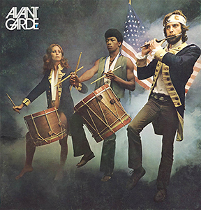 If you know something about the social and cultural climate in America during 1968-71, you can probably figure out what the magazine was about. For example, issue number 7 from March 1969 had a front cover photograph that is a parody of Archibald Willard’s famous patriotic painting “The Spirit of ’76”; Carl Fischer’s version of the image includes a white woman and a black man as two of the three Minutemen from the American Revolution.
You will have to look up Avant Garde magazine on the Internet for yourself to learn more about its editorial perspective. Suffice it to say that Ralph Ginzburg was the editor and Avant Garde “was extremely popular in certain circles, including New York’s advertising and editorial art directors.”
Most importantly, however, Avant Garde was a breakthrough publication creatively; during its four years of existence, it was the cutting edge of graphic design, especially typography. This is not hard to believe when you learn that the magazine’s art director was Herb Lubalin, one of the most important American graphic and type designers of the 1960s and 1970s.
* * * * * *
Herbert F. Lubalin was born in New York City on March 17, 1918. As a high school student he did not show a particular interest in the graphic arts, although he liked to draw. He entered art school at Cooper Union at the age of 17 where his interest in typography was nurtured.
Herb graduated in 1939 and first worked as a freelance designer and typographer. It has been reported that he was fired from a position at a display company after he requested a two-dollar raise on his weekly eight-dollar salary.
Soon thereafter, and for the next twenty-five years, Lubalin worked as an art director for advertising agencies. The New York City firms he worked for included Deutsch & Shea, Fairchild Publications, Reiss Advertising and Sudler & Hennessey. During these years, Lubalin established himself as a genius of what would be later called “typographics” or “expressive typography,” i.e. words and letters as imagery with verbal and conceptual twists.
This was achieved through a meticulous creative approach to advertisements, trademarks and logos, posters, magazines and packaging design. In 1952, Herb won a New York Art Directors Club Gold Medal as creative director at Sudler & Hennessey, the first of hundreds of awards he would receive during his career.
After leaving Sudler in 1964, he established his own graphic design consultancy called Herb Lubalin, Inc. This was the first of multiple businesses and subsidiaries that Lubalin would found in both the US and Europe over the next two decades. In 1970, along with Aaron Burns and Edward Ronthaler, Lubalin created the International Typeface Corporation (ITC), one of the world’s first type foundries that had no history in hot metal type design.

Herb Lubalin achieved worldwide success as an art director and graphic designer during the “Mad Men” era (of the popular AMC TV series) of advertising. Lubalin became identified with graphic clarity and simplicity embodied in the following statement he made some years later, “Typography is a servant—the servant of thought and language to which it gives visible existence.”
In terms of the technology of type, this was the age of phototypesetting. The replacement of hot type with cold type meant that a new library of modern fonts could be developed. It also meant that type forms could be manipulated in ways that were extremely difficult, if not impossible, with the metal casting.
Although Lubalin’s ITC took up the task of preserving and reviving old classic faces such as ITC Bookman and ITC Garamond, the foundry also specialized in modern sans serif fonts such as ITC Franklin, ITC American Typewriter, ITC Kabel and ITC Bauhaus among many others.

Herb Lubalin’s relationship with Ralph Ginzburg—who was convicted in 1963 for violating US obscenity laws—was noteworthy. The two worked together on three of groundbreaking magazines: Eros (1962), Fact: (January 1964–August 1967) and the aforementioned Avant Garde.
Avant Garde magazine proved to be most significant for Lubalin, specifically for his design of the publication nameplate. The Avant Garde moniker became so popular that Lubalin, his partner Tom Carnase and the type designer Edward Benguiat developed an entire font set from it. What became the Avant Garde Gothic type design included a series of ligatures (combinations of two letters into one type element), an innovative development for a sans serif font.
Officially launched by ITC in 1970, Avant Garde Gothic became one of the most popular typefaces of the era. Although it came under criticism and was eschewed by the post-modernist graphic design community for its structural and grid-like consistency, Avant Garde Gothic was eventually included in the set of 35 base fonts on the Adobe PostScript print engine that was launched in the 1980s. For this reason, Avant Garde Gothic continues to be one of the most popular and often used alternatives to Helvetica.
 Herb Lubalin designed some of the most memorable and lasting images of expressive typography that have ever been created. His publication nameplate for “Mother & Child,” logo for L’eggs and logo for the World Trade Center are part of iconic graphic design history.
Herb Lubalin had a near legendary reluctance to talk with anyone, especially the media and trade publications, about his work and some interpreted his reserved character as a lack of intellectual acumen. However, Lubalin was a very sharp advocate of his approach to his craft and he was not averse to sharing his knowledge with those who wanted to learn, particularly students.
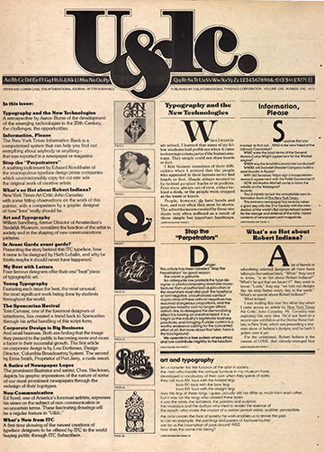
In 1973, Lubalin launched, became editor and art director of International Typeface Corporation’s quarterly in-house publication called U&lc (Upper and lower case). The journal became an instant force in the industry and rapidly built up a subscription circulation of 170,000 readers. It was in U&lc that some of Lubalin’s conceptions about graphic and type design can be studied and learned about.
The following statement—published in the introduction to Graphis Annual 65/66—shows that Herb Lubalin possessed a sharp, critical and iconoclastic attitude to the industry that he devoted his life to, “Advertising in the U.S.A. is a fairly stupid business. We have made it that way by underestimating the intelligence of the American people. The bulk of our output is devised to appeal to the sub-teen-age mentality of that great big consuming monster that we have created. Who’s responsible? Those of us that put absolute faith in antiquated, ineffective, stereotyped, outmoded, unreliable, unbelievable, valueless research methods such as copy testing. … If recent statistics are any indication of the value of copy-testing, we would all be advised to spend our research money researching successful art-directors and copy-writers, knowledgeable creative people who have made their reputations not by fancy words and pretty designs, but by creating intelligent advertising that appeals to a surprisingly intelligent audience (the American people).”
Beginning in 1972, Lubalin began teaching graphic design at Cornell University and starting in 1976 he taught a course at Cooper Union where he remained until his death on May 24, 1981 at New York University Hospital.
* * * * * *
I recently searched for copies of Avant Garde magazine on eBay and found that my high school art teacher was right about how they would be worth something. Although a full set of 14 editions is only going for several hundred dollars, I’m glad I still have my copies of an important piece of modern graphic and type design history.

2 thoughts on “Herb Lubalin: 1918 – 1981”