Adrian Frutiger (1928–2015): Univers and OCR-B

Adrian Frutiger: May 24, 1928 – September 10, 2015

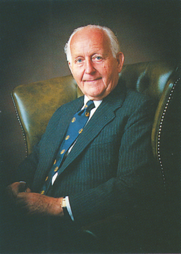
Adrian Frutiger died on September 10, 2015 at the age of 87. He was one of the most important type designers of his generation, having created some 40 fonts, many of them still widely used today. He was also a teacher, author and specialist in the language of graphic expression and—since his career spanned metal, photomechanical and electronic type technologies—Frutiger became an important figure in the transition from the analog to the digital eras of print communications.

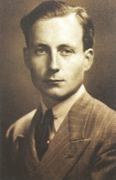
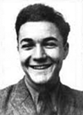
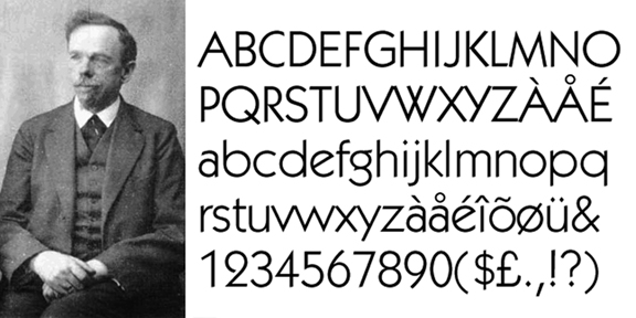
Frutiger was born on May 24, 1928 in the town of Interseen, near Interlaken and about 60 kilometers southeast of the city of Bern, Switzerland. His father was a weaver. As a youth, Adrian showed an interest in handwriting and lettering. He was encouraged by his family and secondary school teachers to pursue an apprenticeship rather than a fine arts career.

Adrian Frutiger around the time of his apprenticeship

At age 16, Adrian obtained a four-year apprenticeship as a metal type compositor with the printer Otto Schlaeffli in Interlaken. He also took classes in drawing and woodcuts at a business school in the vicinity of Bern. In 1949, Frutiger transferred to the School of Applied Arts in Zürich, where he concentrated on calligraphy. In 1951, he created a brochure for his dissertation entitled, “The Development of the Latin Alphabet” that was illustrated with his own woodcuts.

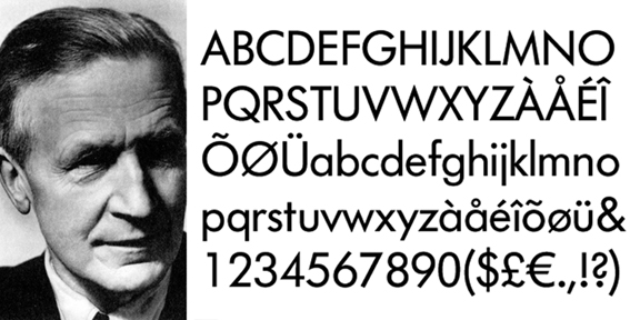
It was during his years in Zürich that Adrian worked on sketches for what would later become the typeface Univers, one of the most important contributions to post-war type design. In 1952, following his graduation, Frutiger moved to Paris and joined the foundry Deberny & Peignot as a type designer.

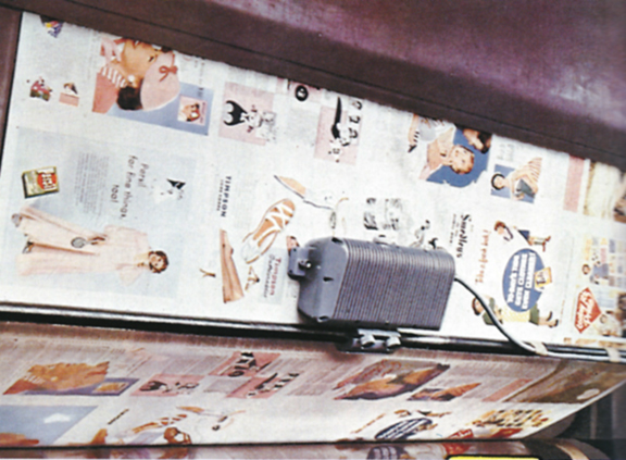
During his early work with the French type house, Frutiger was engaged in the conversion of existing metal type designs for the newly emerging phototypesetting technologies. He also designed several new typefaces— Président, Méridien, and Ondine—in the early 1950s.

San serif and Swiss typography

San serif type is a product of the twentieth century. Also known as grotesque (or grotesk), san serif fonts emerged with commercial advertising, especially signage. The original san serif designs (beginning in 1898) possessed qualities—lack of lower case letters, lack of italics, the inclusion of condensed or extended widths and equivalent cap and ascender heights—that seemingly violated the rules of typographic tradition. As such, these early san serif designs were often considered too clumsy and inelegant for the professional type houses and their clients.

Rudolf Koch, Kabel, 1927
Paul Renner, Futura, 1927
Eric Gill, Gill Sans, 1927

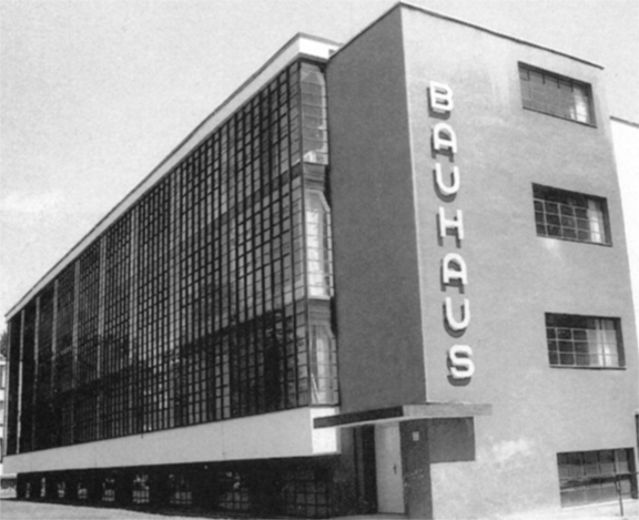
Along with the modern art and design movements of the early twentieth century, a reconsideration of the largely experimental work of the first generation of sans serif types began in the 1920s. Fonts such as Futura, Kabel and Gill Sans incorporated some of the theoretical concepts of the Bauhaus and DeStijl movements and pushed sans serif to new spheres of respectability.

However, these fonts—which are still used today—did not succeed in elevating san serif beyond headline usage and banner advertising and into broader application. Sans serif type remained something of an oddity and not yet accepted by the traditional foundry industry as viable in terms of either style or legibility.

In the 1930s, especially within the European countries that fell to dictatorship prior to and during World War II, there was a backlash against modernist conceptions. Sans serif type came under attack, was derided as “degenerate” and banned in some instances. Exceptions to this trend were in the US, where the use of grotesque types was increasing, and Switzerland, where the minimalist typographic ideas of the Bauhaus were brought by designers who had fled the countries ruled by the Nazis.

The Bauhaus School, founded in 1919 in Weimar, Germany, was dedicated to the expansion of the modernist esthetic

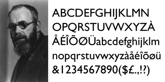
After the war, interest in sans serif type design was renewed as a symbol of modernism and a break from the first four decades of the century. By the late 1950s, the most successful period of san serif type opened up and the epicenter of this change emerged in Switzerland, signified by the creation of Helvetica (1957) by Eduard Hoffmann and Max Miedinger of the Haas Type Foundry in Münchenstein.

It was the nexus of the creative drive to design the definitively “modern” typeface and the possibilities opened up by the displacement of metal type with phototypesetting that brought san serif from a niche font into global preeminence.

Frutiger’s Univers

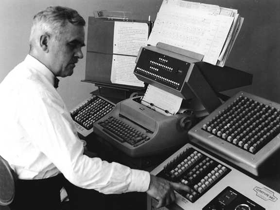
This was the cultural environment that influenced Adrian Frutiger as he set about his work on a new typeface as a Swiss trained type designer at a French foundry. As Frutiger explained in a 1999 interview with Eye Magazine, “When I came to Deberny & Peignot in Paris, Futura (though it was called Europe there) was the most important font in lead typesetting. Then one day the question was raised of a grotesque for the Lumitype-Photon [the first phototypesetting system]. …

“I asked him [Peignot] if I might offer an alternative. And within ten days I constructed an entire font system. When I was with Käch I had already designed a thin, normal, semi-bold and italic Grotesque with modulated stroke weights. This was the precursor of Univers. … When Peignot saw it he almost jumped in the air: ‘Good heavens, Adrian, that’s the future!’ ”

An early diagram of Frutiger’s Univers in 1955 shows the original name “Monde”
Final diagram of Frutiger’s 21 styles of Univers in 1955

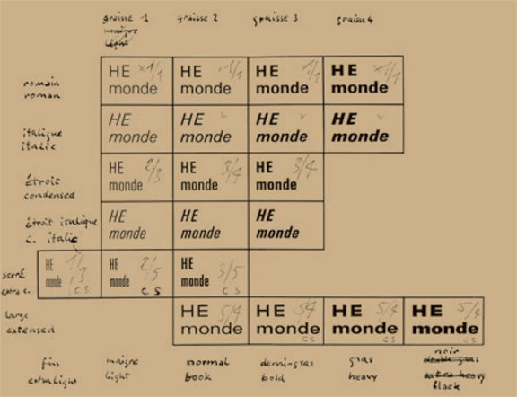
Originally calling his type design “Monde” (French for “world”), Frutiger’s innovation was that he designed 21 variations of Univers from the beginning; for the first time in the history of typography a complete set of typefaces were planned precisely as a coherent system. He also gave the styles and weights a numbering scheme beginning with Univers 55. The different weights (extended, condensed, ultra condensed, etc.) were numbered in increments of ten, i.e. 45, 65, 75, 85 and styles with the same line thickness were numbered in single digit increments (italics were the even numbers), i.e. 53, 56, 57, 58, 59, etc.

Univers was released by Deberny & Peignot in 1957 and it was quickly embraced internationally for both text and display type purposes. Throughout the 1960s and 70s, like Helvetica, it was widely used for corporate identity (GE, Lufthansa, Deutsche Bank). It was the official promotional font of the 1972 Munich Olympic Games.

Frutiger explained the significance of his creation in the interview with Eye Magazine, “It happened to be the time when the big advertising agencies were being set up, they set their heart on having this diverse system. This is how the big bang occurred and Univers conquered the world. But I don’t want to claim the glory. It was simply the time, the surroundings, the country, the invention, the postwar period and my studies during the war. Everything led towards it. It could not have happened any other way.”

Computers and digital typography

Had Adrian Frutiger retired at the age of 29 after designing Univers, he would have already made an indelible contribution to the evolution of typography. However, his work was by no means complete. By 1962, Frutiger had established his own graphic design studio with Bruno Pfaffli and Andre Gurtler in Arcueil near Paris. This firm designed posters, catalogs and identity systems for major museums and corporations in France.

Throughout the 1960s, Frutiger continued to design new typefaces for the phototypesetting industry such as Lumitype, Monotype, Linotype and Stempel AG. Among his most well-known later san serif designs were Frutiger, Serifa and Avenir. Frutiger’s font systems can be seen to this day on the signage at Orly and Charles de Gaulle airports and the Paris Metro.

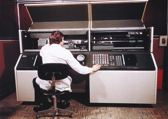
The penetration of computers and information systems into the printing and publishing process were well underway by the 1960s. In 1961, thirteen computer and typewriter manufacturers founded the European Computer Manufacturers Association (ECMA) based in Geneva. A top priority of the EMCA was to create an international standard for optical character recognition (OCR)—a system for capturing the image of printed information and numbers and converting them into electronic data—especially for the banking industry.

By 1968, OCR-A was developed in the US by American Type Founders—a trust of 23 American type foundries—and it was later adopted by the American National Standards Institute. This was the first practically adopted standard mono-spaced font that could be read by both machines and the human optical system.

However, in Europe the ECMA wanted a font that could be used as an international standard such that it accommodated the requirements of all typographic considerations and computerized scanning technologies all over the world. Among the issues, for example, were the treatment of the British pound symbol (£) and the Dutch IJ and French oe (œ) ligatures. Other technical considerations included the ability to integrate OCR standards with typewriter and letterpress fonts in addition to the latest phototypesetting systems.

Comparison of OCR-A (1968) with Frutiger’s OCR-B (1973)

In 1963, Adrian Frutiger was approached by representatives of the ECMA and asked to design OCR-B as an international standard with a non-stylized alphabet that was also esthetically pleasing to the human eye. Over the next five years, Frutiger showed the exceptional ability to learn the complicated technical requirements of the engineers: the grid systems of the different readers, the strict spacing requirements between characters and the special shapes needed to make one letter or number optically distinguishable from another.

In 1973, after multiple revisions and extensive testing, Adrian Frutiger’s OCR-B was adopted as an international standard. Today, the font can be most commonly found on UPC barcodes, ISBN barcodes, government issued ID cards and passports. Frutiger’s OCR-B font will no doubt live on into the distant future—alongside various 2D barcode systems—as one of the primary means of translating analog information into digital data and back again.

Frutigers Sign and Symbols 1989
Frutiger’s 1989 English translation of “Signs and Symbols: Their Design and Meaning”

Adrian Frutiger’s type design career extended well into the era of desktop publishing, PostScript fonts and the Internet age. In 1989, Frutiger published the English translation of Signs and Symbols: Their Design and Meaning a theoretical and retrospective study of the two-dimensional expression of graphic drawing with typography among its most advanced forms. For someone who spent his life working on the nearly imperceptible detail of type and graphic design, Frutiger exhibited an exceptional grasp of the historical and social sources of man’s urge toward pictographic representation and communication.

As an example, Frutiger wrote in the introduction to his book, “For twentieth century humans, it is difficult to imagine a void, a chaos, because they have learned that a kind of order appears to prevail in both the infinitely small and the infinitely large.  The understanding that there is no element of chance around or in us, but that all things, both mind and matter, follow an ordered pattern, supports the argument that even the simplest blot or scribble cannot exist by pure chance or without significance, but rather that the viewer does not clearly recognize the causes, origins, and occasion of such a ‘drawing’.”

Hermann Zapf (1918–2015): Digital typography

Hermann Zapf: November 8, 1918 – June 4, 2015

On Friday, June 12, Apple released its San Francisco system font for OSX, iOS and watchOS. Largely overlooked amid the media coverage of other Apple product announcements, the introduction of San Francisco was a noteworthy technical event.

San Francisco is a neo-grotesk, sans serif and Pan European typeface with characters in Latin as well as Cyrillic and Greek scripts. It is significant because it is the first font to be designed specifically for all of Apple’s display technologies. Important variations have been introduced into San Francisco to optimize its readability on Apple desktop, notebook, TV, mobile and watch devices.

It is also the first font designed by Apple in two decades. San Francisco extends Apple’s association with typographic innovation that began in the mid-1980s with desktop publishing. From a broader historical perspective, Apple’s new font confirms of the ideas developed more than fifty years ago by renowned calligrapher and type designer Hermann Zapf. Sadly, Zapf died at the age of 96 on June 4, 2015 just one week before Apple’s San Francisco announcement.

Hermann Zapf’s contributions to typography are extensive and astonishing. He designed more than 200 typefaces—the popular Palatino (1948), Optima (1952), Zapf Dingbats (1978) and Zapf Chancery (1979) among them—including fonts in Arabic, Pan-Nigerian, Sequoia and Cherokee. Meanwhile, Zapf’s exceptional calligraphic skills were such that he famously penned the Preamble of the Charter of the United Nations in four languages for the New York Pierpont Morgan Library in 1960.

Preamble of the charter of The United Nations
Zapf’s calligraphic skills were called upon for the republication of the Preamble of the UN Charter in 1960 for the Pierpont Morgan Library in New York City.

While he made many extraordinary creative accomplishments—far too many to list here—Hermann Zapf’s greatest legacy is the way he thought about type and its relationship to technology as a whole. Herman Zapf was among the first and perhaps the most important typographers to theorize about the need for new forms of type driven by computer and digital technologies.

Early life

Hermann Zapf was born in Nuremburg on November 8, 1918 during the turbulent times at the end of World War I. As he wrote later in life, “On the day I was born, a workers’ and soldiers’ council took political control of the city. Munich and Berlin were rocked by revolution. The war ended, and the Republic was declared in Berlin on 9 November 1918. The next day Kaiser Wilhelm fled to Holland.”

At school, Hermann took an interest in technical subjects. He spent time in the library reading scientific journals and at home, along with his older brother, experimenting with electronics. He also tried hand lettering and created his own alphabets.

Hermann left school in 1933 with the intention of becoming an engineer. However, economic crisis and upheaval in Germany—including the temporary political detention of his father in March 1933 at the prison camp in Dachau—prevented him from pursuing his plans.

Apprentice years

Barred from attending the Ohm Technical Institute in Nuremberg for political reasons, Hermann sought an apprenticeship in lithography. He was hired in February 1934 to a four-year apprenticeship as a photo retoucher by Karl Ulrich and Company.

In 1935, after reading books by Rudolf Koch and Edward Johnson on lettering and illuminating techniques, Hermann taught himself calligraphy. When management saw the quality of Hermann’s lettering, the Ulrich firm began to assign him work outside of his retouching apprenticeship.

Hermann refused to take the test at his father’s insistence on the grounds that the training had been interrupted by many unrelated tasks. He never received his journeyman’s certificate and left Nuremburg for Frankfurt to find work.

Zapf’s Gilgengart designed originally in 1938

Zapf started his career in type design at the age of 20 after he was employed at the Fürsteneck Workshop House, a printing establishment run by Paul Koch, the son of Rudolf Koch. As he later explained, “It was through the print historian Gustav Mori that I first came into contact with the D. Stempel AG type foundry and Linotype GmbH in Frankfurt. It was for them that I designed my first printed type in 1938, a fraktur type called ‘Gilgengart’.”

War years

Hermann Zapf was conscripted in 1939 and called up to serve in the German army near the town of Pirmasens on the French border. After a few weeks, he developed heart trouble and was transferred from the hard labor of shovel work to the writing room where he composed camp reports and certificates.

When World War II started, Hermann was dismissed for health reasons. In April 1942 he was called up again, this time for the artillery. Hermann was quickly reassigned to the cartographic unit where he became well-known for his exceptional map drawing skills. He was the youngest cartographer in the German army through the end of the war.

An example of calligraphy from the sketchbook that Hermann Zapf kept during World War II.

Zapf was captured after the war by the French and held in a field hospital in Tübingen. As he recounted, “I was treated very well and they even let me keep my drawing instruments. They had a great deal of respect for me as an ‘artiste’ … Since I was in very poor health, the French sent me home just four weeks after the end of the war. I first went back to my parents in my home town of Nuremberg, which had suffered terrible damage.”

Post-war years

In the years following the war, Hermann taught and gave lessons in calligraphy in Nuremberg. In 1947, he returned to Frankfurt and took a position with the Stempel AG foundry with little qualification other than his sketch books from the war years.

From 1948 to 1950, while he worked at Stempel on typography designs for metal punch cutting, he developed a specialization in book design. Hermann also continued to teach calligraphy twice a week at the Arts and Crafts School in Offenbach.

Zapf’s Palatino (1948) and Optima (1952) fonts

It was during these years, that Zapf designed Palatino and Optima. Working closely with the punch cutter August Rosenberg, Hermann design Palatino and named it after the 16th century Italian master of calligraphy Giambattista Palatino. In the Palatino face, Zapf attempted to emulate the forms of the great humanist typographers of the Renaissance.

Optima, on the other hand, expressed more directly the genius of Zapf’s vision and foreshadowed his later contributions. Optima can be described as a hybrid serif-and-sans serif typeface because it blends features of both: serif-less thick and thin strokes with subtle swelling at the terminals that suggest serifs. Zapf designed Optima during a visit to Italy in 1950 when he examined inscriptions at the Basilica di Santa Croce in Florence. It is remarkably modern, yet clearly derived from the Roman monumental capital model.

By the time Optima was released commercially by Stempel AG in 1958, the industry had begun to move away from metal casting methods and into phototypesetting. As many of his most successful fonts were reworked for the new methods, Zapf recognized—perhaps before and more profoundly than most—that phototypesetting was a transitional technology on the path from analog to an entirely new digital typography.

Digital typography

To grasp the significance of Zapf’s work, it is important to understand that, although “cold” photo type was an advance over “hot” metal type, both are analog technologies, i.e. they require the transfer of “master” shapes from manually engraved punches or hand drawn outlines to final production type by way of molds or photomechanical processes.

Due to the inherent limitations of metal and photomechanical media, analog type masters often contain design compromises. Additionally, the reproduction from one master generation to the next has variations and inconsistencies connected with the craftsmanship of punch cutting or outline drawing.

With digital type, the character shapes exist as electronic files that “describe” fonts in mathematical vector outlines or in raster images plotted on an XY coordinate grid. With computer font data, typefaces have many nuances and features that could never be rendered in metal or photo type. Meanwhile, digital font masters can be copied precisely without any quality degradation from one generation to the next.

Hermann Zapf in 1960

From the earliest days of computers, Hermann Zapf began advocating for the advancement of digital typography. He argued that type designers needed to take advantage of the possibilities opened up by the new technologies and needed to create types that reflected the age. Zapf also combined knowledge of the rules of good type design with a recognition that fonts needed to be created specifically for electronic displays (at that time CRT-based monitors and televisions).

In 1959, at the age of 41, Zapf wrote in an industry journal, “It is necessary to combine the purpose, the simplicity and the beauty of the types, created as an expression of contemporary industrial society, into one harmonious whole. We should not seek this expression in imitations of the Middle Ages or in revivals of nineteenth century material., as sometimes seems the trend; the question for us is satisfying tomorrow’s requirements and creating types that are a real expression of our time but also represent a logical continuation of the typographic tradition of the western world.”

Warm reception in the US

 Despite a very cold response in Germany—his ideas about computerized type were rejected as “unrealistic” by the Technical University in Darmstadt where he was a lecturer and by leading printing industry representatives—Hermann persevered. Beginning in the early 1960s, Zapf delivered a series of lectures in the US that were met with enthusiasm.

For example, a talk he delivered at Harvard University in October 1964 became so popular that it led to an offer for a professorship at the University of Texas in Austin. The governor even also made Hermann an “Honorary Citizen of the State of Texas.” In the end, Zapf turned down the opportunity due to family obligations in Germany.

Among his many digital accomplishments are the following:

  • Rudolf Hell
    Rudolf Hell

    When digital typography was born in 1964 with the Digiset system of Rudolf Hell, Hermann Zapf was involved. By the early 1970s, Zapf created some of the first fonts designed specifically for any digital system: Marconi, Edison, and Aurelia.

  • In 1976, Hermann was asked to head a professorship in typographic computer programming at Rochester Institute of Technology (RIT) in Rochester, New York, the first of its kind in the world. Zapf taught at RIT for ten years and was able to develop his conceptions in collaboration with computer scientists and representatives of IBM and Xerox.
  • With Aaron Burns
    With Aaron Burns

    In 1977, Zapf partnered with graphic designers Herb Lubalin and Aaron Burns and founded Design Processing International, Inc. (DPI) in New York City. The firm developed software with menu-driven typesetting features that could be used by non-professionals. The DPI software was focused on automating hyphenation and justification as opposed to the style of type design.

  • In 1979, Hermann began a collaboration with Professor Donald Knuth of Stanford University to develop a font that was adaptable for mathematical formulae and symbols.
  • With Peter Karnow
    With Peter Karnow

    In the 1990s, Hermann Zapf continued to focus on the development of professional typesetting algorithms with his “hz -program” in collaboration with Peter Karow of the font company URW. Eventually the Zapf composition engine was incorporated by Adobe Systems into the InDesign desktop publishing software.

Zapf’s legacy

Hermann Zapf actively participated—into his 70s and 80s—in some of the most important developments in type technology of the past fifty years. This was no accident. He possessed both a deep knowledge of the techniques and forms of type history and a unique appreciation for the impact of information technologies on the creation and consumption of the written word.

In 1971, Zapf gave a lecture in Stockholm called “The Electronic Screen and the Book” where he said, “The problem of legibility is as old as the alphabet, for the identification of a letterform is the basis of its practical use. … To produce a clear, readable text that is pleasing to the eye and well arranged has been the primary goal of typography in all the past centuries. With a text made visible on a CRT screen, new factors for legibility are created.”

More than 40 years before the Apple design team set out to create a font that is legible on multiple computer screens, the typography visionary Hermann Zapf was theorizing about the very same questions.

John Crosfield (1915 – 2012): Printing press automation

John Crosfield
John Fothergill Crosfield: October 22, 1915 – March 25, 2012

Today’s digital and mobile wireless technologies are in a constant state of flux. As we pass the midpoint of 2015, the human computer interface is being once again transformed with haptic technology—tactile feedback from a device such as force or vibration.

If you have felt vibration in response to a touch function on your smartphone, then you have experienced haptics. What was until recently available only to virtual reality enthusiasts and gamers, is now a feature of every smartphone and tablet.

Technical evolution has been so fast that it is hard to believe smartphones have been around for less than eight years and the tablet is just a little over three years old. As we try to keep up with the pace of change, it is easy to miss the fact that the electronics revolution has been underway for more than a century and digital electronics represents less than half of that time period.

Electronic technology can be divided into two basic forms: analog and digital. Long before there were microprocessors and memory chips that exchange all information, data, code, signals, etc. in a series of zeroes and ones, there were analog electronics such as resistors, capacitors, inductors, diodes and transistors.

The difference between a clock with hour, minute and second hands rotating around the face and the numerals on an Light Emitting Diode (LED) clock display is a simple illustration of analogue vs digital technology.

John Crosfield’s contributions to printing and the graphic arts spanned both analogue and digital electronics. His analogue systems were developed in the late 1940s and became dominant in the industry throughout the 1950s. When the first computers were introduced in the 1960s, Crosfield pioneered digital electronics and became a major worldwide provider of equipment into the 1960s and mid-70s.

Crosfield’s youth

Young John Crosfield
Young John F. Crosfield

John Fothergill Crosfield was born into a well-off family. He was the third child and second son of prominent English Quakers. Born on October 22, 1915 in Hampstead, London—a community known for its intellectual, liberal, artistic, musical and literary associations—John had five siblings.

John’s father, Bertram Fothergill Crosfield, was managing director and co-proprietor of the News Chronical and The Star, both liberal daily newspapers in London. Bertram was also leader of several Hampstead organizations. John’s mother, Eleanor Cadbury, was the daughter of the famous chocolate maker and leading Quaker, George Cadbury. Eleanor was well-known independently of her father and was elected as a Liberal to Bucks County Council.

John showed an early interest in building things. As a boy, he was often busy in the family workshop making boats, steam engines and other mechanical devices. He once built a cannon and tested it on the garage door. The projectile went through the door and damaged his father’s Daimler. He was fond of trains and, with the assistance of a childhood friend, built an O gauge model railroad on the property of his school grounds.

At age 13 John was enrolled in Leighton Park School, a Quaker establishment. He enjoyed studying physics and math and decided he wanted to pursue engineering at college. Following in his father’s footsteps, John enrolled at Trinity College Cambridge. He designed and built gliders and other flying machinery such as a winch launcher in his spare time. Although he had many hobbies, John was an exceptional student and put most of his time into his studies.

John graduated from Cambridge in 1936 and went to Munich, Germany to improve his language skills. He came into contact with anti-Semitism and Nazi propaganda and was horrified by Hitler’s methods. Upon his return to England, John’s accounts of the treatment of political prisoners in Germany were met with disbelief.

World War II

John Crosfield was a member of a generation of engineers whose formative experiences were made in World War II. Much of the technology advancements that were deployed throughout industry in the post war period originated in the struggle by the warring countries for military supremacy.

After he left Cambridge, Crosfield took a student-apprentice engineering position with British Thomson-Hudson (BTH), a heavy industry firm based in Warwickshire. BTH was founded as a subsidiary of the US-based General Electric Company (GE) and specialized in steam turbines. In 1938, he left BTH and went to work at the Stockholm facility of ASEA, a Swedish version of BTH and GE. When the war began in 1939, John made his way back to England and planned to join the Navy.

Crosfield used some connections at ASEA to get an assignment by the Admiralty to the Mine Design Department. It was here that Crosfield’s electronic genius would begin to be expressed. He worked on a magnetic mine project that could detect German boats near British harbors.

Crosfield also designed and built a prototype of an acoustic mine that could pick up on the sound of the propeller of wooden German E-boats. The acoustic mine became a success with 200 being deployed in the Baltic Sea and sinking 47 enemy vessels. Crosfield and his colleagues later worked on the development of both acoustic and subsonic mines. He got involved in the production process and in 1944 Crosfield’s inventions proved extremely effective in major battles at the Straits of Dover and the Western Approaches.

Crosfield Electronics Limited & the Autotron

1949 advertisement for the Crosfield Autotron, the first automated electronic register control system

After the war, John Crosfield decided—after having learned from his experience at ASEA that some of the projects that he had worked on would never be funded—to start his own business. In 1947, he set up a lab in Hampstead and began working on new projects. He later recalled that in 1945, while he was in charge of electronics research for the Admiralty, he was approached by a printing industry representative about the problem of color registration on high speed rotogravure magazine presses. There was a need for an automated system to align all the process colors in the printed page to improve quality and reduce press waste.

With about £2,000 of his own money and another £2,500 borrowed from family members, Crosfield set out to design an electronic and automated registration system for color printing. After 18 months of hard work, the “Autotron” was tested as a prototype on the production of Women’s Weekly at Amalgamated Press in London. Prior to the Autotron, a magazine production run would often waste 25-30% of the impressions using manual controls. Crosfield’s automatic register system brought the waste figures down to 4-5%.

The Autotron consisted of a scanning heads mounted on each printing unit and a control cubicle that was located away from the press. The scanning heads picked up “register marks”—unobtrusive symbols on the printed page that were hidden from view—to regulate the movement of the printed image from unit to unit with an accuracy of one thousandth (1/1000) of an inch.

Word about the Autotron travelled quickly in the printing industry and Crosfield was soon taking prepaid orders from companies in Britain. An opportunity to show the system at the British Industries Fair in 1949 made Autotron an international phenomenon and orders were quickly being placed from printers in countries around the world.

Pressroom automation

The success of the Autotron encouraged John Crosfield to invest in further research in pressroom automation for gravure magazine printing and other presses such as offset newspaper and packaging print.

In Recollections of Crosfield Electronics, 1947 to 1975, John Crosfield wrote, “My philosophy was to concentrate our research on new electronic aids for the printing industry, in order to maximize the use of our electronic ‘know how’ on the one hand and our sales contacts in the printing industry on the other. Eventually we had the greatest range of electronic equipment for the printing industry of any company in the world.”

In the 1950s, Crosfield developed a suite of successful automation products for the industry:

  • Secatron: an optical system for packaging printers that kept images in the right position on the cardboard so they would look right on the finished carton.
  • Webatron: a system similar to Autotron for high speed presses that regulated the movement of paper through the press for delivery to folders and sheeters.
  • Trakatron: a system for regulating print on web-fed cellophane and wax paper presses.
  • Idotron: a system for measuring ink density on a web press to keep color reproduction consistent during press runs.
  • Viscomex: an ink viscosity control system that added solvents to the ink automatically as needed as a result of evaporation.
  • Flying Paster: an automatic splicing mechanism that enabled production to go from one roll of paper to the other without slowing down or stopping the press.
Crosfield Idotron measured and adjusted ink density inline on a high speed rotogravure press

Many of these systems relied upon photo-electric cells to detect movement of paper or printed images on the paper. Crosfield’s expertise in the area of optical sensors lead him to several other important breakthroughs in the composition and preparatory stages of print production. These developments took place in an environment of intense global competition with companies in Europe, the US and Middle East.

Phototypesetting and color scanning

The Crosfield Lumitype 450 was the first phototypesetting system designed and built in Europe. It was licensed to Crosfield by the US based Photon.

By the 1960s, the printing industry had been moving rapidly into offset lithography. A major factor in this regard was the displacement of hot metal typesetting with cold type, i.e. phototypesetting systems. While Crosfield was not the inventor of the first phototypesetter, his company was a designer and builder of the Lumitype 540 under patents from the original inventors at Photon in the US. This relationship would continue through the development of the high speed Photon 713 in 1965, which was the first computer controlled phototypesetting system.

Among the greatest successes of Crosfield Electronics, Ltd. was its color scanning systems. The Crosfield Scanatron—which was developed in 1958—was the first scanning technology that could make color corrections and eliminate the time-consuming work of retouchers.

The Crosfield Magnascan was the first color scanning device that could retouch color electronically.

Crosfield continued with advancements in color scanning throughout the 1960s. The Magnascan was introduced in 1969 and it was capable of scanning a color transparency. It also had the software capability to adjust the size, form, color and hue such that the printed image was of the finest quality anywhere.

While the Magnascan was an international success, it was developed at the same time as Rudolf Hell’s Chromograph. Recognizing that a battle over who invented and patented the drum scanner first, the two men signed an agreement giving cross licenses for a modest royalty. Crosfield and Hell remained good friends from that point forward.

Impact of desktop computing

John Crosfield receiving the gold medal of the Institute of Printing in 1973

In addition to accomplishments in the graphic arts, Crosfield Electronics Limited (CEL). also developed computerized business systems and—leveraging the expertise in optical devices—invented a very successful automated bank note sorting and processing technology.

While the company was very successful in the printing market, an attempt to take CEL public in 1974 was made during a collapse of the stock exchange and Crosfield ended up selling his business to De La Rue. The color scanning segment of his business—the most profitable aspect of CEL—was sold by De La Rue in 1989 to a joint venture of Fuji and DuPont called Fujifilm Electronics Imaging.

With the introduction of the desktop PC—and especially the desktop publishing system associated with the Apple Macintosh computer in 1985 and shortly thereafter desktop flatbed scanners—Crosfield’s era graphic arts electronics had come to a close.

John Crosfield received many accolades for his contributions to the printing industry over nearly five decades, including four United Kingdom Queen’s Awards and the gold medal of the Institute of Printing in 1973. He remained a board member of De La Rue until 1985 and thereafter was Honorary President of CEL. A very modest, personable and generous man, John Crosfield died on March 25, 2012 at his home in Hampstead at age 96.