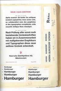
It is a fact of typographic history that the font Helvetica exists today because of Hamburgers … but not the food “Hamburgers.” Eduard Hoffmann, the creator of the ubiquitous typeface, knew the word “Hamburgers” contained the complete range of character attributes in the alphabet; he knew that from this one word the quality of a typeface design could be evaluated, that the features of its anatomy could be examined.
And so, early on in the design of the precursor to Helvetica—called Neue Haas Grotesk—Eduard Hoffmann of the Swiss-based Haas Type Foundry wrote to his designer and confident Max Miedinger, “But our first priority is the word ‘Hamburgers.’ It is the universal type founders’ word that contains all the varieties of letters.”
Helvetica is probably the most successful typeface in all of history. It is everywhere, all the time and there are reasons for this: Helvetica is neutral and easy to read; its different weights and styles effectively embody almost any meaning or message. Helvetica is plain but it is also modern and timeless.
Helvetica came about when typography and printing technology were moving from the metal casting, mechanical and letterpress era to the electronic phototypesetting, word processing, laser imaging and computer age. It rode atop this transformation and became the first truly international typeface. By the mid-1960s, Helvetica emerged as a global standard for public signage, corporate identity and communications.

Regardless of one’s personal opinion of the esthetics and usefulness of Helvetica today, its creation and development—the people who developed it and how they developed it—is one of the most important accomplishments of twentieth century graphic arts.
Eduard Hoffmann was born on May 26, 1892 in Zurich, Switzerland. As a student, he studied technology and engineering in Zurich, Berlin and Munich with a specific interest in aviation. In 1917, the 25-year-old Hoffmann took a position under the direction of his uncle Max Krayer at Haas’sche Schriftgiesserei (Haas Type Foundry) in Münchenstein, Switzerland and made a commitment to the profession of typography. In 1937, Eduard became co-manager of the company with Krayer, and after his uncle’s death in 1944, became sole manager where he remained until his retirement in 1965.
As early as 1950, Hoffmann made a decision to introduce a new sans serif typeface into the Swiss market that could compete with those coming from the other European countries. The origins of san serif typefaces date back to the late eighteenth century where it was used with an embossing technique to enable the blind to read. The first fully developed sans serif (also known as grotesque or grotesk) made its appearance in Germany around 1825 and a French type founder first used the term sans serif (without decorative extensions) in 1830.
The sans serif types that Hoffmann wanted to compete with originally became popular and successful in the late nineteenth century. This was true of Akzidenz Grotesk of the Berlin-based H. Berthold AG type foundry, for example, which was originally designed in 1896. But there were neo-grotesk faces that had since entered the market, Bauer’s Folio and Frutiger’s Univers for example, that threatened to eclipse Hoffmann’s venture.
In 1956, as grotesk font use was surging in Europe, Hoffmann thought the timing was right to attempt a specifically Swiss variety. He contacted Max Miedinger, who had been a salesman and type designer at the Haas Type Foundry for the previous ten years, and wrote “he was the only man to design a new typeface for Haas.”

Miedinger’s role in the process was decisive and many credit him more than Hoffmann for the creation of Helvetica. It is true that Miedinger made the original hand-drawn letters of the alphabet. But the esthetic component was only one side of the value that Miedinger brought to Haas. It was his in-depth knowledge and relationship with the customers of the type foundry that made Miedinger indispensible to the success of Neue Haas Grotesk and later Helvetica.
Miedinger had access to some of the most brilliant Swiss graphic artists as well as advertising representatives from major Swiss corporations—the chemical firm J.R. Geigy AG among them—and through a painstaking and collaborative development process headed up by Hoffmann, Neue Haas Grotesk took shape.
Throughout 1957 and 1958, the two men collaborated back and forth, fine-tuning each character. The record of the exchange between Hoffmann and Miedinger has been preserved and can be followed in detail in the book, Story of a Typeface: Helvetica forever. The book includes photographic reproductions of the letters the men wrote to each other as well as Hoffmann’s project notebook.

Hoffmann knew that designing a great typeface was not only about the beauty and logical construction of each individual character, even though this was an important aspect. Each character had to fit together with all the other characters in the various combinations that make letters into words. There was also the technical question of how the typeface would look at different sizes and once it was printed with ink on paper.
As Hoffmann explained in 1957, “praxis has shown that a new typeface cannot be correctly and objectively evaluated until it is in printed form. But even then, it is quite curious to find that a letter might be very satisfactory in a word, while seemingly quite out of place in another context. This makes it necessary to consider its design anew, which usually leads to unavoidable compromises.”
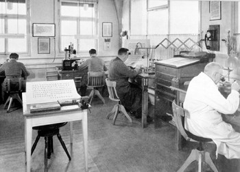
Once they were satisfied with the basic letterforms and had designed enough weights and sizes—at that time, the Haas Type Foundry was punch cutting, engraving and typecasting by hand thousands upon thousands of individual characters in metal—the men took their product to market. With the help of some well-designed promotional brochures and an initial buzz at the Graphic 57 trade fair in Lausanne, Neue Haas Grotesk became a hit. By 1959, about ten percent of the printers in Switzerland were carrying it.

The Haas Type Foundry was majority-owned by the German firm D. Stempel AG. In turn, Stempel was in a contract with the multinational Linotype Corporation for the production of machine manufactured metal type forms. In order to expand the appeal of Hoffmann and Miedinger’s typeface and to bring it to the world of mass production typography, especially in the US, Linotype’s marketing department pushed for Neue Haas Grotesk to be renamed.
Linotype initially suggested that it simply be named Helvetia (Latin for Switzerland). Hoffmann felt that, although it was distinctly a Swiss product, the typeface could not have the exact same name as the country. He came up with Helvetica, which means “The Swiss Typeface,” and all involved accepted the new name developed by its creator.
Into the 1960s, Helvetica gained spectacular popularity and was adopted as the “in-house typeface” of various international corporations, many of which still use it to this day. Commentary on the significance and social driving force behind the success of Helvetica has often referred to post-war economic expansion. There was a thirst in the 1950s within the creative community for visual clues that conveyed optimism about the future. Designers wanted an excessively modern look that helped to put the bad memories of the first half the twentieth century far behind. For many, Helvetica accomplished this goal.
In 1971, Eduard established a foundation with the aim of creating a museum dedicated to the printing industry. In 1980, in the former Gallician paper mill on the Rhine, the museum opened with Hoffmann’s collection of papers on the history of the Haas Type Foundry as one of its main attractions. Eduard Hoffmann died in Basel, Switzerland on September 17, 1980.

