George Baxter (1804–1867): Pictorial color printing

George Baxter: July 31, 1804–January 11, 1867
George Baxter: Jul 31, 1804–Jan 11, 1867

Prior to the invention of photography and photomechanical halftones, the printing of pictures required the handwork of skilled artists. For centuries, craftsmen used various manual techniques—engraving, etching, stippling and drawing—to create original images on wood blocks, metal plates or lithographic stones that could be inked and printed onto paper.

At each evolutionary stage—from relief to intaglio to lithography—pictorial printing became incrementally more productive. However, the craftsmen’s work persisted and the process remained slow. Well into the 1800s, it was common for creative work on pictures such as engraved images on text pages or separately printed lithographic plates to begin a year or two before the date of publication.

Although the artistic work was time-consuming, it often produced striking results. By the time color printing methods were perfected, magnificent pictures began to appear. In the mid-nineteenth century, pictorial color printers—some using RBY or RBYK models and others using “tinting” techniques of up to 20 or even 30 different colors—were producing astonishingly beautiful prints.

As the methods advanced and cost per picture declined, the quantity of color printing grew. This expansion was in part due to the industrialization of printing press machinery. The speed and volume of print was being driven up exponentially by metal cylinders, steam power and rotary printing equipment.

The Coronation of Queen Victoria and the Opening of Parliament (1842)
“Her Most Gracious Majesty Receiving the Sacrament at her Coronation” (1841) is among George Baxter’s most famous pictorial work. It includes two hundred identifiable portraits of individuals who were present at the event.

Another side of the surge in color was that more people than ever before had access to the new low-priced prints. For the first time, average people could buy printed copies of paintings and other items previously seen only in the private collections of society’s elite. The color printer became for the people the disseminator of artistic masterpieces and the chronicler of contemporary events.

A few enterprising printers recognized that industrial society had created an opportunity to produce and sell pictures to the general public. They established companies in cities and employed the available labor—including child workers—to print inexpensive color pictures for the growing urban population. In this environment, the Englishman George Baxter emerged as perhaps the most important figure of the era of pictorial color printing.

George Baxter’s innovation

In some respects, the color work of George Baxter should be considered Victorian-age fine art. Even though he produced upwards of 20 million prints during his lifetime, Baxter’s work exhibits virtuosity in the technical aspects of platemaking and printing as well as extraordinary gifts as an engraver.

It would take many decades after his death for the meaning of Baxter’s accomplishments to be fully appreciated. As C.T. Courtney Lewis explained in George Baxter, Color Printer, His Life and Work in 1908, “His genius was not unrecognized in his own day; yet it seems that it is only now that the hour of his complete triumph has sounded … he was not a printer merely: he was an artist, a pioneer, and a man of many and versatile talents.”

The innovation for which George Baxter is known—and for which he applied for on October 23, 1835 and was granted a patent on April 23, 1836—is a complex one. To produce long press runs of beautiful and economically viability color pictures, Baxter combined two previously existing printing techniques:

  1. Steel or copper plate intaglio printing
  2. Woodblock relief printing

Baxter’s novelty was that the first impression was printed in black or gray ink with an intaglio outline or “key plate” and then subsequent multiple layers of color tinting were printed with relief woodblocks. His convergence of intaglio and relief printing produced pictures that were significantly superior to anything printed with either process independently of one another.

An early example of Baxter’s color printing innovation, “Evening on the sea” (1835), is the frontispiece of Robert Mudie’s book “The Sea”

As Baxter himself explained in his patent application, “My invention consists in colouring such impressions of steel and copper plate engravings and lithographic and zincographic printing by means of block printing in place of colouring such impressions by hand as heretofore practised, and which is an expensive process; and by such a process producing coloured impressions of a high degree of perfection and far superior in appearance to those which are coloured by hand and such prints as are obtained by means of block printing in various colours uncombined with copper and steel lithographic or zincographic impressions.”

Prior to Baxter, key plates had been used in the more labor-intensive process of color tinting by hand. In the case of the woodblock method (also known as chromoxylography), it was used previously by others without the preliminary step of the key plate. It is also true that a combination of the two methods had been performed a century earlier by the Englishman Elisha Kirkall, but with nothing approaching the level of Baxter’s perfection or economy.

A decisive aspect of what became known as Baxter’s Process was the remarkably consistent quality of the entire color printing run. This was achieved with tight registration—using four pins or “pointers” in the press to hold the paper in position from one impression to the next—and oil-based inks. The advent of improved brightness of pigments and the permanent quality of the oil-based inks gave Baxter’s prints a superior color fidelity.

Among the first examples of Baxter’s method was the frontispiece of Robert Mudie’s 1835 book The Sea. What may seem today as a subtle change, the picture of a boat at sea during sunset carries a degree of precision and detail that was not achievable prior to Baxter’s two-step process.
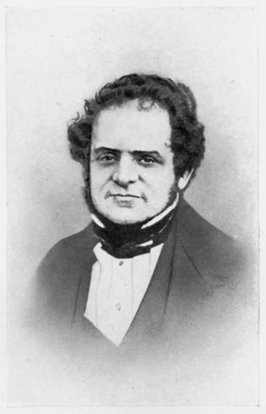
Early life

George Baxter was born on July 31, 1804 at Lewes in the southeastern English county of Sussex. This area is known to have been a center of the early English printing and papermaking industries.

George was the second son of John Baxter, the proprietor of a typography, printing and publishing establishment in Lewes. George’s father would gain in his lifetime a reputation as an advanced printer who was the first to test and perfect several early industrial innovations in printing press technology.

George attended Cliffe House Academy and went to high school at St. Ann’s in Lewes. After he finished school, he worked in a book shop in Brighton, a seaside town less than ten miles from home. Later, although the record is unclear, he apprenticed as a wood engraver and lithographer.

By the age of nineteen, George was focusing on the artistic elements of printing rather than the mechanical and he began making a name for himself as a gifted illustrator. By 1826, it is known that George Baxter was in Lewes at his father’s establishment identifying himself as a “wood-engraver.”

At age 23, George migrated to London and set up his own business as an engraver and printer. Six months after starting his enterprise in London, George married Mary Harrild, daughter of Robert Harrild, a printing industry innovator and business partner of John Baxter. The record shows that at this time George Baxter began his experiments with color printing.

Greatest works

Once he had demonstrated to himself—if not also to everyone in the printing business—that his patented process represented an important breakthrough, Baxter started on a path that would continue for the next thirty years. During the period of his first patent grant (1834-1849), Baxter had no competitors in England for the process that he advertised as “Pictorial Colour Printing for Book Illustration and Picture Printing.”

“The Pictorial Album, or Cabinet of Paintings for the Year 1837” included eleven color prints by George Baxter. Some consider this to be among his finest work.

At the end of 1836, Baxter produced a volume called The Pictorial Album, or Cabinet of Paintings that was published by Chapman and Hall. This project—which contained ten pictures including reproductions of several works of well-known artists of the day along with a frontispiece—was the first major publication of Baxter’s process. Some have said it was the high-water mark of his craft.

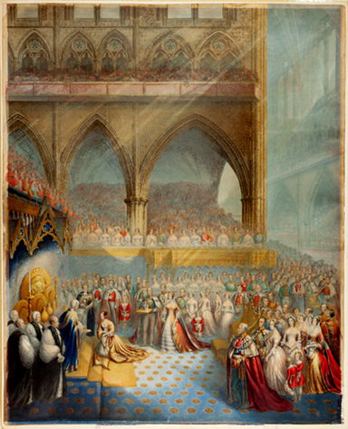
In 1841, Baxter printed two pictures called “Her Most Gracious Majesty Receiving the Sacrament at Her Coronation” and “The Arrival Her Most Gracious Majesty Queen Victoria at the House of Lords to Open her First Parliament” that include 200 portraits of identifiable guests at the event at Westminster Abbey in 1938. These oil-color prints—which are 21-3/4” by 17-1/2”—were prepared in cooperation with Buckingham Palace and gained Baxter direct access to the Queen and other royals in Britain and elsewhere in Europe.

Confident of the superiority of his methods, George Baxter was not shy about self-promotion as he gained a level of notoriety for his invention. However, as Baxter was continually preoccupied with the artistic and technical aspects of his business, he was never successful financially. In 1849, he petitioned the Privy Council and was granted a five-year extension on his patent on the grounds that he had lost money during the previous fourteen years.

Baxter’s print booth at the Great Exhibition

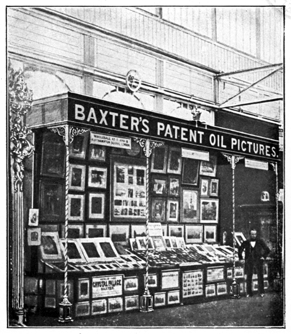
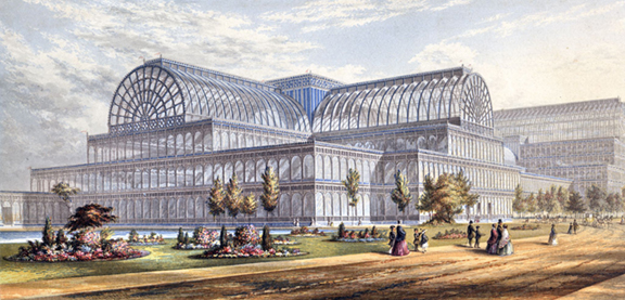
In 1851, Baxter prints were on display at The Great Exhibition (also called the Crystal Palace Exhibition) in London. Of his work, the official catalog of the expo said, “Mr. George Baxter, the patentee of the process of printing in oil colours, exhibits in the Fine Art Court, upwards of sixty specimens (from the largest size to the smallest miniature), of his choicest productions … The visitors will indeed be delighted with these charming specimens which form the principal attraction in the Fine Art Court.”

Baxter also exhibited prints at the international expos in New York City in 1852 and Paris in 1855. He was awarded medals for these entries. Later, Baxter produced a series of prints called “Gems of The Great Exhibition” which show the grandeur of his vision and the dexterity of his engraving skills.

Baxter’s series “Gems of the Great Exhibition” (1852) included this image of the exterior of the Crystal Palace in London.

Legacy

In later years, while still holding his patent, Baxter took to licensing his method to other printers as a means of generating income. Having obtained color printing patents in France, Belgium and Germany as well as Britain, Baxter sold annual licenses to a handful of printers in all of these countries. Some have said that the work of these printers never approached Baxter’s in graceful detail and delicate coloring.

Six years after his process went into the public domain, Baxter liquidated his oil-color printing business and sold off his inventory of prints and intaglio plates and woodblocks to another printer. Part of this arrangement included Baxter’s agreement to provide technical assistance to the new owner.

The reasons for his decision to exit the business are unknown. It is clear that by the 1860s other competing methods such as chromolithography (Engelmann, 1837) and photography (Daguerre, 1839) were challenging the Baxter method in both quality and cost. By 1865, the remainder of Baxter’s printing business went bankrupt.

In late 1866 George Baxter was struck in the head during an accident involving a horse-drawn omnibus. He died at his residence in Sydenham on January 11, 1867 and was buried at Christ Church, Forest Hill in London. A red granite obelisk above his grave bears the inscription “the sole inventor and patentee of oil-colour printing.”

Some believed that Baxter’s significance and contribution had been exaggerated by a cult of enthusiasm built up by clubs and associations organized to collect copies of his works. One such critic, R.M. Burch, wrote of Baxter in 1910, “Had he not been, rediscovered … his name and fame would in all probability have completely passed into the limbo of forgetfulness.”

However, George Baxter is remembered for the lasting impact of his original color printing method and for making color printing popular and viable. Like others before and after him, Baxter’s genius and creative gifts intersected with important changes in the means and methods of printing during his lifetime. It is undeniable that George Baxter played a decisive role in expanding the influence of print upon society during the Victorian era.

The pioneers of color printing

Red Apple Green Leaves Blue Sky

Color is a perception; it is the response of the human visual system to light reflected from objects in the world around us. We learn as children to associate these color perceptions with names: the red of an apple, the green of the leaves or the blue of the sky. More scientifically, color is the way our eyes, optic nerve and brain receive and process different wavelengths of the visible spectrum of electromagnetic radiation.

It took hundreds of years of thought and experiment—beginning with Isaac Newton’s 1672 idea that white light is the source of color sensation—to arrive at the modern understanding of color and the way we perceive it. In 1802, the visible spectrum of electromagnetic energy was defined by Thomas Young when he measured various wavelengths of light and established their relationship to color, i.e. red is about 650 nm, green is about 510 nm and blue is about 475 nm.

Visible Light as a Segment of Electromagic Waves
The visible portion of the electromagnetic spectrum represents all the colors of the rainbow

Later, Young and Hermann von Helmholtz developed the theory of trichromatic color vision. They surmised that the human eye has three types of photoreceptors, each with particular sensitivity to a corresponding range of light waves. In the 1950s it was proved—with advanced measuring equipment—that the three kinds of visual receptors (cones) have the capacity to sense many combinations of light wavelengths and see them as all the colors of the rainbow.

Knowledge of the properties of light and color was a major achievement of the scientific revolution (1500 to 1900) that—alongside the discovery of graphical perspective and other mathematical linear projections—transformed the visual arts. Artists and craftsmen that exclusively relied on their sensibility, talent and experience were able to integrate the principles of science into their works, bringing a degree of realism and accuracy that was previously impossible.

While the history of two-dimensional color representation is most often associated with fine art painting—the fresco, oil and tempera works of the Renaissance masters—the lesser known origins of color printing took a parallel development in time. Starting with the birth of mechanical metal type in Germany during the High Renaissance, a quest was begun to conquer the challenge of practical and high-quality color printing.

Relief color, Fust and Schoeffer (1457)

Page from the Mainz Psalter
A three-color page from the Mainz Psalter printed by Fust and Schoeffer in 1457

There is evidence that Johannes Gutenberg experimented with color during the printing of his famous 42-line Bible. For the most part, however, traditional hand-painted ornamental color lettering was used by Gutenberg alongside the black letter printing type he invented around 1450. Shortly thereafter, relief printing of color type and other ornamental figures was performed remarkably well by Gutenberg’s former collaborators on the printing of the Bible, Johann Fust and Peter Schoeffer.

In 1457, Fust and Schoeffer printed the Mainz Psalter with three colors—black, red and blue—all at one time. Their ingenious technique of compound printing involved interlocking metal type characters that were inked separately and reassembled for a single impression on the printing press. Although it returned extraordinary results, the process was very time consuming and expensive.

Intaglio color, Teyler ( 1680)

Johan Teyler intaglio color print

For most of the next two centuries, limited color printing was attempted as hand-colored pages remained the preferred method of pictorial representation. As various printing techniques spread across Europe, new approaches to color reproduction were tested. Some color illustrations were made using wood blocks.

By the mid-fifteenth century, intaglio engraving emerged as the standard method for printing images in black and white. Around 1680, a mathematician and engineer from Nijmegen, Holland named Johan Teyler developed a means of dabbing different colored inks into the wells of intaglio plates—originally intended for black-only printing—to make a full-color impression all at one time. Like Fust and Schoeffer’s work, Teyler’s color results were artistically beautiful but could not be developed into a viable commercial process.

Three-color mezzotint, Le Blon (1720)

Jacob Christoph Le Blon’s three-color mezzotint of 1722

Following the publication in 1704 of Isaac Newton’s discoveries regarding the physics of light and color—especially the idea that all colors are made of different combinations of red, blue and yellow (this was later proven to be imprecise for both light waves and pigments)—a few printers began working with techniques in three-color mezzotint printing. By this time, mezzotint copperplates were the favored image reproduction method because they rendered tones more easily than engraving.

In 1711, the Frankfurt-born painter Jacob Christoph Le Blon, basing himself directly upon Newton’s theory, mastered trichromatic mezzotint printing in his Amsterdam studio. Le Blon first tried and failed to commercialize his invention in Amsterdam, The Hague and Paris. He relocated in London in 1720, successfully obtained a royal patent from George I for his process and opened up a business selling printed color copies of oil paintings.

While his technical accomplishment was a significant step forward, Le Blon’s business lasted for three years before bankruptcy forced him back to Paris. Creating an appropriate balance of intensity between the primary color plates and maintaining tight registration between the three press impressions upon the paper was an exceedingly difficult and costly trial-and-error process.

Four-color mezzotint, L’Admiral and Gautier (1736)

Test printing of yellow and blue plates of the human skull by L’Admiral (1738) and the four-color mezzotint of the musculature of the head by Gautier (1745)

It is documented that J. C. Le Blon also invented four-color mezzotint printing by adding black to the red, yellow and blue plates on a few of his prints. However, the perfection RYBK (K is for the key color, black) model was made by others, especially following Le Blon’s death in 1741. Among those who contributed were the Dutch engraver and printer Jan L’Admiral and the French painter Jacques Gautier, who had both been assistants to Le Blon. L’Admiral and Gautier initially produced color plates of human anatomy for medical research publications in Paris in the 1730s and 1740s.

In France, Gautier proved to be something of a charlatan and attempted to take full credit for the invention of four-color printing. He started a periodical in 1752 called Observations on natural history, on physics and painting in which popular sensationalism appears to have been his primary objective. Gautier fabricated a full-color image of a “siren” with the body of a seahorse and a hideous head of a human and reproduced some images that bordered on pornography. Nonetheless, Gautier’s journal proved to be among the first financially successful uses of color printing; it was published quarterly for five years.

Chromolithography, Engelmann (1837)

Godefroy Engelmann 1838 chromolithograph copy and the original oil of Master Lambton

The invention of lithography by the Bavarian Alois Senefelder in 1796 brought a fundamentally new approach to printing. While relief letter press and intaglio mezzotint were mechanical printing processes, lithography relied upon the chemical antipathy of oil and water to transfer the image onto paper. The new method enabled artists to draw on the surface of limestone instead of the much more difficult etching or engraving of metal plates. In 1818, Senefelder experimented with lithographic color reproduction and pointed the way forward for others.

For the next two decades, lithographers from Germany, France and England made strides with color, for the most part printing decorative ornamentations or title pages of relief printed books. The chromolithography during this time was also a return to a multi-color approach of the seventeenth century as opposed to the later and more advanced three- or four-color mezzotint separation process.

Chromolithography came of age with the work of the French-German Godefroy Engelmann of Mulhouse. After becoming a pioneer and master in monochrome lithography, Engelmann made significant progress with four-color lithographs in 1837. He moved to Paris a year later and obtained a patent for his process. His works proved that chromolithography could effectively render lifelike prints of landscapes, flower and fruit arrangements and the most difficult human forms.

Toward modern color printing

The four-color chromolithography of the mid-nineteenth century finally brought color printing to an economically viable balance of quality, time and cost. However, full color printing was still largely a special process that was performed separately from letterpress black-only text print. With the rapid industrial expansion of book and newspaper publishing, color work remained essentially a very slow, craft-based process that required highly skilled artisans.

The production of relief, intaglio and lithographic “prints” and “plates” remained the convention for color work during the balance of the 1800s. These products were most often sold as single items—sometimes for as little a penny each—or bound into books as illustrations. It would require the development and maturity of three major advancements in the graphic arts to integrate printed color together with black text: color photography by Thomas Sutton (1861) and halftone reproduction by Frederic Ives (1881) and the CMYK ink model (1906).

Initially, some black and white halftones were enhanced with synthetically applied color. By the 1920s, improvements in mechanical color separation techniques and the growth of magazine publishing made it possible for some titles to afford full-color pictures and black text to be printed together on sheetfed letterpress systems. Some of these publications, such as National Geographic Magazine, continued with letterpress color all the way up to the late 1970s.

By the late 1950s, offset lithography and electronic color separations had begun their rise as the foremost method of reproducing high quality, inexpensive printed color images. Although the personal computer (IBM, 1981), digital camera (Fuji, 1987) and digital printing (Indigo, 1993) have brought color reproduction to new levels of high quality and low cost—especially for small quantities—the breakthroughs of seventy years ago remain by far the dominant methods of color reproduction today.