

In 1930 Stanley Morison wrote, “Typography is the efficient means to an essentially utilitarian and only accidentally aesthetic end, for the enjoyment of patterns is rarely the reader’s chief aim. Therefore, any disposition of printing material which, whatever the intention, has the effect of coming between the author and the reader is wrong.”
This is taken from Morison’s essay First Principles of Typography, which became in the decades that followed an industry manual of book typesetting standards, especially in America. By the 1930s, Stanley Morison had acquired a remarkable depth of knowledge and experience in printing. He understood better than most the importance of the “invisible” beauty and subordination of form to function in typography.
 Morison’s first principle still applies today: when it comes to typographic design and style—especially in books—easing the comprehension of the text is the primary objective. “Dullness and monotony” and “obedience to convention” are preferred over “eccentricity or pleasantry” and “typographical experiment.” A text is useless if it is hard to read because it is “different” or “jolly.”
One might conclude from the above that Stanley Morison was opposed to typographic innovation, but nothing is further from the truth. Within a year of writing his tribute to typographical tradition, Morison would develop and design—in collaboration with the graphic artist Victor Lardent—one of the most widely used typefaces in history: Times New Roman.
Stanley Arthur Morison was born May 6, 1889 in Wanstead in Essex between London and Epping Forest. As a child of seven or eight, the family moved to north London. Stanley lived at this location on Fairfax Road, Harringay until he was 23 years old.
Stanley was largely self-taught. He left school at age 14 to find work after his father—who was a traveling salesman—abandoned the family. His mother was strong-willed and inspired Stanley to serious and independent study. He was influenced by her to take up philosophy and a study of ancient manuscripts (palaeography), spending his spare time at King’s Library at the British Museum.

At age 23, while working unhappily as a bank clerk, Stanley read a supplement published by The Times that carried an ad about the start of a new magazine on printing called The Imprint. After the first issue appeared in January 1913, he applied for and was hired as an editorial assistant. This job would prove to be the beginning of the extraordinary graphic arts career of Stanley Morison.
During World War I, Morison was imprisoned for being a conscientious objector. Following the war, Stanley underwent a conversion to Catholicism and began a study of liturgical writings, hymnals and other early church publications. In 1919, he became design supervisor for Pelican Press and in 1921 published his first typographical study: “The Craft of Printing: Notes on the History of Type Forms.”
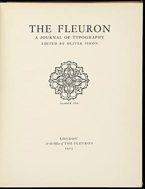
In 1922—along with Francis Meynell, Holbrook Jackson, Bernard Newdigate and Oliver Simon—Stanley became a founding member of the type-centric Fleuron Society (a fleuron is a typographer’s floral ornament). Seven volumes of their journal called The Fleuron appeared between 1923 and 1930. Each lavish edition contained papers, illustrations, specimens and essays by contemporary authorities on typography and book design.
The scholarly works contained in The Fleuron remain relevant today as the material spans all publishing forms (print and electronic) and technologies (conventional and digital). It was in this publication that Morison’s “First Principles of Typography” originally appeared.
In 1923 Stanley Morison became a typographic consultant for the Monotype Corporation. Monotype was a manufacturer of hot metal casting machines that industrialized and revolutionized in the 1880s—along with Linotype Corporation—the process of making type for print. While the Linotype machine cast complete lines of type primarily for newspaper publishing, the Monotype machine cast individual characters and was often used in book and other “fine” printing.
During the remainder of the 1920s, Morison became involved in Monotype’s program of old style type revival. Sparked by technological innovation, the first few decades of the twentieth century witnessed a typographic renaissance. At Monotype fonts such as Bodoni, Baskerville, Bembo, Centaur, Perpetua and others were reinterpreted and recut under Morison’s direction.
In 1929 Stanley Morison publicly criticized The Times for being poorly printed and typographically antiquated. Following discussions with the publisher, Morison was hired as a consultant and commissioned in 1931 to develop a new, easy-to-read typeface for the newspaper. His task was to design a font that was economical—capable of fitting more copy in a column than previous typefaces—as well as technically compatible with the printing machinery of the time.
Morison began his work with an authoritative historical survey called The typography of The Times that showed the evolution of its type. Morison presented to the publisher a folio with 42 full-size reproductions from the earliest days in the eighteenth century into the 1920s to make the case for his solution.

In “A Tally of Types” in 1953, Morison wrote that he “penciled the original set of drawings, and handed them to Victor Lardent, a draughtsman in the publicity department of Printing House Square,” who Stanley “considered capable of producing an unusually firm and lean line.” The drawings were then used by Monotype to cut the punches for the first set of Times New Roman types. The first issue of The Times to use the new typeface appeared on October 3, 1932.
As a historian, Morison was appreciative of the accomplishments of others before him that made his work possible. In summing up the experience with the typography of The Times, Morison explained, “Above 14,750 punches, including those corrected (a large number), were cut by Monotype Corporation for the installation at Printing House Square. … Their cutting was a triumph for the mechanism invented by Linn Boyd Benton of Milwaukee. In 1885 he adapted the pantograph principle to the mechanical cutting of the punches used for striking the matrices from which the type is cast. This invention lies at the basis of all mechanical composition, which requires at some stage the pouring of metal into a single matrix or line of matrices.”
Following the achievement of Times New Roman, Stanley Morison continued his design consulting work with Monotype and The Times for three decades. He became editor of the History of the Times from 1935 to 1952 and he was also editor of The Times Literary Supplement between 1945 and 1948. He spent his later years on typographical research. Although he was offered a knighthood in 1953 and the CBE in 1962, he declined both. He was elected a Royal Designer for Industry in 1960. He died on October 11, 1967 at the age of 78.
It is difficult to appropriately summarize the work of a figure such as Stanley Morison in this small space. Although his writings have never been brought together into a single collection or set of volumes, Morison was a prolific scholar and practitioner of the graphic arts. He was perhaps the most important theoretician, designer and historian of print in the twentieth century.
Postscript
In 1994, printing historian Mike Parker published findings that showed Times New Roman was based upon a design originally made by William Starling Burgess in 1904. A complete review of Parker’s story can be found in an article titled “The history of the Times New Roman typeface” on the FT Magazine web site (http://on.ft.com/M7kYD3). Although still controversial, The Times began in 2007 accepting the possibility of an alternative history to the one provided by Morison about the origin of the famous font. According The Times web site, Times New Roman was designed by Morison, Lardent “and possibly Starling Burgess.” In 2009, Mike Parker worked with The Font Bureau, Inc. and published a font series called Starling based upon Burgess’s original conception.

2 thoughts on “Stanley Morison: 1889 – 1967”