Hermann Zapf (1918–2015): Digital typography

Hermann Zapf: November 8, 1918 – June 4, 2015

On Friday, June 12, Apple released its San Francisco system font for OSX, iOS and watchOS. Largely overlooked amid the media coverage of other Apple product announcements, the introduction of San Francisco was a noteworthy technical event.

San Francisco is a neo-grotesk, sans serif and Pan European typeface with characters in Latin as well as Cyrillic and Greek scripts. It is significant because it is the first font to be designed specifically for all of Apple’s display technologies. Important variations have been introduced into San Francisco to optimize its readability on Apple desktop, notebook, TV, mobile and watch devices.

It is also the first font designed by Apple in two decades. San Francisco extends Apple’s association with typographic innovation that began in the mid-1980s with desktop publishing. From a broader historical perspective, Apple’s new font confirms of the ideas developed more than fifty years ago by renowned calligrapher and type designer Hermann Zapf. Sadly, Zapf died at the age of 96 on June 4, 2015 just one week before Apple’s San Francisco announcement.

Hermann Zapf’s contributions to typography are extensive and astonishing. He designed more than 200 typefaces—the popular Palatino (1948), Optima (1952), Zapf Dingbats (1978) and Zapf Chancery (1979) among them—including fonts in Arabic, Pan-Nigerian, Sequoia and Cherokee. Meanwhile, Zapf’s exceptional calligraphic skills were such that he famously penned the Preamble of the Charter of the United Nations in four languages for the New York Pierpont Morgan Library in 1960.

Preamble of the charter of The United Nations
Zapf’s calligraphic skills were called upon for the republication of the Preamble of the UN Charter in 1960 for the Pierpont Morgan Library in New York City.

While he made many extraordinary creative accomplishments—far too many to list here—Hermann Zapf’s greatest legacy is the way he thought about type and its relationship to technology as a whole. Herman Zapf was among the first and perhaps the most important typographers to theorize about the need for new forms of type driven by computer and digital technologies.

Early life

Hermann Zapf was born in Nuremburg on November 8, 1918 during the turbulent times at the end of World War I. As he wrote later in life, “On the day I was born, a workers’ and soldiers’ council took political control of the city. Munich and Berlin were rocked by revolution. The war ended, and the Republic was declared in Berlin on 9 November 1918. The next day Kaiser Wilhelm fled to Holland.”

At school, Hermann took an interest in technical subjects. He spent time in the library reading scientific journals and at home, along with his older brother, experimenting with electronics. He also tried hand lettering and created his own alphabets.

Hermann left school in 1933 with the intention of becoming an engineer. However, economic crisis and upheaval in Germany—including the temporary political detention of his father in March 1933 at the prison camp in Dachau—prevented him from pursuing his plans.

Apprentice years

Barred from attending the Ohm Technical Institute in Nuremberg for political reasons, Hermann sought an apprenticeship in lithography. He was hired in February 1934 to a four-year apprenticeship as a photo retoucher by Karl Ulrich and Company.

In 1935, after reading books by Rudolf Koch and Edward Johnson on lettering and illuminating techniques, Hermann taught himself calligraphy. When management saw the quality of Hermann’s lettering, the Ulrich firm began to assign him work outside of his retouching apprenticeship.

Hermann refused to take the test at his father’s insistence on the grounds that the training had been interrupted by many unrelated tasks. He never received his journeyman’s certificate and left Nuremburg for Frankfurt to find work.

Zapf’s Gilgengart designed originally in 1938

Zapf started his career in type design at the age of 20 after he was employed at the Fürsteneck Workshop House, a printing establishment run by Paul Koch, the son of Rudolf Koch. As he later explained, “It was through the print historian Gustav Mori that I first came into contact with the D. Stempel AG type foundry and Linotype GmbH in Frankfurt. It was for them that I designed my first printed type in 1938, a fraktur type called ‘Gilgengart’.”

War years

Hermann Zapf was conscripted in 1939 and called up to serve in the German army near the town of Pirmasens on the French border. After a few weeks, he developed heart trouble and was transferred from the hard labor of shovel work to the writing room where he composed camp reports and certificates.

When World War II started, Hermann was dismissed for health reasons. In April 1942 he was called up again, this time for the artillery. Hermann was quickly reassigned to the cartographic unit where he became well-known for his exceptional map drawing skills. He was the youngest cartographer in the German army through the end of the war.

An example of calligraphy from the sketchbook that Hermann Zapf kept during World War II.

Zapf was captured after the war by the French and held in a field hospital in Tübingen. As he recounted, “I was treated very well and they even let me keep my drawing instruments. They had a great deal of respect for me as an ‘artiste’ … Since I was in very poor health, the French sent me home just four weeks after the end of the war. I first went back to my parents in my home town of Nuremberg, which had suffered terrible damage.”

Post-war years

In the years following the war, Hermann taught and gave lessons in calligraphy in Nuremberg. In 1947, he returned to Frankfurt and took a position with the Stempel AG foundry with little qualification other than his sketch books from the war years.

From 1948 to 1950, while he worked at Stempel on typography designs for metal punch cutting, he developed a specialization in book design. Hermann also continued to teach calligraphy twice a week at the Arts and Crafts School in Offenbach.

Zapf’s Palatino (1948) and Optima (1952) fonts

It was during these years, that Zapf designed Palatino and Optima. Working closely with the punch cutter August Rosenberg, Hermann design Palatino and named it after the 16th century Italian master of calligraphy Giambattista Palatino. In the Palatino face, Zapf attempted to emulate the forms of the great humanist typographers of the Renaissance.

Optima, on the other hand, expressed more directly the genius of Zapf’s vision and foreshadowed his later contributions. Optima can be described as a hybrid serif-and-sans serif typeface because it blends features of both: serif-less thick and thin strokes with subtle swelling at the terminals that suggest serifs. Zapf designed Optima during a visit to Italy in 1950 when he examined inscriptions at the Basilica di Santa Croce in Florence. It is remarkably modern, yet clearly derived from the Roman monumental capital model.

By the time Optima was released commercially by Stempel AG in 1958, the industry had begun to move away from metal casting methods and into phototypesetting. As many of his most successful fonts were reworked for the new methods, Zapf recognized—perhaps before and more profoundly than most—that phototypesetting was a transitional technology on the path from analog to an entirely new digital typography.

Digital typography

To grasp the significance of Zapf’s work, it is important to understand that, although “cold” photo type was an advance over “hot” metal type, both are analog technologies, i.e. they require the transfer of “master” shapes from manually engraved punches or hand drawn outlines to final production type by way of molds or photomechanical processes.

Due to the inherent limitations of metal and photomechanical media, analog type masters often contain design compromises. Additionally, the reproduction from one master generation to the next has variations and inconsistencies connected with the craftsmanship of punch cutting or outline drawing.

With digital type, the character shapes exist as electronic files that “describe” fonts in mathematical vector outlines or in raster images plotted on an XY coordinate grid. With computer font data, typefaces have many nuances and features that could never be rendered in metal or photo type. Meanwhile, digital font masters can be copied precisely without any quality degradation from one generation to the next.

Hermann Zapf in 1960

From the earliest days of computers, Hermann Zapf began advocating for the advancement of digital typography. He argued that type designers needed to take advantage of the possibilities opened up by the new technologies and needed to create types that reflected the age. Zapf also combined knowledge of the rules of good type design with a recognition that fonts needed to be created specifically for electronic displays (at that time CRT-based monitors and televisions).

In 1959, at the age of 41, Zapf wrote in an industry journal, “It is necessary to combine the purpose, the simplicity and the beauty of the types, created as an expression of contemporary industrial society, into one harmonious whole. We should not seek this expression in imitations of the Middle Ages or in revivals of nineteenth century material., as sometimes seems the trend; the question for us is satisfying tomorrow’s requirements and creating types that are a real expression of our time but also represent a logical continuation of the typographic tradition of the western world.”

Warm reception in the US

 Despite a very cold response in Germany—his ideas about computerized type were rejected as “unrealistic” by the Technical University in Darmstadt where he was a lecturer and by leading printing industry representatives—Hermann persevered. Beginning in the early 1960s, Zapf delivered a series of lectures in the US that were met with enthusiasm.

For example, a talk he delivered at Harvard University in October 1964 became so popular that it led to an offer for a professorship at the University of Texas in Austin. The governor even also made Hermann an “Honorary Citizen of the State of Texas.” In the end, Zapf turned down the opportunity due to family obligations in Germany.

Among his many digital accomplishments are the following:

  • Rudolf Hell
    Rudolf Hell

    When digital typography was born in 1964 with the Digiset system of Rudolf Hell, Hermann Zapf was involved. By the early 1970s, Zapf created some of the first fonts designed specifically for any digital system: Marconi, Edison, and Aurelia.

  • In 1976, Hermann was asked to head a professorship in typographic computer programming at Rochester Institute of Technology (RIT) in Rochester, New York, the first of its kind in the world. Zapf taught at RIT for ten years and was able to develop his conceptions in collaboration with computer scientists and representatives of IBM and Xerox.
  • With Aaron Burns
    With Aaron Burns

    In 1977, Zapf partnered with graphic designers Herb Lubalin and Aaron Burns and founded Design Processing International, Inc. (DPI) in New York City. The firm developed software with menu-driven typesetting features that could be used by non-professionals. The DPI software was focused on automating hyphenation and justification as opposed to the style of type design.

  • In 1979, Hermann began a collaboration with Professor Donald Knuth of Stanford University to develop a font that was adaptable for mathematical formulae and symbols.
  • With Peter Karnow
    With Peter Karnow

    In the 1990s, Hermann Zapf continued to focus on the development of professional typesetting algorithms with his “hz -program” in collaboration with Peter Karow of the font company URW. Eventually the Zapf composition engine was incorporated by Adobe Systems into the InDesign desktop publishing software.

Zapf’s legacy

Hermann Zapf actively participated—into his 70s and 80s—in some of the most important developments in type technology of the past fifty years. This was no accident. He possessed both a deep knowledge of the techniques and forms of type history and a unique appreciation for the impact of information technologies on the creation and consumption of the written word.

In 1971, Zapf gave a lecture in Stockholm called “The Electronic Screen and the Book” where he said, “The problem of legibility is as old as the alphabet, for the identification of a letterform is the basis of its practical use. … To produce a clear, readable text that is pleasing to the eye and well arranged has been the primary goal of typography in all the past centuries. With a text made visible on a CRT screen, new factors for legibility are created.”

More than 40 years before the Apple design team set out to create a font that is legible on multiple computer screens, the typography visionary Hermann Zapf was theorizing about the very same questions.

AI and the future of information

Amazon Echo intelligent home assistant

Last November, Amazon revealed its intelligent home assistant called Echo. The black cylinder-shaped device is always on and ready for your voice commands. It can play music, read audio books and it is connected to Alexa, Amazon’s cloud-based information service. Alexa can answer any number of questions regarding the weather, news, sports scores, traffic reports and your schedule in a human-like voice.

Echo has an array of seven microphones and it can hear—and also learn—your voice, speech pattern and vocabulary even from across the room. With additional plugins, Echo can control your automated home devices like lights, thermostat, kitchen appliances, security system and more with just the sound of your voice. This is certainly a major leap from “Clap on, Clap off” (watch “The Clapper” video from the mid-1980s here: https://www.youtube.com/watch?v=Ny8-G8EoWOw).

As many critics have pointed out, the Echo is Amazon’s response to Siri, Apple’s voice-activate intelligent personal assistant and knowledge navigator. Siri was launched as an integrated feature of the iPhone 4S in October 2011 and the iPad released in May 2012. Siri is also now part of the Apple Watch, a wearable device, that adds haptics—tactile feedback—and voice recognition along with a digital crown control knob to the human computer interface (HCI).

If you have tried to use any of these technologies, you know that they are far from perfect. As the New York Times reviewer, Farhad Manjoo explained, “If Alexa were a human assistant, you’d fire her, if not have her committed.” Often times, using any of the modern artificial intelligence (AI) systems can be an exercise in futility. However, it is important to recognize that computer interaction has come a long way since the transition from mainframe consoles and command line interfaces were replaced by the graphical, point and click interaction of the desktop.

What is artificial intelligence?

The pioneers of artificial intelligence theory: Alan Turing, John McCarthy, Marvin Minsky and Ray Kurzweil

Artificial intelligence is the simulation of the functions of the human brain—such as visual perception, speech recognition, decision-making, and translation between languages—by man-made machines, especially computers. The field was started by the noted computer scientist Alan Turing shortly after WWII and the term was coined in 1956 by John McCarthy, a cognitive and computer scientist and Stanford University professor. McCarthy developed one of the first programming languages called LISP in the late 1950s and is recognized for having been an early proponent of the idea that computer services should be provided as a utility.

McCarthy worked with Marvin Minsky at MIT in the late 1950s and early 1960s and together they founded what has become known as the MIT Computer Science and Artificial Intelligence Laboratory. Minsky, a leading AI theorist and cognitive scientist, put forward a range of ideas and theories to explain how language, memory, learning and consciousness work.

The core of Minsky’s theory—what he called the society of mind—is that human intelligence is a vast complex of very simple processes that can be individually replicated by computers. In his 1986 book The Society of Mind Minsky wrote, “What magical trick makes us intelligent? The trick is that there is no trick. The power of intelligence stems from our vast diversity, not from any single, perfect principle.”

The theory, science and technology of artificial intelligence have been advancing rapidly with the development of microprocessors and the personal computer. These advancements have also been aided by the growth in understanding of the functions of the human brain. The field of neuroscience has vastly expanded in recent decades our knowledge of the parts of the brain, especially the neocortex and its role in the transition from sensory perceptions to thought and reasoning.

Ray Kurzweil has been a leading theoretician of AI since the 1980s and has pioneered the development of devices for text-to-speech, speech recognition, optical character recognition and music synthesizers (Kurzweil K250). He sees the development of AI as a necessary outcome of computer technology and has written widely—The Age of Intelligent Machines (1990), The Age of Spiritual Machines (1999), The Singularity is Near (2005) and How to Create a Mind (2012)—that this is a natural extension of the biological capacities of the human mind.

Kurzweil, who corresponded as a New York City high school student with Marvin Minksy, has postulated that artificial intelligence can solve many of society’s problems. Kurzweil believes—based on the exponential growth rate of computing power, processor speed and memory capacity—that humanity is rapidly approaching a “singularity” in which machine intelligence will be infinitely more powerful than all human intelligence combined. He predicts that this transformation will occur in 2029; a moment in time when developments in computer technology, genetics, nanotechnology, robotics and artificial intelligence will transform the minds and bodies of humans in ways that cannot currently be comprehended.

Some fear that the ideas of Kurzweil and his fellow adherents of transhumanism represent an existential threat to society and mankind. These opponents—among them the physicist Stephen Hawking and the pioneer of electric cars and private spaceflight Elon Musk—argue that artificial intelligence will become the biggest “blow back” in history such as depicted in Kubrick’s film 2001: A Space Odyssey.

While much of this discussion remains speculative, anyone who watched in 2011 as the IBM supercomputer Watson defeated two very successful Jeopardy! champions (Ken Jennings and Brad Rutter) knows that AI has already advanced a long way. Unlike the human contestants, Watson was able to commit 200 million pages of structured and unstructured content, including the full text of Wikipedia, into four terabytes of its memory.

Media and interface obsolescence

Today, the advantages of artificial intelligence are available to great numbers of people in the form of personal assistants like Echo and Siri. Even with their limitations, these tools allow instant access to information almost anywhere and anytime with a series of simple voice commands. When combined with mobile, wearable and cloud computing, AI is making all previous forms of information access and retrieval—analog and digital alike—obsolete.

There was a time not that long ago when gathering important information required a trip—with pen and paper in hand—to the library or to the family encyclopedia in the den, living room or study. Can you think of the last time you picked up a printed dictionary? The last complete edition of the Oxford English Dictionary—all 20 volumes—was printed in 1989. Anyone born after 1993 is likely to have never seen an encyclopedia (the last edition of the Encyclopedia Britannica was printed in 2010). Further still, GPS technologies have driven most printed maps into bottom drawers and the library archives.

Instant messaging vs email communications
Among teenagers, instant messaging has overtaken email as the primary form of electronic communications

But that is not all.  The technology convergence embodied in artificial intelligence is making even more recent information and communication media forms relics of the past. Optical discs have all but disappeared from computers and the TV viewing experience as cloud storage and time-shifted streaming video have become dominant. Social media (especially photo apps) and instant messaging have also made email a legacy form of communication for an entire generation of young people.

Meanwhile, the advance of the touch/gesture interface is rapidly replacing the mouse and, with improvements in speech-to-text technology, is it not easy to visualize the disappearance of the QWERTY keyboard (a relic from the mechanical limitations of the 19th century typewriter)? Even the desktop computer display is in for replacement by cameras and projectors that can make any surface an interactive workspace.

In his epilogue to How to Create a Mind, Ray Kurzweil writes, “I already consider the devices I use and the cloud computing resources to which they are virtually connected as extensions of myself, and feel less than complete if I am cut off from these brain extenders.” While some degree of skepticism is justified toward Kurzweil’s transhumanist theories as a form of technological utopianism, there is no question that artificial intelligence is a reality and that it will be with us—increasingly integrated into us and as an extension of us—for now and evermore.

Steve Jobs (1955 – 2011): Fonts and desktop publishing

Steven P. Jobs’ role in creating the first personal computer (along with his neighborhood friend Steve Wozniak), the founding of Apple Computer and his subsequent firing and return to the company have become part of tech industry lore. His later contributions to mobile, wireless and touch computing—embodied in the Apple iPod, iPhone and iPad—were no less transformative.

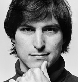
Steven P.  Jobs in 1984
Steven P. Jobs in 1984

Although Steve Jobs had extensive knowledge of computer hardware, operating systems and applications—he even worked for a short time in the early 1970s as a technician for Atari—his greatest skills were as technology visionary, marketer and salesman. Without the entrepreneurial drive, leadership charisma and design esthetic of Steve Jobs, Apple would never have emerged as the world’s largest publicly traded corporation; nor would it have the most loyal customers in the history of the consumer products industries.

Owing a great deal to the location and times of his upbringing, Steve Jobs expressed a broad cultural viewpoint and considered every project and product as an aspect of a larger creative purpose. Having developed an enthusiasm for the Bauhaus movement’s form and function philosophy, he identified design simplicity with products that were both beautiful and easy to use.

In his 2012 biography, Walter Isaacson quotes Steve Jobs from the early 1980s, “So that’s our approach. Very simple, and we’re really shooting for Museum of Modern Art quality. The way we’re running the company, the product design, the advertising, it all comes down to this: Let’s make it simple. Really simple.” Jobs rejected the boxy, bulky and dark industrial style of the earlier generation of computer design in favor of elegance and what he later called “taste.”

It was out of this unique blending of art with science and business that Steve Jobs made two significant contributions to typography and printing technology: the creation of computer fonts and the launching of desktop publishing. As with every innovation associated with his name, Jobs relied on the skills of others to realize his vision and then packaged and presented the accomplishments with great fanfare to investors and consumers alike.

Computer Fonts

Jobs’ esthetic sensibility had been formed a decade earlier while he was briefly a student at Reed College in Portland, Oregon in 1972. After dropping out of school, he enrolled in a calligraphy course at Reed taught by Father Robert Palladino. The course had a lasting impact on him.

As Jobs explained in a commencement address he delivered to Stanford University in 2005: “Reed College at that time offered perhaps the best calligraphy instruction in the country. … I learned about serif and san serif typefaces, about varying the amount of space between different letter combinations, about what makes great typography great. It was beautiful, historical, artistically subtle in a way that science can’t capture, and I found it fascinating.”

“None of this had even a hope of any practical application in my life. But ten years later, when we were designing the first Macintosh computer, it all came back to me. And we designed it all into the Mac. It was the first computer with beautiful typography.”

While working with the Macintosh design team, Jobs was involved in every detail of its size, shape and color as well as every icon, window and box of the graphical user interface. This involvement included the design of a group of fonts which he insisted be named for the great cities of the world: Cairo, Chicago, Geneva, London, Los Angeles, Monaco (monospaced system font), New York, San Francisco, Toronto and Venice.

Apple Macintosh font and desktop icon designer Susan Kare, developer Andy Hertzfeld and engineer Bill Atkinson

Prior to the work of Macintosh designer Susan Kare, developer Andy Hertzfeld and engineer Bill Atkinson on proportional fonts, computers were mostly limited to monospaced typefaces much like a typewriter with al alphanumeric characters and keystrokes the exact same width. Jobs could see that the bitmapped display of the Macintosh desktop was capable of rendering typefaces with a sophistication equal to that of letterpress hot metal type and cold phototypesetting.

Others at Apple Computer, due to their limited perspective on the utility of the personal computer, could not relate to Steve Jobs’ insistence on the font library; they considered it a distracting personal obsession. In his biography of Jobs, Walter Isaacson quotes Apple investor and partner Mark Markkula: “I kept saying, ‘Fonts?!? Don’t we have more important things to do?’ ”

The original Macintosh font library

When Steve Jobs launched the Macintosh on January 24, 1984 at the Flint Center in Cupertino, the font library was a critical part of the presentation of “the computer for the rest of us.” It was the first desktop system to offer not only the 9 city-named fonts listed above but also style choices—Plain, Bold, Italic, Bold Italic, Underline, Outline, Shadowed—for each.

While initially appearing somewhat primitive, bitmapped and lacking the finesse of professional typography, Jobs’ on-screen fonts were the beginning of a revolution in type technology. Firstly, fonts became something that everyone with a computer could use, not just professional graphic designers and printing specialists.

Secondly, the Macintosh font library encouraged professionals to push the limits of computer-generated typography and eventually transformed the field of typesetting altogether. Soon desktop fonts surpassed the quality and versatility of all previous type technologies and offered WYSIWYG (What You See Is What You Get) output; i.e. the image displayed on the computer screen is precisely what is printed onto a sheet of paper or other final output media.

Desktop Publishing

Steve Jobs understood the promise of WYSIWYG long before the phrase was widely used in the printing and publishing industries. Nearly one year to the day after unveiling the Macintosh, Jobs was back on stage in Cupertino at the annual Apple stockholders meeting on January 23, 1985 to launch the Apple LaserWriter and demonstrate the first ever desktop publishing system.

Desktop publishing signifies an integrated publishing system whereby pages containing both text and graphics are designed in layout software on a desktop computer and printed in individual or multiple copies on a desktop printer. Building on the accomplishments of the Macintosh, Steve Jobs worked throughout 1984 with partner companies and publishing industry experts to integrate the Apple Macintosh computer with other basic elements of desktop publishing: the Apple LaserWriter, Adobe PostScript and Aldus PageMaker.

The Apple LaserWriter, Apple project manager Bruce Blumberg and laser printer invertor Gary Starkweather
The Apple LaserWriter, Apple project manager Bruce Blumberg and laser printer invertor Gary Starkweather 

Apple LaserWriter: Gary Starkweather invented the core toner imaging technology of the laser printer at Xerox PARC in the early 1970s. Although Xerox never brought a desktop laser printer to market, HP and Canon developed systems independently of each other in the 1970s. The HP LaserJet, based on the Canon LBP-CX printing engine, was the first desktop laser printer and was released in 1984. The Apple LaserWriter, developed by a team led by project manager Bruce Blumberg, had two important differences with the HP device: it was networked (with AppleTalk) and could be shared and contained breakthrough PostScript software that enabled true WYSIWYG capability. The Apple LaserWriter was available for purchase in March 1985 and sold for $6,995.

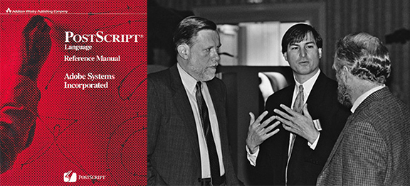
PostScript Language Reference Manual. Steve Jobs talking with Chuck Geschke (left) and John Warnock of Adobe in January 1985.

Adobe Postscript: The software at the heart of the Apple LaserWriter was Adobe’s PostScript page description language. John Warnock and Chuck Geschke, who also came from Xerox PARC, founded Adobe Systems in 1982 with PostScript as their flagship product. Warnock and Geschke developed a state-of-the-art device independent print programming language that: 1.) captured all the elements—text, graphics, geometry, etc. —on the page of the desktop layout software during the “Print” function; 2.) interpreted the layout data as vector-based objects within the memory of the printer and; 3.) converted the PostScript objects into raster print data such that the page could to rendered onto a sheet of paper at a resolution of 300 dots per inch. The Adobe founders also signed a licensing agreement with Linotype that made 13 professional typefaces (four styles for each of the Helvetica, Times Roman and Courier families and a Symbol font) “resident” within the PostScript raster image processor (RIP) in the Apple LaserWriter.

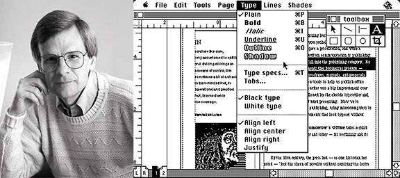
Paul Brainerd and an early version of Aldus PageMaker on the Macintosh
Paul Brainerd and an early version of Aldus PageMaker on the Macintosh 

Aldus PageMaker: Paul Brainerd—the man who coined the phrase “desktop publishing”—founded Aldus Corporation in February 1984 in Seattle, WA. With a background in computerized newspaper publishing systems, Brainerd and a group of developers began working on layout software initially for newspapers. After getting some early peeks at the Apple Macintosh, Adobe PostScript and Apple LaserWriter, the Aldus team developed PageMaker as the first application capable of placing columns of text and images onto a virtual page and used a floating tool palette. The first commercially available version of PageMaker was released in July 1985 and sold for $495.

John W. Seybold
John W. Seybold

An important advisor to Steve Jobs throughout the process was John Seybold, a pioneer in computerized publishing systems and industry consultant. According to Paul Brainerd, “There were a couple of people that really were the glue that made all of this come together, and the most important was Jonathan Seybold. He was consulting to both Adobe and Apple. He and I knew each other for a long time going back … he told me some time during ’84, probably in the first quarter, that there was some confidential information that I needed to know. He got clearance from his clients to be able to share it with me.”

In an account published by Adobe in 2004, Jonathan Seybold reviewed the significance of the events that unfolded during the summer of 1984, “Steve wanted to see me urgently. He said they had a deal with Adobe, they were signing a deal with Linotype, they had real fonts. I went to Cupertino and walked into this tiny room, and there stood Jobs and Warnock with a Mac and a LaserWriter. He showed me what they were up to. I turned to Steve and said, ‘You’ve just turned publishing on its head. This is the watershed event.’ ”

Although they are less celebrated, Steve Jobs’ introduction of the Apple Macintosh font library and his pivotal role in launching the desktop publishing revolution in 1984-85 were watershed developments because they made designing and publishing accessible to anyone with a desktop computer and printer. The lasting impact of Jobs’ breakthrough continues to be felt today in the explosion of online and social media publishing by billions of people across the globe. Jobs’ death from cancer at age 56 on October 5, 2011 prematurely ended the life of one of the most important and unique figures of our times.