During the twentieth century, printing technology made a major transition from mechanical and photomechanical to analog electronic and digital systems. The process took decades and by the 1990s all the technology of graphic arts production was impacted: design, text and image acquisition, typesetting, prepress, printing, binding and finishing. The result of this innovation was a dramatic improvement in the speed, quality, variety and complexity of printed material.
It is remarkable how the pace of electronic advancement—beginning with Marconi’s December 1901 wireless trans-Atlantic radio broadcast—accelerated throughout the century and influenced every industry and occupation. There were many important theoreticians, scientists and engineers that participated in this progression. A few of the most familiar names from the early 1900s are Planck (quantum theory,) Fleming (diode) and Einstein (relativity).
Rudolf Hell, whose life spanned the entire twentieth century, was an outstanding representative of the generation of engineers who participated in the electronics revolution. Particularly after World War II, Hell was responsible for many critical inventions related to the image reproduction aspects of printing. The truth is that Rudolf Hell is such an important figure and his inventions are so numerous—he is credited with more than 130 patents—that it is only possible to focus here on the most significant of his achievements.
Early years
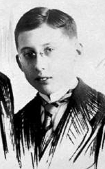
Rudolf Hell was born on December 19, 1901 in Eggmühl, Germany, about 70 miles northeast of Munich. Rudolf’s father Karl Hell was the train stationmaster for the Royal Bavarian Railway at Eggmühl. The family lived in the romantic style station building and it was here that Rudolf had early exposure to the telegraph.
Rudolf’s mother was the daughter of a brewery owner and he would later describe her as “vivacious.” It seems that Rudolf inherited his entrepreneurialism from his mother since his father was very much “a proper official” and “quite relaxed and Bavarian in character.” When Rudolf was six years old, his father relocated the family to the town of Eger—now a border town in the Czech Republic—to become the stationmaster of an Austro-Hungarian freight station, an important transfer point to the Saxon and Bohemian railway lines. Rudolf attended school for twelve years in Eger.
While in high school at the Rudolphinum Oberrealschule, Hell earned high marks in math and science. He would later explain, “I was always the best in physics, and in mathematics too. I was mediocre in languages, and poor in the subjects that required me to study a lot.” Just before age eighteen, Rudolf enrolled in the Technical University at Munich (THM) to study electrical engineering.
In 1923, he received a masters degree from THM in electrical engineering at the age of 22. He then became Assistant to Professor Max Dieckmann, a specialist in wireless telegraphy at the university. While continuing his studies, Hell worked with Dieckmann on innovations in radio direction finding and television technology.
Germany is home to the invention of the CRT (cathode ray tube) and the oscilloscope by Karl Ferdinand Braun in 1897. This device is the foundation of the first functioning television systems that were invented more or less simultaneously by Takayanagi (Japan), Farnsworth (US) and Zworykin (USSR and US) in the mid-1920s. For many people, the idea of transmitting moving pictures through a wireless medium was a fantasy. Such was the case with Dieckmann’s superiors at THM who forced the professor to rename his course in “wireless television” to something less provocative.

This did not stop Rudolf Hell. In 1925, he filed a patent along with Dieckmann for a photoelectric scanning tube that was basically a primitive television camera. The concept behind this device—the “image dissector tube”—was that images or scenes could be broken up into small picture elements and transmitted to a receiver for viewing. In that same year, Hell and Dieckmann presented a complete radio-based television system at the Transport Exposition in Munich that included a reception station.
Rudolf Hell’s “image dissection,” transmission and reassembly of picture elements (pixels) is at the heart of his remarkable career. To understand the significance of the accomplishment, it is useful to put it into a modern day perspective. In 1925, Hell’s “image dissector tube” was understood by a handful of engineers and physicists; today, the concept and its practical application are familiar to billions of people all over the world in the form of “megapixel” cameras in their mobile phones.
In 1927, Hell received a Ph.D. for his dissertation on “direct-indicating radio direction finder for aviation.” Far ahead of its time, this system enabled pilots to navigate their flights in poor visibility conditions by homing in on a radio beacon. While initially ridiculed by “experts” because “no one flies in the fog anyway and when the weather is clear you don’t need it,” Hell’s invention became the technical basis of all automatic guidance systems and aircraft autopilot technologies. Rudolf Hell received the present-day equivalent of $750,000 from firms in Germany and the US for the license to use his invention in their aviation equipment.
Hell-Schreiber (precursor to the fax)
The young Rudolf had always said he did not want to remain in academia as an “ivory tower scientist.” He ended his time as Assistant to Max Dieckmann, took the money he had earned and founded his own business called Dr.-Ing. Rudolph Hell Company in May 1929 in Neubabelsberg near Berlin. It was here that Hell began work on a project that would bring him significant worldwide recognition.

On his 1929 patent application, Hell called his new invention a “device for electrically transmitting written characters” and it was later renamed the Hell-Schreiber. The device—in which originals were broken into dots and electronically transmitted, received and reassembled—later became the basis of the fax machine. Rudolf sold the patent for his invention to Siemens for the equivalent of $500,000 and he used the money to invest in his business.
At 28-years-old and married, Hell hired about a dozen employees to work in his company machine shop, design office, laboratory and business office located in a house that he bought in Berlin-Dahlem. In 1931, Hell expanded the production operations of his company to accommodate the growth and influence of the Hell-Schreiber. By 1934 the device was being used by news agencies across the globe including the major German agencies, Reuters and TASS.
When World War II started, news organizations and governments alike used the Hell-Schreiber because it was not susceptible to transmission disturbances that were frequent during wartime. By the end of the war, Hell had sold more than 50,000 units and expanded the offerings of his company to include radio position-finding equipment, radio compasses and encryption devices.
As a businessman who refused to leave Germany during the war, Rudolf Hell chose to maintain his company and its two factories and 1,000 employees throughout the conflict. In the end, the bombing of Berlin between 1940 and 1945 resulted in the partial destruction of the Hell manufacturing facilities and the business was lost.
Post-war printing technologies
Rudolf Hell declined an offer to relocate his enterprise in Britain after the war and instead elected rebuild in the city of Kiel in the north of Germany. Beginning in 1947, Hell started on a path that would lead to important contributions to electronic graphic arts technology.
The reestablishment of The Dr.-Ing. Rudolf Hell Company in Kiel was difficult since resources, materials and tools were in limited supply. Hell’s first post-war contract was with Siemens and he worked on several projects including a fax machine with a spinning drum and a flatbed scanner/printer. These projects were way ahead of their time—Japanese companies such as Canon successful developed and marketed these technologies 20 years later—and Siemens decided abandoned them.
Rudolf Hell’s previous discoveries and accomplishments in image dissection led him in the 1950s to explore electronic systems for the graphic arts that would replace the previous generation of mechanical and photomechanical methods. The following are the most important of Hell’s inventions in this field:
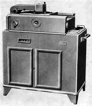
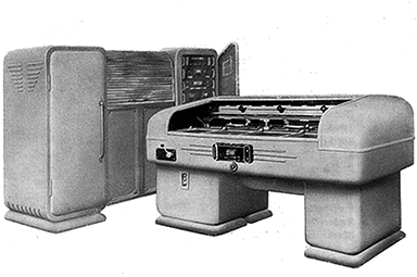
 Klischograph (1951): Hell first tested this device that scanned originals and converted them electronically into an engraved printing block. The Klischograph, which was released commercially to the newspaper industry in 1954, dramatically reduced the production time required to make halftone plates by combining three stages of production—film processing, screening and etching—into one operation.
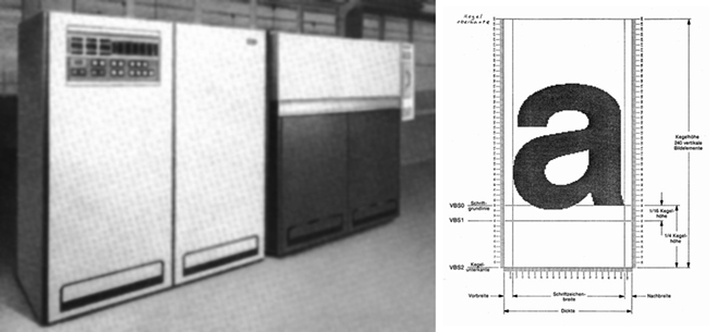
 Digiset (1956): In the early 1950s, Hell developed a technology called Digiset. Different from the technology of other phototypesetting equipment of the era—where complete characters are projected onto photographic material from a negative—the Digiset built each characters from digital elements and projected them onto a CRT and then this image was projected onto photosensitive material. With this system, Rudolf Hell invented the first “bitmap” fonts that would become standard technology in desktop publishing three decades later. The system was launched commercially in 1965.
 Colorgraph (1956): By the late 1950s technology firms were locked in an international race to invent an electronic scanning system that could produce process color separations. Rudolf Hell was well positioned to compete. He put significant resources into the development of a flatbed scanning system that could convert an original photographic transparency or print into fully color corrected separations all in one step. Hell launched the Colorgraph system commercially in 1958.
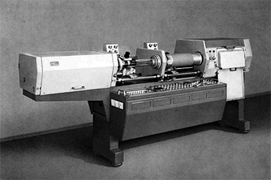
 Helio-Klischograph (1961): In October 1959, Hell was approached by a representative of a major German publishing company and asked to devise an electronic system for automated engraving of gravure cylinders. By 1960, Hell had developed a prototype system on a lathe that employed the Klischograph engraving head. Hell’s solution—that enabled mass production of gravure cylinders for illustration, decorative and packaging printing—was debuted at DRUPA in 1962. The Helio-Klischograph system replaced approximately ten separate manual steps in gravure cylinder preparation and is still in use today.

 Chromagraph (1963): Throughout the 1960s, Hell perfected the successful scanning and cylinder technologies of the Klischograph and Colorgraph. Striving for the most advanced drum scanning technology of the era, Hell was in a rivalry with John Crosfield of London for the first system to market. By 1967, Rudolf Hell had filed a patent application for his daylight drum scanning technology and the Chromograph DC300 system was brought to market in 1970. Hell drum scanning technology became the standard for high quality color reproduction in the printing industry for the next three decades and some of these systems remain in use to this day.
These inventions taken as a whole represent a stage in the transition of print technology from the mechanical to the digital age. Later referred to as “proprietary” systems, the self-contained computerized solutions of Rudolf Hell—and others like Crosfield, Scitex and Linotype—in the 1950s, 60s and 70s were the precursors to the desktop publishing revolution of the mid-1980s.
Rudolf Hell, who is sometimes called the Thomas Edison of the graphic arts industry, continued to develop these early electronic technologies —along with others like the electronic page composition system called ChromaCom—right up to the 50th anniversary of his company in 1979.
Rudolph Hell retired from the management of his company but remained active as chairman of the board in 1972. In 1981, he sold the business to Siemens and became honorary chairman of the supervisory board. He officially retired in 1989 and the firm was sold again to Linotype creating the Linotype-Hell Company. The assets of Linotype-Hell were acquired by Heidelberg in 1996 and the technologies pioneered by Rudolf Hell were incorporated into the Heidelberg prepress and press systems.
Hell was the recipient of numerous accolades and honors during his lifetime including the Gutenberg Award (1977), Werner-von-Siemens Ring in recognition of achievements in the natural sciences and technology (1978) and Honorary Citizen of Kiel (1979) and a Kiel city street was named after him (2001). Rudolf Hell died in Kiel on March 11, 2002 at 100 years old.