Sketches of Disruptive Continuity in the Age of Print from Johannes Gutenberg to Steve Jobs

Everything existing in the Universe is the fruit of chance and necessity.
Democritus, circa 400 BC
Necessity is blind only so long as it is not understood.
G. W. F. Hegel, 1817
It is notable that some inventions in the history of print technology are recorded as having been achieved by chance. In accounts written at the time of the inventions as well as in historical studies, majorbreakthroughs in printing have been attributed to accidental events. Much in the same way schoolchildren are taught that the natural scientist Isaac Newton discovered the law of gravitation afteran apple fell from a tree upon his head, significant inventions in the history of printing are said to be the result of lucky mistakes.
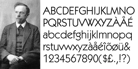
Perhaps the two most well-known examples of this phenomenon are found in accounts of the late-eighteenth-century invention of lithography by Alois Senefelder and the early-twentieth-century inventionof offset printing by Ira Washington Rubel. In both cases, the technical advances made by the inventors areoften explained as having been accidental.
Here are two citations:
Lithography was invented around 1796 in Germany by an otherwise unknown Bavarian playwright, Alois Senefelder, who accidentallydiscovered that he could duplicate his scripts by writing them in greasycrayon on slabs of limestone and then printing them with rolled-on ink
Department of Drawings and Prints, The Metropolitan Museum of Art, October 2004
Offset printing, also called offset lithography, or litho-offset, in commercial printing, widely used printing technique in which the inked image on a printing plate is printed on a rubber cylinder and then transferred(i.e., offset) to paper or other material. The rubber cylinder gives great flexibility, permitting printing on wood, cloth, metal, leather, and rough paper. An American printer, Ira W. Rubel, of Nutley, New Jersey,accidentally discovered the process in 1904 and soon built a press to exploit it.
The editors of Encyclopædia Britannica, July 1998
Readers of these passages would not be blamed for thinking that Senefelder of Bavaria, Germany, in 1796 and Rubel of Nutley, New Jersey, in 1904 were the beneficiaries of pure luck or that they fortuitously stumbled their way into print technology history. However, this would be an incorrect or, at best, an incomplete way of understanding the contributions of these two innovators.
Why does the word “accidentally” appear in the above accounts of historic inventions that took place more than one hundred years apart and, together, established what is known as offset lithography, a technology that revolutionized the printing industry and remains today the dominant method of transferring ink to paper? Why is it that stories of accidental invention—even from authoritative sources like the Metropolitan Museum of Art and Encyclopædia Britannica—persist for both men, despite ample evidence that Senefelder and Rubel were in pursuit of innovation and striving to improve the printing process through the methods of ingenuity, experimentation, and science that prevailed during their respective lifetimes?
Finding answers to these questions requires investigative journey. While it may be a fact of popular interest that Senefelder and Rubel are known as much—or even more—for the accidental way they arrived at their achievements than they are for the significance of the achievements themselves, it is also a fact that invention by happenstance has occurred in history more often than is generally known. Since the “accidental” attribution tends to overshadow and mystify the progress attained—in printing as well as other industries—it is instructive to examine these two inventions in their socio-economic context and to locate the place of Senefelder and Rubel within the whole history of printing. Such an examination shows that their accomplishments were absolutely necessary advancements.
To untangle the riddle of accidental invention in the specific cases of Senefelder and Rubel, it is necessary to: (1) investigate the historical record and review the facts of what is known about the men and how they invented lithography and offset printing; (2) look outside print technology and into the prevalence of “serendipity” more broadly in the history of scientific and technological discovery; (3) explore the source of the need for the legends of accidental discovery in human progress; (4) make a theoretical analysis of the two-sided and contradictory content of “accidents” in general; and, (5) return to Senefelder and Rubel and show how their inventions were manifestations of disruptive continuity in the history of printing.
The concept of disruptive continuity applies to the development of printing—as well as all human technical progress—because it acknowledges that each innovation owes its emergence to the accomplishments of others that came beforehand; that significant innovation could not take place without innumerable connections to the past. At the same time, disruptive continuity also recognizes that each new breakthrough represents a sharp departure from the past. It is a transition point forward that expresses the future in ways that were previously impossible and could not have been accomplished but for the spark of genius embedded in the new innovation.
As this introduction will go on to explain, it is at this nexus point of discontinuity from the prior gradual progression and the moment of a leap into the future that the phenomenon of accidental invention occurs. To understand how unanticipated events, which are rooted in antecedent accomplishments, can and do become transformed into significant innovations is to understand the mechanism by which the old era of technology is superseded by that of an entirely new era of progress.
Finally, by developing a socio-historical-technical analysis of nearly six centuries of print communications—based on the theory of disruptive innovation—significant conclusions can be drawn about the future of ink-on-paper media within the new environment dominated by online, mobile, social and streaming content delivery systems.
* * * * *
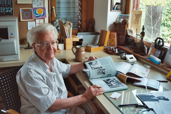
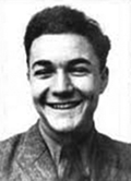
The investigative journey begins with an examination of the work of the two printing innovators who are frequently remembered as accidental inventors. It is fortunate that, in the case of Senefelder, an account written by the inventor himself is available and, in the case of Rubel, there exists two technical explanations, an anecdotal account and a posthumous tribute to the inventor written by a close business partner at the time of his death.
The invention of lithography
In 1817, at the urging of his colleagues, Alois Senefelder wrote down the story of his life along with a detailed description of how he invented lithography by experimental methods. He also provided a step-by-step technical guide for those wishing to learn and practice the art also known as “printing from a stone” or “stone printing.” Senefelder’s account was published one year later in the German volume entitled Vollständiges Lehrbuch der Steindruckerey (A Complete Course of Lithography). The work was translated into English by J.W. Muller and published by The Fuchs & Lang Manufacturing Company in New York in 1911 as The Invention of Lithography.
The relevant passages from the 1911 English text are found in the first chapter, “Section I: History of Stone Printing, Part I: From 1796 to 1800.”
As mentioned in the above quote from the Metropolitan Museum of Art, the young Alois Senefelder was an aspiring playwright and was motivated to start a printing firm so that he could publish his own works. Senefelder wrote that he was familiar with the procedures of the letterpress printing process of his day, “I had spent many a day in the establishments,” and that “it would not be hard for me to learn.” Senefelder also had a “desire to own a small printing establishment myself” because—having studied both public finance and law for three years at the University of Ingolstadt—he wanted to “earn a decent living” and “become an independent man” by going into business.
However, it was economic reality—a lack of the financial resources required to become a printer—that drove Senefelder down the path of innovation. As he wrote, “If I had possessed the necessary money, I would have bought types, a press and paper, and printing on stone probably would not have been invented so soon. The lack of funds, however, forced me to other expedients.”
Senefelder gave details of three different approaches he took in an effort to replicate the letterpress method without the ability to purchase the technologies that were readily available to others with the requisite capital resources. These were:
- To etch letters in steel and then “impressing them on pear wood, in which the letters would show in relief, somewhat like the cast type of the book printers, and they could have been printed like a wood-cut.” He abandoned the approach, “I had to give up the whole thing through lack of implements and sufficient skill in engraving.”
- To purchase “enough types to set one column or folio” and transfer the letters “to a board covered with soft sealing-wax, and reproduce the relief plate thus obtained in stereotype form.” Although this method was a technical success—especially after he began “mixing finely powdered gypsum with the sealing-wax” and “made the latter harder than the ordinary type composition”—Senefelder was unable to move forward because, “even this exceeded my financial power.” He gave up on this plan, “especially as I had conceived a new one during my experiments.”
- To learn “to write out ordinary type letters exactly, but reversed” with “an elastic steel pen on a copper plate covered in ordinary manner with etching surface” and these plates would be given to copper-plate printers for the press work. Here, Senefelder had difficulties because, though he learned quickly the skill of writing in reverse, “I could not correct the errors made during writing” because the “accessories of copper-plate engravers, especially the so-called cover varnish, were quite unknown to me.”
Senefelder then “labored desperately to overcome the difficulty” and tried three sub-methods within this “elastic steel pen” approach:
(a) Having “attained much chemical knowledge” during his days as a student, Senefelder began working with “spirits of wine and various resinous forms” and “oil of turpentine and wax” as methods for making corrections on the copper plate. However, he abandoned these materials because the chemical solution frequently became heavily diluted and “caused it to flow too much and dissolve the etching surface, at which time several well-done parts of the engraving were ruined.”
(b) Still determined to work with copper plate, Senefelder experimented with a wax and soap mixture as a material that could be used for correcting mistakes. He used, “a mixture of three parts of wax with one part of common tallow soap, melted over the fire, mixed with some fine lampblack, and then dissolved in rainwater, gave me a sort of black ink with which I could correct faulty spots most easily.” But this path “presented a new difficulty” in that he had only a “single little copper plate,” and, after he “pulled proofs at the house of a friend who possessed a copper-plate press,” he had to spend “hours again laboriously grinding and polishing the plate, a process which also wore away the copper fast.”
(c) To get around the limited copper plate resources, Senefelder transitioned to experimentation with “an old zinc plate of my mother’s,” that was “easier to scrape and polish.” However, “the results were very unsatisfactory,” because the “zinc probably was mixed with lead,” and he did not have a “more powerful acid” that could penetrate it.
Finally, Senefelder moved on to transferring a printed image to paper based on “a handsome piece of Kellheimer stone.” He explained, “The experiments succeeded, and though I had not thought originally that the stone itself might be used for printing (the samples I had seen hitherto of this Kellheim limestone were too thin to withstand the pressure exerted in printing), I soon began to believe that it was possible. It was much easier to do good work on the stone than on the copper.”
He began working “in order to use the stone just like copper” and trying “all possible kinds of polishing and grinding without attaining my purpose completely.” Senefelder wrote that moving from copper or zinc plate to printing from a limestone did not immediately result in the invention of lithography, “I had invented little that was new, but simply had applied the copper-plate etching method to stone.” And furthermore, “I was not the first discoverer of stone-etching, nor of stone-printing; and only after I made this new discovery which I will describe now, which led me from the engraved to the relief process, with my new ink, might I call myself the inventor of an art.”
In the midst of his detailed survey, Senefelder made it clear that he decided to write his account in 1817 in order to set the record straight, “I have told all of these things fully in order to prove to the reader that I did not invent stone-printing through lucky accident, but that I arrived at it by a way pointed out by industrious thought.”
However, he went on to say that his experiments with etched, i.e., mechanical and relief and not yet chemical, processes on stone “were entirely checked by a new, accidental discovery. Until now I had invented little that was new, but simply had applied the copper-plate etching method to stone. But this new discovery founded an entirely new form of printing, which basically became the foundation of all succeeding methods.” [Emphasis added]
Senefelder then recounted his well-known story of accidental invention:
I had just ground a stone plate smooth in order to treat it with etching fluid and to pursue on it my practice in reverse writing, when my mother asked me to write a laundry list for her. The laundress was waiting, but we could find no paper. My own supply had been used up by pulling proofs. Even the writing-ink was dried up. Without bothering to look for writing materials, I wrote the list hastily on the clean stone, with my prepared stone ink of wax, soap, and lampblack, intending to copy it as soon as paper was supplied.
As I was preparing afterward to wash the writing from the stone, I became curious to see what would happen with writing made thus of prepared ink …
My further experiments with this relief plate succeeded far better than my previous ones with etched letters. The inking in was much easier, and hardly one quarter of the force was necessary for making impressions. Thus the stones were not so liable to crack, and, what was the most important for me, this method of printing was entirely new, and I might hope to obtain a franchise and even financial aid.
It would take further experimentation with the stone by Senefelder to finally arrive at the invention of lithography, “Even this method, new in 1796, still was purely mechanical in its purpose, whereas the present printing method, which I began in 1799, may be called purely chemical.”
The following can drawn from the above summary of Senefelder’s own account of his invention: (1) Senefelder began in 1796 by experimenting and practicing with multiple materials and chemicals as he sought to develop an affordable mechanical printing process that was less capital intensive than the letterpress method; (2) he insisted that he did not invent lithography “through a lucky accident” but by way of “industrious thought”; (3) he stated that his efforts to come up with an alternative mechanical method to letterpress “were entirely checked by a new, accidental discovery”; (4) he told the story of how, while working with a limestone as a mechanical image transfer base, he wrote a laundry list upon the stone and from here new possibilities then occurred to him; (5) it would take three more years of further experimentation with the limestone before the “purely chemical” printing method was discovered in 1799 that become known as lithography.
It is highly significant that in his own account Senefelder presented two different and internally contradictory explanations for how he made his breakthrough. In one sentence, he wrote that he did not invent lithography by “lucky accident” but by “industrious thought” and, in another sentence, he said his experiments with mechanical methods on limestone “were entirely checked by a new, accidental discovery” that subsequently led to his invention of the “art” of the purely chemical method of printing.
This shows that Senefelder was perplexed in his attempt to explain the two opposing determinations that both appeared to him as true. Since he could not have expressed the genuine relationship between accident and necessity in the invention of lithography in a clear and scientific manner, Senefelder instead gave two separate and mutually conflicting explanations for how it happened.
It becomes plain from this that it is Senefelder himself who is responsible for two different stories: one stating that he invented lithography by an “accidental discovery” and another that he arrived at stone-printing not “through lucky accident” but by deliberately experimental methods. While this explanation appears to confound rather than clarify matters, Senefelder’s contradictory elaboration provides an important clue to solving the riddle of why stories of chance discovery have come to predominate.