Books, e-books and the e-paper chase

Last November Amazon opened its first retail book store in Seattle near the campus of the University of Washington. More than two decades after it pioneered online book sales—and initiated the e-commerce disruption of the retail industry—the $550 billion company seemed to be taking a step backward with its “brick and mortar” Amazon Books.

Amazon Books opened in Seattle on November 3, 2015
Amazon opened its first retail book store in Seattle on November 3, 2015

However, Amazon launched its store concept with a nod to traditional consumer shopping habits, i.e. the ability to “kick the tires.” Amazon knows very well that many customers like to browse the shelves in bookstores and fiddle with electronic gadgets like the Kindle, Fire TV and Echo before they make buying decisions.

So far, the Seattle book store has been successful and Amazon has plans to open more locations. Some unique features of the Amazon.com buying experience have been extended to the book store. Customer star ratings and reviews are posted near book displays; shoppers are encouraged to use the Amazon app and scan bar codes to check prices.

Amazon’s book store initiative was also possibly motivated by the persistence and strength of the print book market. Despite the rapid rise of e-books, print books have shown a resurgence of late. Following a sales decline of 15 million print books in 2013 to just above 500 million units, the past two years have seen an increase to 560 million in 2014 and 570 million in 2015. Meanwhile, the American Booksellers Association reported a substantial increase in independent bookstores over the past five years (1,712 member stores in 2,227 locations in 2015, up from 1,410 in 1,660 locations in 2010).

Print books and e-books

After rising rapidly since 2008, e-book sales have stabilized at between 25% and 30% of total book sales

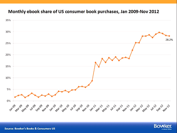
The ratio of e-book to print book sales appears to have leveled off at around 1 to 3. This relationship supports recent public perception surveys and learning studies that show the reading experience and information retention properties of print books are superior to that of e-books.

The reasons for the recent uptick in print sales and the slowing of e-book expansion are complex. Changes in the overall economy, adjustments to bookstore inventory from digital print technologies and the acclimation of consumers to the differences between the two media platforms have created a dynamic and rapidly shifting landscape.

As many analysts have insisted, it is difficult to make any hard and fast predictions about future trends of either segment of the book market. However, two things are clear: (1) the printed book will undergo little further evolution and (2) the e-book is headed for rapid and dramatic innovation.

Amazon launched the e-book revolution in 2007 with the first Kindle device. Although digital books were previously available in various computer file formats and media types like CD-ROMs for decades, e-books connected with Amazon’s Kindle took off in popularity beginning in 2008. The most important technical innovation of the Kindle—and a major factor in its success—was the implementation of the e-paper display.

Distinct from backlit LCD displays on most mobile devices and personal computers, e-paper displays are designed to mimic the appearance of ink on paper. Another important difference is that the energy requirements of e-paper devices are significantly lower than LCD-based systems. Even in later models that offer automatic back lighting for low-light reading conditions, e-paper devices will run for weeks on a single charge while most LCD systems require a recharge in less than 24-hours.

Nick Sheridon and Gyricon

The theory behind the Kindle’s ink-on-paper emulation was originated in the 1970s at the Xerox Palo Alto Research Center in California by Nick Sheridon. Sheridon developed his concepts while working to overcome limitations with the displays of the Xerox Alto, the first desktop computer. The early monitors could only be viewed in darkened office environments because of insufficient brightness and contrast.

Nick Sheridon and his team at Xerox PARC invented Gyricon in 1974, a thin layer of transparent plastic composed of bichromal beads that rotate to create an image
Nick Sheridon and his team at Xerox PARC invented Gyricon in 1974, a thin layer of transparent plastic composed of bichromal beads that rotate with changes in voltage to create an image on the surface

Sheridon sought to develop a display that could match the contrast and readability of black ink on white paper. Along with his team of engineers at Xerox, Sheridon developed Gyricon, a substrate with thousands of microscopic plastic beads—each of which were half black and half white—suspended in a thin and transparent silicon sheet. Changes in voltage polarity caused either the white or black side of the beads to rotate up and display images and text without backlighting or special ambient light conditions.

After Xerox cancelled the Alto project in the early 1980s, Sheridon took his Gyricon technology in a new direction. By the late 1980s, he was working on methods to manufacture a new digital display system as part of the “paperless office.” As Sheridon explained later, “There was a need for a paper-like electronic display—e-paper! It needed to have as many paper properties as possible, because ink on paper is the ‘perfect display.’”

In 2000, Gyricon LLC was founded as a subsidiary of Xerox to develop commercially viable e-paper products. The startup opened manufacturing facilities in Ann Arbor, Michigan and developed several products including e-signage that utilized Wi-Fi networking to remotely update messaging. Unfortunately, Xerox shut down the entity in 2005 due to financial problems.

Pioneer of e-paper Nick Sheridon
Pioneer of e-paper, Nicholas Sheridan

Among the challenges Gyricon faced were making a truly paper-like material that had sufficient contrast and resolution while keeping manufacturing costs low. Sheridan maintained that e-paper displays would only be viable economically if units were sold for less than $100 so that “nearly everyone could have one.”

As Sheridon explained in a 2009 interview: “The holy grail of e-paper will be embodied as a cylindrical tube, about 1 centimeter in diameter and 15 to 20 centimeters long, that a person can comfortably carry in his or her pocket. The tube will contain a tightly rolled sheet of e-paper that can be spooled out of a slit in the tube as a flat sheet, for reading, and stored again at the touch of a button. Information will be downloaded—there will be simple user interface—from an overhead satellite, a cell phone network, or an internal memory chip.”

E Ink

By the 1990s competitors began entering the e-paper market. E Ink, founded in 1998 by a group of scientists and engineers from MIT’s Media Lab including Russ Wilcox, developed a concept similar to Sheridon’s. Instead of using rotating beads with white and black hemispheres, E Ink introduced a method of suspending microencapsulated cells filled with both black and white particles in a thin transparent film. Electrical charges to the film caused the black or white particles to rise to the top of the microcapsules and create the appearance of a printed page.

E Ink cofounder Russ Wilcox

E Ink’s e-paper technology was initially implemented by Sony in 2004 in the first commercially available e-reader called LIBRIe. In 2006, Motorola integrated an E Ink display in its F3 cellular phone. A year later, Amazon included E Ink’s 6-inch display in the first Amazon Kindle which became by far the most popular device of its kind.

Kindle Voyage (2014) and Kindle Paperwhite (2015) with the latest e-paper displays (Carta) from E ink

Subsequent generations of Kindle devices have integrated E Ink displays with progressively improved contrast, resolution and energy consumption. By 2011, the third generation Kindle included touch screen capability (the original Kindle had an integrated hardware keyboard for input).

The current edition of the Kindle Paperwhite (3rd Generation) combines back lighting and a touch interface with E Ink Carta technology and a resolution of 300 pixels per inch. Many other e-readers such as the Barnes & Noble Nook, the Kobo, the Onyx Boox and the PocketBook also use E Ink products for their displays.

Historical parallel

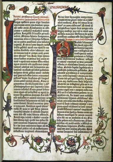
The quest to replicate, as closely as possible in electronic form, the appearance of ink on paper is logical enough. In the absence of a practical and culturally established form, the new media naturally strives to emulate that which came before it. This process is reminiscent of the evolution of the first printed books. For many decades, print carried over the characteristics of the books that were hand-copied by scribes.

It is well known that Gutenberg’s “mechanized handwriting” invention (1440-50) sought to imitate the best works of the Medieval monks. The Gutenberg Bible, for instance, has two columns of print text while everything else about the volume—paper, size, ornamental drop caps, illustrations, gold leaf accents, binding, etc.—required techniques that preceded the invention of printing. Thus, the initial impact of Gutenberg’s system was an increase in the productivity of book duplication and the displacement of scribes; it would take some time for the implications of the new process to work its way through the function, form and content of books.

Ornamented title page of the Gutenberg Bible printed in 1451

More than a half century later—following the spread of Gutenberg’s invention to the rest of Europe—the book began to evolve dramatically and take on attributes specific to printing and other changes taking place in society. For example, by the first decade of the 1500s, books were no longer stationary objects to be read in exclusive libraries and reading rooms of the privileged few. As their cost dropped, editions became more plentiful and literacy expanded, books were being read everywhere and by everybody.

By the middle 1500s, both the form and content of books became transformed. To facilitate their newfound portability, the size of books fell from the folio (14.5” x 20”) to the octavo dimension (7” x 10.5”). By the beginning of the next century, popular literature—the first European novel is widely recognized as Cervantes’ Don Quixote of 1605—supplanted verse and classic texts. New forms of print media developed such as chapbooks, broadsheets and newspapers.

Next generation e-paper

It seems clear that the dominance of LCD displays on computers, mobile and handheld devices is a factor in the persistent affinity of the public for print books. Much of the technology investment and advancement of the past decade—coming from companies such as Apple Computer—has been been committed to computer miniaturization, touch interface and mobility, not the transition from print to electronic media. While first decade e-readers have made important strides, most e-books are still being read on devices that are visually distant from print books, impeding a more substantial migration to the new media.

Additionally, most current e-paper devices have many unpaper-like characteristics such as relatively small size, inflexibility, limited bit-depth and the inability to write ton them. All current model e-paper Kindles, for example, are limited to 6-inch displays with 16 grey levels beneath a heavy and fragile layer of glass and no support for handwriting.

The Sony Digital Paper System (DPT-S1) is based on E Ink’s Mobius e-paper display technology: 13.3” format, flexible and supports stylus handwriting

A new generation of e-paper systems is now being developed that overcome many of these limitations. In 2014, Sony released its Digital Paper System (DPT-S1) that is a letter-size e-reader and e-notebook (for $1,100 at launch and currently selling for $799). The DPT-S1 is based on E Ink’s Mobius display, a 13.3” thin film transistor (TFT) platform that is flexible and can accept handwriting from a stylus.

Since it does not have any glass, the new Sony device weighs 12.6 oz or about half of a similar LCD-based tablet. With the addition of stylus-based handwriting capability, the device functions like an electronic notepad and, meanwhile, notes can be written in the margins of e-books and other electronic documents.

These advancements and others show that e-paper is positioned for a renewed surge into things that have yet to be conceived. Once a flat surface can be curved or even folded and then made to transform itself into any image—including a color image—at any time and at very low cost and very low energy consumption, then many things are possible like e-wall paper, e-wrapping paper, e-milk cartons and e-price tags. The possibilities are enormous.

Charles Stanhope (1753–1816): Iron printing press

Charles Stanhope, 3rd Earl Stanhope: August 3, 1753–December 15, 1816

Historians generally agree that the first industrial revolution took place between 1760 and 1840. Among the features of the great economic and social transformation were: (1) the progression from predominantly rural to urban society, (2) the replacement of handicraft with machine production, (3) the introduction of iron and steel in place of wood and (4) the substitution of muscle power with new energy sources like coal-fired steam power.

A unique set of circumstances—a stable commercial environment, advances in iron making and an abundance of skilled mechanics—made Britain the birthplace of the industrial revolution. Beginning with new techniques in textile production, industrial innovations spread rapidly to other manufacturing sectors and then across national borders in Europe and around the globe. All aspects of life would be touched by industrialization: population, politics, trade and commerce, science and culture, education, transportation and communication.

It was during this era of remarkable change that the English aristocrat Charles Stanhope invented—sometime around 1800—the first printing press constructed wholly of iron. Prior to Stanhope’s achievement, the design and build of printing machines had not changed in the three and a half centuries since Gutenberg.

Previously, small adjustments had been made to the wooden press. These related to structural stability, increased sheet size and automation to reduce human muscle power. But, even with the inclusion of some iron parts, the basic design of printing presses remained as they were in 1450.

With the Stanhope hand press, both the design of the impression mechanism as well as the material from which the machine was built were transformed; Stanhope’s contribution was a crucial preliminary step in the industrial development of print communications.

Young Lord Stanhope

Charles Stanhope, third Earl Stanhope, was born on August 3, 1753, the younger of two sons of Philip Stanhope, second Earl Stanhope, and his wife Lady Grisel (Hamilton) Stanhope. As a member of the English peerage system—with titles like Duke, Earl and Baron—Charles is often referred to as Lord Stanhope or Earl Stanhope. Born into the English aristocracy, he was afforded a privileged upbringing and, at the age of nine, was enrolled by his parents at prestigious Eton boarding school.

Portrait of the young Lord Stanhope

In 1763, following the death at age seventeen of his brother Philip from tuberculosis, Charles became family heir. His parents decided that Charles’ “health should not be exposed to the English climate, or the care of his mind to the capricious attention of the English schoolmaster” and the family relocated to Geneva, Switzerland. At age eleven, he was enrolled at the school in Geneva founded on the principles of John Calvin and there studied philosophy, science and math.

As a teenager, Charles was known to be a devoted cricket player, an exceptional equestrian and a well mannered young man who was admired by his peers. At age seventeen, Charles won a prize in a Swedish competition for the best essay, written in French, on the construction of a pendulum.

While Charles was accomplished academically in math and science, he was also known to have talents in drawing and painting. As a nobleman, Charles had obligations as a militia commander and he developed a passion for archery and musket shooting. At eighteen, he won a competition and was crowned the best shot and so-called “King of the Arquebusiers.”

By the time Charles completed his education in Switzerland, his parents decided to move the family back to England. According to a published account, as the family and its entourage left Geneva in 1774, “The young gentleman was obliged to come out again and again to his old friends and companions who pressed round the coach to bid him farewell, and expressed their sorrow for his departure and their wishes for his prosperity.”

Stanhope the inventor

During their five-month journey home to England from Switzerland, the family made a stop in Paris. Charles was welcomed and “esteemed by most of the learned educated men of the capital” over the prize he had won for his paper on pendulum design. He was developing an international reputation as an innovator.

Upon his return to England, Charles used his skills in mechanics to win election to London’s Royal Society, a world renowned club founded by King Charles in the 17th century to promote the benefits and accomplishments of science. At the age of 20, Charles embarked on a series of self-funded experiments and inventions and his interest in such matters continued throughout his life.

The first of two calculating machines invented by Charles Stanhope. His "arithmetical machines" have been recognized as precursors to the computer.
The first of two calculating machines invented by Charles Stanhope. His “arithmetical machines” have been recognized as precursors to the computer.

The most important of these were:

  • A method for preventing counterfeiting of gold currency (1775)
  • A system for fireproofing houses by starving a fire of air (1778)
  • Several mechanical “arithmetical machines” that could add, subtract, multiply and divide. These inventions were early forerunners of computers (1777 and 1780).
  • Experiments in steamboat navigation and ship construction which included the invention of the split pin, later known as the Cottier pin (1789).
  • A popular single lens microscope that became known as the Stanhope that was used in medical practice and for examination of transparent materials such as crystals and fluids (1806).
  • A monochord or a single string device, used for tuning musical instruments
  • Improvements in canal locks and inland navigation (1806)

Charles Stanhope became so well accomplished in international scientific circles that he was befriended by Benjamin Franklin. The two spent time together during Franklin’s visits to England prior to the American Revolution. They shared a mutual interest in electricity and, in 1779, Charles Stanhope published a volume entitled “Principles of Electricity” that corroborated through experimental evidence Franklin’s ideas about lighting rods.

The Stanhope press

By 1800, as has often happened in graphic arts history, the environment became ripe for a major step forward in printing methods. Charles Stanhope—who had the desire, know-how and resources to make it happen—stepped forward with a significant breakthrough.

Due to his many democratic political pursuits and scientific publishing activities—some of which concerned freedom of the press—Charles was very familiar with printing technology. Among his concerns were the cost of production, the accuracy of the content, the beauty of the print quality and the importance of books for the expansion of knowledge in society as a whole.

A drawing of the original Stanhope press design. None of these are known to exist today.

All letterpress technologies require a means to transfer ink from the surface of the metal type forms to the paper. This process requires the application of pressure, i.e. an impression, that mechanically drives the ink into the paper fibers. The pressure also creates a slight indentation in the shape of the letter forms in the surface of the paper.

Prior to 1800, press designs were based on the screw press that had been used for pressing grapes (wine) and olives (oil), cloth and paper going back to Roman times. The screw mechanism is a complex arrangement of the screw, nut, spindle and fixed bar that drives the platen—the flat plate that presses the paper against the type form—downward. There are many historical drawings and engravings that illustrate how physical strength is required to pull the bar and make a printing impression with the Gutenberg era press design.

Stanhope’s innovation, according to historian James Moran, was that “he retained the conventional screw but separated it from the spindle and bar, inserting a system of compound levers between them. The effect of several levers acting upon another is to multiply considerably the power applied.” The compound lever system was so successful that it became referred to as “Stanhope principles” and was incorporated into subsequent generations of hand press design in the nineteenth century (Columbian, Albion and Washington).

The second and more common design of the Stanhope hand press. Note the separation of the lever system from the screw and platen mechanism.

Other important Stanhope press changes were:

  • All iron construction including a massive frame formed in one piece
  • A double size platen
  • A regulator that controlled the intensity of the impression

The Stanhope press would undergo several important modifications, the most important of which was strengthening the frame in 1806 to prevent the iron from cracking under the stress of repeated impressions. The second design—with its characteristic rounded cheeks—is what today is commonly associated with the Stanhope press.

The Times of London immediately adopted the Stanhope press and it became successful across Europe and America in the first few decades of the 1800s. Meanwhile, further developments with all-iron hand presses would continue up to the end of the nineteenth century. However, driven by the rapid advancement of the industrial revolution, the next stage in the evolution of press design—the introduction of cylinders and steam power—would rapidly eclipse Stanhope’s accomplishments.

Stanhope the statesmen

Charles 3rd Earl Stanhope was an unusual man. In addition to his many inventions and scientific studies, he devoted himself to radical political causes that often controverted his aristocratic background. He often referred to himself as “Citizen” Stanhope. The origins of his democratic leanings were to be found in the influence of his father—who was a member of Parliament and an outspoken critic of the crown and proponent of Habeas Corpus—his education in the radical environment of Geneva and the Revolutions in America (1776) and France (1789).

Known publicly as Viscount Mahon at the time, Charles was elected to Parliament in 1780 and adopted positions that conflicted with the political elite. His demands for electoral and finance reform and religious tolerance of dissenters and Catholics did not sit well with the establishment. Charles was also known to have campaigned against slavery and was party to the abolition bill known as the Slave Trade Act of 1807.

Stanhope estate at Chevening, Kent. Charles died here on December 15, 1816.

Charles Stanhope was an opponent of the war against the thirteen colonies and a supporter of John Wilkes, a British sympathizer of the American rebels. Despite his efforts on behalf of the oppressed and downtrodden in society, Charles Stanhope’s personal eccentricities caused him, especially later in life, to be isolated from his family.

Always thinking of others before himself, he allowed his manse at Chevening, Kent to fall into disrepair and it is speculated that he had starved himself to death on a diet of soup and barley water. Charles Stanhope was interred “as a very poor man” in the family vault at Chevening Church one week after his death on December 15, 1816.

Adrian Frutiger (1928–2015): Univers and OCR-B

Adrian Frutiger: May 24, 1928 – September 10, 2015

Adrian Frutiger died on September 10, 2015 at the age of 87. He was one of the most important type designers of his generation, having created some 40 fonts, many of them still widely used today. He was also a teacher, author and specialist in the language of graphic expression and—since his career spanned metal, photomechanical and electronic type technologies—Frutiger became an important figure in the transition from the analog to the digital eras of print communications.

Frutiger was born on May 24, 1928 in the town of Interseen, near Interlaken and about 60 kilometers southeast of the city of Bern, Switzerland. His father was a weaver. As a youth, Adrian showed an interest in handwriting and lettering. He was encouraged by his family and secondary school teachers to pursue an apprenticeship rather than a fine arts career.

Adrian Frutiger around the time of his apprenticeship

At age 16, Adrian obtained a four-year apprenticeship as a metal type compositor with the printer Otto Schlaeffli in Interlaken. He also took classes in drawing and woodcuts at a business school in the vicinity of Bern. In 1949, Frutiger transferred to the School of Applied Arts in Zürich, where he concentrated on calligraphy. In 1951, he created a brochure for his dissertation entitled, “The Development of the Latin Alphabet” that was illustrated with his own woodcuts.

It was during his years in Zürich that Adrian worked on sketches for what would later become the typeface Univers, one of the most important contributions to post-war type design. In 1952, following his graduation, Frutiger moved to Paris and joined the foundry Deberny & Peignot as a type designer.

During his early work with the French type house, Frutiger was engaged in the conversion of existing metal type designs for the newly emerging phototypesetting technologies. He also designed several new typefaces— Président, Méridien, and Ondine—in the early 1950s.

San serif and Swiss typography

San serif type is a product of the twentieth century. Also known as grotesque (or grotesk), san serif fonts emerged with commercial advertising, especially signage. The original san serif designs (beginning in 1898) possessed qualities—lack of lower case letters, lack of italics, the inclusion of condensed or extended widths and equivalent cap and ascender heights—that seemingly violated the rules of typographic tradition. As such, these early san serif designs were often considered too clumsy and inelegant for the professional type houses and their clients.

Rudolf Koch, Kabel, 1927
Paul Renner, Futura, 1927
Eric Gill, Gill Sans, 1927

Along with the modern art and design movements of the early twentieth century, a reconsideration of the largely experimental work of the first generation of sans serif types began in the 1920s. Fonts such as Futura, Kabel and Gill Sans incorporated some of the theoretical concepts of the Bauhaus and DeStijl movements and pushed sans serif to new spheres of respectability.

However, these fonts—which are still used today—did not succeed in elevating san serif beyond headline usage and banner advertising and into broader application. Sans serif type remained something of an oddity and not yet accepted by the traditional foundry industry as viable in terms of either style or legibility.

In the 1930s, especially within the European countries that fell to dictatorship prior to and during World War II, there was a backlash against modernist conceptions. Sans serif type came under attack, was derided as “degenerate” and banned in some instances. Exceptions to this trend were in the US, where the use of grotesque types was increasing, and Switzerland, where the minimalist typographic ideas of the Bauhaus were brought by designers who had fled the countries ruled by the Nazis.

The Bauhaus School, founded in 1919 in Weimar, Germany, was dedicated to the expansion of the modernist esthetic

After the war, interest in sans serif type design was renewed as a symbol of modernism and a break from the first four decades of the century. By the late 1950s, the most successful period of san serif type opened up and the epicenter of this change emerged in Switzerland, signified by the creation of Helvetica (1957) by Eduard Hoffmann and Max Miedinger of the Haas Type Foundry in Münchenstein.

It was the nexus of the creative drive to design the definitively “modern” typeface and the possibilities opened up by the displacement of metal type with phototypesetting that brought san serif from a niche font into global preeminence.

Frutiger’s Univers

This was the cultural environment that influenced Adrian Frutiger as he set about his work on a new typeface as a Swiss trained type designer at a French foundry. As Frutiger explained in a 1999 interview with Eye Magazine, “When I came to Deberny & Peignot in Paris, Futura (though it was called Europe there) was the most important font in lead typesetting. Then one day the question was raised of a grotesque for the Lumitype-Photon [the first phototypesetting system]. …

“I asked him [Peignot] if I might offer an alternative. And within ten days I constructed an entire font system. When I was with Käch I had already designed a thin, normal, semi-bold and italic Grotesque with modulated stroke weights. This was the precursor of Univers. … When Peignot saw it he almost jumped in the air: ‘Good heavens, Adrian, that’s the future!’ ”

An early diagram of Frutiger’s Univers in 1955 shows the original name “Monde”
Final diagram of Frutiger’s 21 styles of Univers in 1955

Originally calling his type design “Monde” (French for “world”), Frutiger’s innovation was that he designed 21 variations of Univers from the beginning; for the first time in the history of typography a complete set of typefaces were planned precisely as a coherent system. He also gave the styles and weights a numbering scheme beginning with Univers 55. The different weights (extended, condensed, ultra condensed, etc.) were numbered in increments of ten, i.e. 45, 65, 75, 85 and styles with the same line thickness were numbered in single digit increments (italics were the even numbers), i.e. 53, 56, 57, 58, 59, etc.

Univers was released by Deberny & Peignot in 1957 and it was quickly embraced internationally for both text and display type purposes. Throughout the 1960s and 70s, like Helvetica, it was widely used for corporate identity (GE, Lufthansa, Deutsche Bank). It was the official promotional font of the 1972 Munich Olympic Games.

Frutiger explained the significance of his creation in the interview with Eye Magazine, “It happened to be the time when the big advertising agencies were being set up, they set their heart on having this diverse system. This is how the big bang occurred and Univers conquered the world. But I don’t want to claim the glory. It was simply the time, the surroundings, the country, the invention, the postwar period and my studies during the war. Everything led towards it. It could not have happened any other way.”

Computers and digital typography

Had Adrian Frutiger retired at the age of 29 after designing Univers, he would have already made an indelible contribution to the evolution of typography. However, his work was by no means complete. By 1962, Frutiger had established his own graphic design studio with Bruno Pfaffli and Andre Gurtler in Arcueil near Paris. This firm designed posters, catalogs and identity systems for major museums and corporations in France.

Throughout the 1960s, Frutiger continued to design new typefaces for the phototypesetting industry such as Lumitype, Monotype, Linotype and Stempel AG. Among his most well-known later san serif designs were Frutiger, Serifa and Avenir. Frutiger’s font systems can be seen to this day on the signage at Orly and Charles de Gaulle airports and the Paris Metro.

The penetration of computers and information systems into the printing and publishing process were well underway by the 1960s. In 1961, thirteen computer and typewriter manufacturers founded the European Computer Manufacturers Association (ECMA) based in Geneva. A top priority of the EMCA was to create an international standard for optical character recognition (OCR)—a system for capturing the image of printed information and numbers and converting them into electronic data—especially for the banking industry.

By 1968, OCR-A was developed in the US by American Type Founders—a trust of 23 American type foundries—and it was later adopted by the American National Standards Institute. This was the first practically adopted standard mono-spaced font that could be read by both machines and the human optical system.

However, in Europe the ECMA wanted a font that could be used as an international standard such that it accommodated the requirements of all typographic considerations and computerized scanning technologies all over the world. Among the issues, for example, were the treatment of the British pound symbol (£) and the Dutch IJ and French oe (œ) ligatures. Other technical considerations included the ability to integrate OCR standards with typewriter and letterpress fonts in addition to the latest phototypesetting systems.

Comparison of OCR-A (1968) with Frutiger’s OCR-B (1973)

In 1963, Adrian Frutiger was approached by representatives of the ECMA and asked to design OCR-B as an international standard with a non-stylized alphabet that was also esthetically pleasing to the human eye. Over the next five years, Frutiger showed the exceptional ability to learn the complicated technical requirements of the engineers: the grid systems of the different readers, the strict spacing requirements between characters and the special shapes needed to make one letter or number optically distinguishable from another.

In 1973, after multiple revisions and extensive testing, Adrian Frutiger’s OCR-B was adopted as an international standard. Today, the font can be most commonly found on UPC barcodes, ISBN barcodes, government issued ID cards and passports. Frutiger’s OCR-B font will no doubt live on into the distant future—alongside various 2D barcode systems—as one of the primary means of translating analog information into digital data and back again.

Frutigers Sign and Symbols 1989
Frutiger’s 1989 English translation of “Signs and Symbols: Their Design and Meaning”

Adrian Frutiger’s type design career extended well into the era of desktop publishing, PostScript fonts and the Internet age. In 1989, Frutiger published the English translation of Signs and Symbols: Their Design and Meaning a theoretical and retrospective study of the two-dimensional expression of graphic drawing with typography among its most advanced forms. For someone who spent his life working on the nearly imperceptible detail of type and graphic design, Frutiger exhibited an exceptional grasp of the historical and social sources of man’s urge toward pictographic representation and communication.

As an example, Frutiger wrote in the introduction to his book, “For twentieth century humans, it is difficult to imagine a void, a chaos, because they have learned that a kind of order appears to prevail in both the infinitely small and the infinitely large.  The understanding that there is no element of chance around or in us, but that all things, both mind and matter, follow an ordered pattern, supports the argument that even the simplest blot or scribble cannot exist by pure chance or without significance, but rather that the viewer does not clearly recognize the causes, origins, and occasion of such a ‘drawing’.”