Linn Boyd Benton: 1844 – 1932

inland-printer-vol-089-n05-1932-08-linn-boyd-benton-obituary.pdf
Linn Boyd Benton

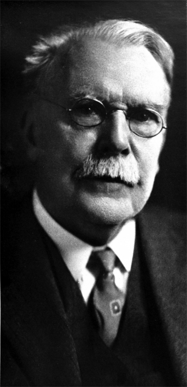
Linn Boyd Benton is not a widely known figure in the history of printing. This is an odd fact given that he is responsible for one of the most important technical achievements of the late nineteenth century: the invention of the pantographic engraver of type punches. Without Benton’s contribution, the completion of the industrialization of the printing process—and the success of Mergenthaler’s Linotype casting machine—would not have been possible.

Linn Boyd Benton was born on May 13, 1844 in Little Falls, New York, a town about 75 miles east of Syracuse. His father, Charles Swan Benton, was a lawyer and the founder-editor of the Mohawk Courier & Little Falls Gazette. In 1840, the elder Benton was elected as US Representative of the 17th District of New York State.

It has been said that Linn Boyd was forced to rely upon himself at an early age because his mother, Emeline Fuller of Little Falls, died when he was just three years old. That his father moved the family frequently also contributed to Linn Boyd’s character development.

After Charles remarried, he relocated the family to Milwaukee, Wisconsin where he became part owner and editor of the Milwaukee Daily News. At age eleven, Linn Boyd had his first experience with typography in the composing room of his father’s newspaper.

Boyd—as he was called—attended Galesville College, in Galesville, Wisconsin and studied advanced subjects for two years with a private tutor in La Crosse, Wisconsin. He developed his mechanical aptitude while working summer jobs as a tombstone cutter and as a watch repairman for a jeweler in La Crosse.

At 22 years old, Boyd was hired by a friend of his father’s as a bookkeeper for a Milwaukee type foundry. When the company went bankrupt during the financial panic of 1873, Boyd bought the Northwestern Type Foundry along with a partner and ran the manufacturing operations of the business. This was the beginning of Linn Boyd Benton’s long career in typography.

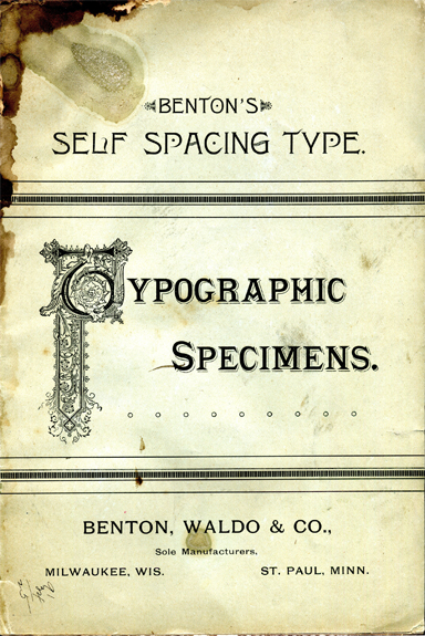
After several name and partnership changes, Boyd remained operations director of Benton, Waldo & Company and, by the early 1880s, the firm was manufacturing and selling metal type in the highly competitive industry. It was during this time that Benton began developing his skills as an inventor and typographic innovator.

Self-spacing type

By the 1880s, the problem of standardized type size measurement had become the scourge of the printing industry. Most printing establishments were forced to maintain relationships with a single type foundry due to the fact that type sizes, widths, base alignment and even metal alloy composition were not common.

With the industrial development of printing machinery long established—the launching of daily newspapers and installation of large steam-powered rotary web presses taking place everywhere—the lack of advanced methods of type specification, manufacture and composition were holding the industry back.

benton-waldo-specimen-booklet-1886-sos-0600dpijpg.pdf
Cover of Benton’s Self Spacing Type Specimen Book

Since the early 1700s efforts had been mounted in Europe and America to come up with a standard for measuring type. The “pica and point” system finally emerged after a long conflict over proprietary interests. On September 17, 1886 the American System of Interchangeable Type Bodies was formally adopted at a meeting of the United States Type Founder’s Association in Niagara, New York.

Within this environment, Linn Boyd Benton began working on methods that would change the way type was specified and handled. The problem facing compositors was that justifying a line of type required the manual arrangement of individual characters and spacers with a “trial and error” working method. According to Benton and others, this antiquated process unnecessarily lengthened composition time and there had to be a means of automating it.

The measuring system of “12 points to a pica and 6 picas to an inch” that we use today was initially developed as a vertical system of type height. Benton’s innovation was that the width should also be measured such that the typography followed “the point system both ways.” In 1883, Benton received US Patent 290,201 for Self Spacing Type that, according to the promotional literature, could “increase composition speeds by 25%.”

The Benton, Waldo & Company’s Self Spacing Type styles were designed primarily for the newspaper industry where compositor speed was the most important issue. For some typographers, the horizontal distortion of characters and spaces required to make Benton’s system work meant that the visual appearance of the type was unacceptable; they argued it was hard to read.

Nonetheless, Benton’s work on self-spacing type was a breakthrough and the production and marketing of its typefaces brought him straight into a much more historically significant technological advancement for the industry.

Benton’s pantographic punch cutting machine

To grasp the significance of Benton’s invention of the pantographic engraver, it is important to understand the components and process of metal typesetting. Gutenberg’s accomplishment was the invention of the hand-held mold for typecasting. It created the mass production of individual metal characters that could be assembled into lines and pages of type, effectively displacing the handwriting by scribes.

There are two preliminary steps required in the production of the type mold into which the molten metal is poured: the punch and the matrix. The punch is a steel relief form of the letter that is driven by a hammer into a piece of copper that creates the cavity of the matrix. The matrix is then placed into the mold assembly where hot metal is poured forming the finished piece of type that will be inked and printed upon.

Punch, matrix and finished type character

Prior to Benton, punch cutting was a manual process that required a highly skilled craftsman to design and engrave the characters into a tapered piece of steel that was two to three inches long. Every character of every size had to be punch cut; these were the “masters” of the font from which many matrices could be produced. If a punch was damaged or broken, it would have to be remade by hand and it was likely that there would be slight differences from the one to the other.

Punch cutting was clearly the most difficult job in the production of type. It was not uncommon for a skilled punch cutter to take an entire day to make one punch; each punch required the continuous use of a magnifying glass, significant manual dexterity and an esthetic sensibility.

Benton’s Self Spacing Type required the cutting of more than 3,000 punches and skilled punch cutters were in short supply. In an effort to solve this problem, Linn Boyd Benton employed the pantograph—a mechanical device that uses parallelograms to trace an image on one surface and reproduce that image precisely on another surface—in the type production process.

Although Benton was not the first person to employ the pantographic principle in type making, he was the first to obtain a patent for the machine that would ultimately be used for cutting steel punches. The device went through several iterations and it has been established that the first machine did not cut punches but actually was used to engrave the metal letters themselves. However, Benton’s third pantographic engraver that was granted US Patent 332,990 was designed specifically for punch cutting.

Patent for Benton’s pantographic punch cutting machine

Coincidentally, while Benton was solving problems with self-spacing type manufacturing, Ottmar Mergenthaler was developing a solution for the mechanical composition of type, one complete line at a time. With the investment of powerful newspaper publishing interests behind him, Mergenthaler invented the Linotype machine in 1886 and by 1888 there were hundreds of these machines on order.

Mergenthaler’s Linotype breakthrough begged for a method of mass matrix production on a scale that had never before existed. As explained by Benton’s publicist Henry Lewis Bullen, “Here was a machine; but no adequate means of supplying it with matrices had been devised. The rapid production of matrices required the rapid production of punches. … In 1890 the Linotype company had six or seven punch cutters in its employ and these could do no more than keep up supply of matrices for about two hundred machines. Not in all the world could enough steel punch cutters be found to furnish an adequate supply of matrices, without which the machines were as useless and unsalable as a gun where powder is unprocurable.”

By chance, Benton’s partner R.V. Waldo was on a self-spacing type sales visit at New York Tribune where Mergenthaler’s machine was pioneered. Once the topic of Benton’s pantograph came up between Waldo and Mergenthaler’s representatives it was just a matter of time before the Linotype matrix production dilemma would be solved. On February 13, 1889, the first Benton punch-cutting machine was leased to the Mergenthaler Printing Company.

Thus, the combined accomplishments of Benton and Mergenthaler terminated the era of hand crafted type production and enabled this most important aspect of print technology to completely enter the industrial age.

Later years

Linn Boyd Benton would go on to make many other technical contributions to the printing and typographic industries: combination fractions (1895), a type dressing machine (1901), an automatic type-caster (1907), and a lining device for engraving matrices of shaded letters (1913). Benton also played an important role with Theodore Lowe De Vinne in the design of the Century Roman typeface, an innovation in type design at the beginning of the twentieth century.

In 1892, Benton, Waldo & Company merged with 23 other type houses and formed the American Type Founders Company with headquarters in Elizabeth, NJ. At the time it represented 85% of all type manufactured in the US and would dominate the industry into the 1940s.

Morris Fuller Benton, Linn Boyd’s only son who was born in Milwaukee in 1872, would join the ATF organization at age 24 after graduating from Cornell with an engineering degree. Morris would go on to be a major contributor to the type business and a force of his own in printing history completing 221 typeface designs—including Cheltenham, Hobo, Broadway and Franklin Gothic—during his career.

Linn Boyd Benton retired from ATF on July 1, 1932 and died two weeks later on July 15, 1932. Along with recognition of his many accomplishments, the company’s board of directors described Benton in a statement the following October: “As a Man Mr. Benton endeared himself to us by his modesty, his delightful humor and his probity in all matters, intellectual and material.”

Nicolas Jenson: c. 1420 – 1480

Artist Robert Thom’s depiction of Nicolas Jenson at his engraving bench

The term incunabula (Latin for “cradle”) is used to denote the earliest period of printing from its birth in 1450 up to January 1, 1501. The books, pamphlets and broadsides printed with the movable metal type method associated with Gutenberg during these first fifty years are also commonly called incunabulum.

It is estimated that 35,000 editions were printed throughout Europe—over two-thirds from Germany and Italy—during the second half of the fifteenth century. Remarkably, nearly 80% of these volumes still exist today, most of which are held in large public collections such as the Bavarian State Library in Munich, the Vatican Library in Vatican City and the British Library in London.

The Lenox copy of the Gutenberg Bible on display at the New York Public Library. It was the first complete set brought to the US in 1847.

The most famous incunabulum, of course, is the 42-line bible printed by Johannes Gutenberg in Mainz, Germany in the 1450s of which there are 48 copies remaining. Since they were printed in two volumes, many of these copies are incomplete. James Lenox brought the first complete set of the Gutenberg Bible to the US in 1847 after he bought it for $2,500; it now sits on display at the New York Public Library. The last sale of a complete Gutenberg Bible took place in 1978 and went for $2.2 million; it is estimated that one would sell for $25-$35 million today.

The British Library maintains an international electronic bibliographic database of extant incunabulum. Called the Incunabula Short Title Catalogue (ISTC), the database was begun in 1980 and currently contains 27,460 records. The ISTC is an extraordinary merger of modern and Renaissance information technology. That anyone can peruse these records—many of which have links to high-resolution images of 500-year old incunabulum—is a testament to both the lasting achievement of print and the significance of its electronic descendent, the World Wide Web.

* * * * *

Next to Gutenberg himself, Nicolas Jenson is recognized as the most important figure of the incunabula. Despite limited records of his life—his last will and testament, a few book introductions written by others and some document fragments—the legacy of Nicholas Jenson survives through his printed works.

According to Martin Lowry, the printing scholar and author of “Nicholas Jenson and Rise of Venetian Publishing in Renaissance Europe,” the first official biography of Jenson was written in the late 1700s and amounted to “a two-volume potpourri of erudition and fantasy.” While arguing that Nicolas Jenson has become something of a printing cult-figure, Lowry does conclude that Jenson’s “place at the very beginning of the typographic age gives him a special importance.”

It is known that Nicolas Jenson was born in Sommevoire, France, a town about 150 miles southeast of Paris. However, after reviewing Lowry’s research, it is difficult to simply repeat here the many other “facts” that are frequently given of Jenson’s early life: his date of birth, his employment experience and the origin of his metal working skills, the means by which he became familiar with the printing methods of Gutenberg and his route from France to Italy. The things that are repeated in many accounts of Jenson’s life are derived from murky historical anecdotes that are contradicted by other important facts.

An engraving depicting an early Venetian printing shop

Jenson is known to have begun printing in Venice in the late 1460s or early 1470s. Prior to his arrival in Venice, it appears that he spent some time in Vicenza, a mainland town about 30 miles to the west, where he developed his printing skills. Jenson’s arrival in Venice, the first non-German printer in recorded history, coincided with the establishment of several important printing firms in the Italian island city. The most notable of these was the enterprise of John and Wendelin of Speyer who arrived in Venice from Germany in 1468 and were granted a five year monopoly on printing by the city authorities.

Nicolas Jenson’s printer’s mark

The Venetian patrician class of scholar-statesmen considered the arrival of printing a major cultural development. It meant that the works of classical humanist teachings could be reproduced at rates that were inconceivable with the handwritten process of the scribes. The ruling elites encouraged the development of print and by the end of the century there were 150 firms operating in the highly competitive Venetian printing market.

Alongside of print’s cultural impact, there was a considerable business opportunity to be exploited. It was to this side of the incunabula that Jenson devoted most of his efforts. During the ten years that he was a printer in Venice, more than anyone else, Jenson brought investment into the printing industry. His businesses were very successful and he made a considerable fortune before his death in 1480.

However, the most important—and universally recognized—contribution of Nicolas Jenson to the development of printing was his design of an early roman typeface. Prior to Jenson, the style of print typography followed the blackletter example set by Gutenberg, i.e. heavy gothic forms that emulated the dominant pen and ink script of the monks of fifteenth century Germany.

The first page of Eusebius’ "Preparation for the Gospel" printed by Nicolas Jenson in 1470. It is thought to be the first appearance of a roman typeface.
The first page of Eusebius’ Preparation for the Gospel printed by Nicolas Jenson in 1470. It is thought to be the first appearance of a roman typeface.

Such were Nicolas Jenson’s metal working skills that he cut a groundbreaking roman type in 1470. Roman type is distinct from blackletter in that it emulates the square capital letters used in ancient Rome combined with the Carolingian minuscule (lowercase) used during the Holy Roman Empire. The first book to appear with Jenson’s new design was an edition of Eusebius’ Preparation for the Gospel originally written in 313 A.D.

The word roman, without a capital R, has come to denote Italian typefaces used during the Renaissance as well as later fonts derived from them such as Times Roman, for example. Although Jenson’s design was quite different in appearance from Gutenberg’s blackletter, it was also modeled on the scribal manuscript style that was popular in fifteenth century Italy.

A comparison of blackletter script (upper left) with Gutenberg’s blackletter type (lower left) and roman/Carolingian script (upper right) with Jenson’s roman type (lower right)

It is a remarkable phenomenon of printing history that the essential forms of Jenson’s roman typeface designed more than 500 years ago are those that we continue to use most often and recognize today as the best and most readable typography. Of course, the characters in the alphabet of the Latin languages are those associated with Jenson’s contribution. But it should also be noted that Jenson designed and cut a Greek alphabet of a similar style.

Throughout the subsequent history of printing, many have noted the beauty and balance of Jenson’s roman type design. In particular, William Morris and the arts and crafts movement of the late nineteenth century focused upon Jenson’s creative genius. According to Lowry, Morris’ romantic affinity for medievalism led to an unjustified elevation of the contribution of Nicolas Jenson alongside those of Johannes Gutenberg and Aldus Manutius.

* * * * *

A search of the British Library’s ISTC for the term “Jenson” results in 113 hits. Many of the items in the database contain links to images of the pages printed by Nicolas Jenson himself on a Gutenberg-style printing press in Venice in the 1470s. A review of these entries shows that—despite language challenges—Jenson’s books appear very similar to those found today in our libraries and book stores. While some of them are adorned with ornate case bound covers and others include hand-illuminated art alongside the printed text, the essential elements of the book are very familiar to any modern reader.

Historians have strictly defined the incunabula as the first fifty years of the printing revolution beginning with Gutenberg. The incunabulum produced by the pioneers of print—including Nicolas Jenson—were devoted to a recreation of scribes’ handwriting such that the reading audience could understand and relate to the new media form.

The questions that arise naturally are: should we consider the early years of the digital revolution to be our modern “incunabula” in which the previous media generation is being replicated in electronic form? Or is the digital age leading to a new media that represents a departure from the forms that were developed and enriched during the Renaissance?

Frederic Goudy: 1865 – 1947

Frederic W. Goudy 1865 – 1947

Making it through our present-day technology transition is surely challenging. We live and work with one foot in the brave new digital, mobile and touch world while the other foot is in ye olde analog, wired and paper world.

Have you done any of the following lately?

  • Talk or text on your smartphone while letting your landline home phone ring without picking it up.
  • Purchase and download an album only to realize later that you already own the CD.
  • Open every piece of US mail while ignoring or deleting the email cluttering your inbox.
  • Check your Facebook newsfeed constantly while not having time to read or even open the daily newspaper.
King Crimson’s 1969 album “In the Court of the Crimson King” contains the track “21st Century Schizoid Man”

We are bombarded with so much information and have so many messages and redundant media it’s a wonder we get anything done! Our bifurcated and overloaded culture evokes the title of a 1969 King Crimson song: “21st Century Schizoid Man.”

When looking back through history, however, it becomes clear that our present condition is not entirely unique. Previous generations have experienced disruptive and even devastating change. It is a fact that every age is both cause and effect; a moment in time between past and future with a host of unpredictable retreats, twists and turns.

Some may ask: isn’t the present different because the pace of change is becoming quicker? This is true but, in relative terms, the rate of change has always been logarithmic from one generation to the next. The phenomenon of accelerated development embodied in Moore’s Law (the number of transistors on an integrated circuit doubles every two years) is frequently applied to all past and present technological progress.

* * * * *

In reviewing the life of Frederic Goudy—the most important American type designer in the first half of the twentieth century—we see a man who thrived during an era of terrific change. Born at the conclusion of the Civil War, Goudy lived through the industrialization of society and two World Wars. Without a formal education, self-taught and often under difficult circumstances, Goudy became a prolific type designer who was known the world over for his accomplishments. Significantly, Frederic Goudy drew his first alphabet at age 30 and began his career as a professional type designer at the age of 46.

Frederic William Goudy was born on March 8, 1865 about 125 miles south of Chicago in a town called Bloomington, Illinois. As a youngster Fred spent time in the Bloomington library reading Mark Twain and browsing the illustrated Harper’s Weekly magazine. He developed the ability to trace and replicate wood engravings in pencil. Although, he did not excel at mathematics, Fred gained an interest in machines such as the lathe and the pantograph.

Fred’s father, John Goudy, was a school administrator and later a real estate man. He moved the family to four different towns in Illinois in the 1870s and early 1880s. In 1883, the family relocated to the Dakota Territory where John started a business in connection with homestead claims. Living in the prairie hamlet of Highmore near an Indian Reservation and with just two years of high school education behind him, Fred went to work as a clerk in his father’s real estate company.

In 1889, Frederic left Highmore and set out on his own. First going to Minneapolis and then Springfield, Illinois, he worked as a bookkeeper in the real estate offices. During these years, Fred gained experience with advertising and layout of newspaper ads. At twenty-eight years old, Fred moved to Chicago and worked for various offices writing advertising copy and designing ads with local printers.

An example of the esthetics of American typography in the late 1800s

In the 1890s, there was no such thing as an advertising industry and there were very few advertising agencies. Newspapers and magazines were filled with garish promotional ads with very bad typography and florid graphics. At this time, Fred started swimming against the tide of generally murky and unreadable printing. In 1893, he founded a magazine called “Modern Advertising” as a means of generating business. Although the publication did not last, Fred gained important experience with the type production and printing processes.

Around 1895, Goudy became influenced with the works of William Morris—the English poet, author, craftsmen and designer—and the Arts and Crafts movement. In collaboration with a Chicago English teacher C. Lauron Hooper, Goudy decided to start his own printing business along the lines of Morris’ Kelmscott Press in England. He would later say of this time, “When I became inoculated with printers’ ink, I was never again the same.”

The young Frederick Goudy in the late 1800s.

As an amateur, Goudy began experimenting with type designs and developed his hand lettering skills. After a short time in Detroit working for a weekly called The Michigan Farmer, Goudy returned to Chicago and worked on advertising for Marshall Field, The Inland Printer, The Pabst Brewery and Hart Schaffner and Marx. He also designed book covers for The Lakeside Press and Rand-McNally. All Goudy’s type designs through this period were for advertising purposes.

By the turn of the century, Goudy wanted to follow Morris’ lead and print the finest books in America. To do so he believed needed to design his own typeface. In 1903, Frederic Goudy made printing history with the establishment of The Village Press in Park Ridge, Illinois and the creation of The Village Type, his first fine book face. The Village Type was the very first American typeface to be cut and caste from free hand, original drawings from a type designer.

Village Type
An example of Village Type, the first American type face to be designed from free hand drawings, designed by Frederic Goudy in 1903

In 1904, Frederic and his wife Bertha moved The Village Press to Hingham, Massachusetts to become part of The Hingham Society of Arts and Crafts and be surrounded by other craftsmen. In 1906, the Goudy’s moved their printing business to New York City. It was during a trip to England in 1909 and then a trip to the Continent in 1910 that Goudy focused himself upon the scholarship and history of typography.

In 1911, according to his own account, Frederic Goudy became a professional type designer with the creation of Kennerley Old Style. Named for his business associate, publisher and Englishman Mitchell Kennerley, Goudy designed the font specifically for the publication of H.G. Wells’ “The Door in the Wall and Other Stories.” Kennerley Old Style was hit in England and through it Goudy suddenly became associated internationally with great type design. It would take some years more for his work to become recognized in America.

Title page to The Door in the Wall
The title page to H.G. Wells’ “The Door in the Wall,” the first appearance of Kennerley Old Style and the beginning of Goudy’s professional type design

From this point forward, Frederic Goudy devoted his energies to type design and his hand lettering and printing work receded into the background. Over five decades, Goudy designed 122 typefaces, an enormous accomplishment in the era of hot metal typography. Among Goudy’s popular typefaces are:

  • Copperplate Gothic (1905)
  • Goudy Old Style (1915)
  • Hadriano (1918)
  • Italian Old Style (1924)
  • Trajan (1930)
  • Berkeley Old Style (1938)

A significant technology factor in the emergence of type design as a profession—making it possible for someone like Frederic Goudy to achieve success—was the invention by Linn Boyd Benton in 1884 of the pantographic engraver. This device, which represented the industrialization of metal type production, enabled foundries to cut matrices from enlarged drawings. Prior to this development, the making of type was largely the work of handicraft punch cutters and not that of designers. At the age of 60, Goudy acquired his own matrix-cutting machine on which he engraved and cast perhaps some of his greatest work.

During his career, Goudy wrote extensively on type design, lettering, typographic style and history. His works “The Alphabet” (1918) and “The Elements of Lettering” (1922) remain important resources, that latter containing explanatory notes on the considerations and influences behind some of his typeface designs. He founded the journal “Ars Typographica” in 1918 and he became the art director for Lanston Monotype Corporation in 1920 where he remained until his death.

Mirtchell Kennerley and Frederic Goudy
Frederic Goudy (right) with publisher Mitchell Kennerley

Frederic Goudy was famous during his lifetime. He was a rugged man, a widely read commentator on design and esthetics and a popular speaker who was approached for his opinion on many topics, some far from his field of expertise. He was known for his larger-than-life personality, as a raconteur and he could be counted on for comments with a punch line. It is said that Goudy was the originator of the statement, “Anyone who would letterspace blackletter would shag sheep,” although he probably used a different word for the Britishism “shag.”

For some of his competitors, Goudy’s self-promotion was a problem. Historically, type designers had never before named their works after themselves; Goudy used his name in about 20 of his typefaces. Goudy’s love for typography is summed up in his favorite broadside designed and produced for a Chicago exhibition in 1933:

I AM TYPE! Of my earliest ancestry neither history nor relics remain. The wedge-shaped symbols impressed in plastic clay by Babylonian builders in the dim past foreshadowed me: from them, on through the hieroglyphs of the ancient Egyptians, down to the beautiful manuscript letters of the mediaeval scribes, I was in the making.

With the golden vision of the ingenious Gutenberg, who first applied the principle of casting me in metal, the profound art of printing with movable types was born. Cold, rigid and implacable I may be, yet the first impress of my face brought the Divine Word to countless thousands.

I bring into the light of day the precious stores of knowledge and wisdom long hidden in the grave of ignorance. I coin for you the enchanting tale, the philosopher’s moralizing and the poet’s fantasies; I enable you to exchange the irksome hours that come, at times, to everyone, for sweet and happy hours with books—golden urns filled with all the manna of the past. In books, I present to you a portion of the eternal mind caught in its progress through the world, stamped in an instant and preserved for eternity. Through me, Socrates and Plato, Chaucer and Bards become your faithful friends who ever surround you and minister to you.

I am the leaden army that conquers the world; I am Type! 

Frederic W. Goudy died at his home in Marlboro-on-Hudson, New York on May 11, 1947. He is buried next to his wife Bertha in Evergreen Cemetery in Chicago.