William Morris: 1834 – 1896

WilliamMorrisAge43
William Morris before his 43rd birthday

A polymath is a person with extraordinary expertise in multiple disciplines. The most remarkable polymath of all time was Leonardo da Vinci, the Italian Renaissance painter, sculptor, inventor, engineer, musician, astronomer, anatomist, biologist, geologist, cartographer, physicist and architect. In addition to painting the Mona Lisa and The Last Supper, Leonardo also conceptualized a flying machine, adding machine, solar power and plate tectonics among many other innovations … in the 16th century.

Any list of polymaths in world history would include:

  • Nicolaus Copernicus: astronomer, lawyer, physician, politician and economist
  • Isaac Newton: mathematician, physicist, theologian, astronomer and philosopher
  • Benjamin Franklin: author, printer, scientist, inventor and statesman
  • Thomas Jefferson: architect, paleontologist, inventor, horticulturalist and politician

It goes without saying that people with such a range of talents are extremely rare. Among the distinguishing attributes of a polymath are boundless curiosity and a facility for encyclopedic knowledge. Additionally, because they have the ability to acquire extensive practical experience in overlapping fields, polymaths are often responsible for inventions, discoveries, breakthroughs and noteworthy creative works.

While it would be an exaggeration to place William Morris—a significant figure of the late 19th century—in the company of the above-mentioned geniuses of human achievement, he was nonetheless a polymath. During his lifetime, William Morris made major contributions to architecture, textile design, decorative arts, poetry, literary fiction, politics, typography and printing.

Early years 

William Morris was born on March 24, 1834 in Walthamstow. He was the third child and oldest son of William Morris and Emma Morris Shelton. His father, who had moved to London from Worcester in the 1820s, became a partner in a stock brokerage firm in the city. His mother was the daughter of Joseph Shelton, a music teacher in Worcester.

In the early 1840s, the elder William Morris became very wealthy from an investment in a copper mining business. The family then moved into a 150-acre estate in Woodford with its own brewery, bakery and buttery and a Governess and housekeeping staff.

Little William Morris was a precocious child and learned to read very early. By the age of four—it is said—he was reading books and familiarizing himself with the Waverly novels. At Woodford, William spent time exploring the outdoors, going fishing and rabbit hunting and he developed a life-long appreciation for animal nature. After William Morris senior died at age 50 in 1847, the Morris family moved back to Walthamstow along with a considerable fortune.

One year later, William Morris was enrolled at Marlborough College where he attended for three years. In a recollection of his experience at Marlborough, Morris said it was “a new and very rough school. As far as my school instruction went, I think I may fairly say I learned next to nothing there, for indeed next to nothing was being taught.” Despite this negative memory, Morris spent time in the school library and developed an interest in archaeology and gothic architecture. He also took long walks in the countryside amid the Neolithic and Bronze Age monuments, stone circles and burial mounds.

Following a rebellion and four-day strike in 1851 by students against the conditions at Marlborough, the Morris family removed William from the college. Determined to prepare him for entry into Oxford, the family arranged a private classical tutor for the seventeen-year-old William. In 1852, William was admitted as a non-resident and unable to dine or sleep in the company of his fellow students, he entered Exeter College, Oxford.

The Brotherhood

It was at Exeter that William made the acquaintance of a student from Birmingham, Edward Burne-Jones, who would become a lifelong friend and collaborator. While the two students had entered the school with the intention of joining the priesthood, they both decided to dedicate themselves to the arts following a trip and tour of the great Gothic cathedrals in Northern France.

William then joined Edward—along with several other undergraduates and friends of Burne-Jones from Birmingham—in a group of intellectuals that called itself “The Brotherhood.” This club, which historians sometimes call the Birmingham Set, began meeting regularly to read theological tracts. This gave way to Shakespeare, the poetry of Tennyson and Browning, the novels of Dickens and then to a secular study of the art and architecture of the middle ages.

John Ruskin in the 1850s

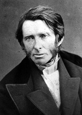
By 1855, the young men were influenced greatly by the views of John Ruskin and the Pre-Raphaelites who wanted to counter the influence of the industrial revolution upon artistic and cultural expression. Ruskin and his followers believed that art had to be returned to the hand-craftsmanship that had been abandoned beginning with the works of Raphael. Ruskin taught that the separation of the intellectual work of the designer from the manual work of physical construction—a significant feature of mass industrial economy—was socially and esthetically damaging.

The first issue of the “Oxford and Cambridge Magazine”

Returning to medieval artistic forms and techniques—and rebelling against what was considered the “barbarity” of contemporary industrial culture—would become a recurring theme of the subsequent works of William Morris. He developed the firm conviction that “without dignified, creative human occupation people became disconnected from life.” Alongside these cultural ideas, Morris and “The Brotherhood” advocated social reform aimed at improving the conditions of misery among the industrial workingmen of Victorian England.

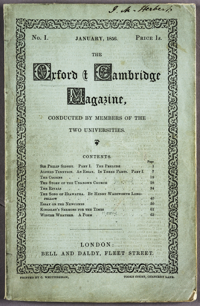
In 1856, the members of “The Brotherhood” published twelve monthly issues of the Oxford and Cambridge Magazine—financed by Morris—which espoused the views of the group. It was out of these ideas, that William Morris, Edward Burne-Jones, Charles Faulkner, Dante Gabriel Rossetti and others would establish what later became known as the Arts and Crafts Movement that spread throughout the world in the late 19th and early 20th centuries.

Morris’s accomplishments

It is not possible to deal in detail with the many significant accomplishments made by William Morris in so many fields over the next four decades. The following is a brief listing:

Red House where William Morris lived with his wife Jane from 1860 to 1865. It is owned today by the National Trust and is open to the public.

–       Architecture:

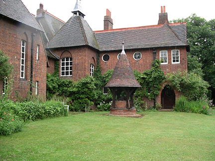
  • He transformed domestic architecture and construction with the Red House built in Kent for Morris and his wife in 1859 with designs by Philip Webb. The house is made of red brick with a steep tiled roof, utilizing all natural materials.
  • Morris founded the Society for the Protection of Ancient Buildings (SPAB) in 1877 dedicated to the repair and preservation of England’s ancient buildings. The society still exists with 8,500 members and operates according to Morris’s original manifesto.

–       Decorative Arts:

  • Founded in 1861 Morris, Marshall, Faulkner & Co. for the creation of woodcarvings, stained glass, metalwork, paper hangings, printed fabrics and carpets.
  • To this day, the textile designs of William Morris—for furniture, embroidery and wallpaper—remain among the most popular choices for home decor.

–       Literature:

  • Morris wrote several novels—News From Nowhere (1890), The Wood Beyond the World (1894) and The Well at the World’s End (1896)that were the first works of science fiction fantasy. Morris influenced both C.S. Lewis (The Chronicles of Narnia) and J. R. R. Tolkien (The Lord of the Rings).
  • In 1869, after learning Old Norse language and together with Eirikr Magnusson, Morris published translations of Icelandic mythology and folklore into English. The project eventually became a six-volume library of 9th century Icelandic sagas.

–       Politics:

  • In 1883, Morris became an active member of the Social Democratic Federation and played a prominent role in its political work.
  • Morris was the financier, editor and writer from 1885-1890 for Commonweal an influential English left political magazine.

Kelmscott Press

Toward the end of his life, William Morris turned to the craft of printing and publishing. In 1891, he founded Kelmscott Press along with William Bowden near his home in Hammersmith, London. As with his previous artistic ventures, Morris wanted to shift book design and production back to that of medieval times.

At Kelmscott Press, Morris set out to produce books with traditional methods as much as possible. This meant first of all redesigning typefaces to reflect the look of the fifteenth century and simultaneously eschewing the use of lithographic printing systems. Morris believed strongly that contemporary book production was inferior to that which could be achieved by the craftsmen’s handwork based on strict adherence to fifteenth century techniques.

The typefaces Golden and Troy designed by William Morris for Kelmscott Press

For all 53 books produced by Kelmscott Press, special hand-woven paper was made entirely of linen, natural materials were used for custom-made inks and Morris himself designed the typefaces. Based upon the 1470 type of Nicholas Jenson, Morris developed his Golden type in 1891. Later that year he also designed the gothic Troy font based upon the black letter type printed by Gutenberg in 1450.

Page 60 of “The Works of Geoffrey Chaucer” published by Kelmscott Press in 1896

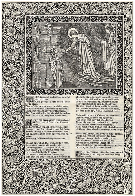
Perhaps Morris’s greatest printing accomplishment was The Works of Geoffrey Chaucer published by Kelmscott in 1896. The magnificent volume established a new standard for book design at the end of the 19th century. Adorned with 87 illustrations and many decorative black borders of acanthus and vine—all designed and produced by Morris’s friend Burne-Jones—there were approximately 425 copies printed.

Morris’s contribution to book design was summed up in a talk that he delivered to the Bibliographic Society in 1893 called “The Ideal Book.” In his presentation, Morris exhibited his considerable knowledge of the technology of book printing as well as the esthetics of typographic design. In poetic style, Morris said,

First, the pages must be clear & easy to read; which
they can hardly be unless,

Secondly, the type is well designed; and

Thirdly, whether the margins be small or big, they
must be in due proportion to the page of letter.

William Morris—the polymath designer, author, social theorist and printer—died on October 3, 1896 at the age of 62. A major figure of the late 19th century and during a time of great technological change, Morris sought solutions to the dilemmas of his time in medieval styles and methods. While one may rightfully question his romanticism and identification of industrial progress with “barbarity,” the positive influence of William Morris lives on today in many more ways than is popularly appreciated or understood.

Aldus Manutius: 1449/1450 – 1515

The great cultural movement called the Renaissance (rebirth) spanned the fourteenth to the seventeenth centuries. This places Johannes Gutenberg’s 1450 invention of printing early in that era. As is widely acknowledged by historians, printing was not only the most important technological achievement of the Renaissance; it was also its greatest catalyst.

Aldus Manutius
Aldus Manutius: 1449/1450 – 1515

Along with the expansion of world trade and the circumnavigation of the globe—combined with enthusiasm for Gutenberg’s innovation—printing spread rapidly from Germany to destinations across Europe and elsewhere. And, as the business and products of “mechanical writing” proliferated, the knowledge that came along with it multiplied exponentially.

Eventually, like so many printing press pebbles tossed into the global pond, the ripple waves of literacy and democracy spread and connected with one another. By the eighteenth century, the achievements of the Renaissance led to the age of Enlightenment. And so, one of the most remarkable end results of this technical and cultural transformation was the American Revolution of 1776 … but that takes us a long way from the subject of this review.

The Renaissance, especially in Italy, was shaped by humanist teachings, i.e. the notion that citizens should be educated in the humanities (language, literature, philosophy, religion and the arts). Florence, Naples, Rome, Venice and Genoa were among the centers of Italian humanism. Great collections of antique hand written manuscripts and also printed books were assembled in libraries and made available for study primarily for those of wealth and means.

It was within this environment that Aldo Manuzio (Aldus Manutius is Latinized) was born in Bassiano, Italy about 100 kilometers south of Rome. The precise date of his birth is not known. It has been surmised that he was born in 1449 or 1450 from the preface to a book published by Aldus’ grandson, Aldus, The Younger, in 1597.

Very little is known about Aldus’ early life. In his The Rudiments of Latin Grammar published in 1501, Aldus mentions he was trained in Latin at a young age. This information—along with the fact that he had an ancestor that was a Bishop—indicates that his family was well off.

Aldus left Bassiano for Rome, perhaps as young as 15 years of age, to be educated as a humanist scholar. His classical studies in Latin continued in Rome for eight years at which time he moved to Ferrara to conduct studies in Greek. Sometime around 1479 or 1480, having established himself as a scholar of the highest quality, the King of Carpi hired Aldus to become the teacher of his nephews. It was during his time in Carpi that Aldus developed his interest in publishing and printing.

By the 1400s, Venice was a center of world commerce much like New York City might be considered today; everything important was happening there. And so, it was to this Italian center of so many things that Aldus, at the time in his late 30s, decided to relocate and start a publishing enterprise.

There is almost no information available about Aldus’ activity during his first five years in Venice. It has been deduced that he spent this time preparing and setting up a viable publishing business—learning the book market and printing technique—in a very competitive environment. Printing arrived in Venice by way of Germany twenty years earlier and there were well-known firms already operating by the time Aldus launched his enterprise.

A page from Aldus printing of Aristotle
A page from one of the 5 volume set of “Aristotle” published by Aldus between 1495 and 1499

Aldus’ initial activity—and this would prove to be his most important accomplishment—was to edit and republish authoritative editions of the classics of literature. The initial project, a reissue of the Greek Grammar of Constantine Liscaris in 1495, was the first volume to be published under Aldus’ name although Andrea Torresani’s press likely did the printing.

A big breakthrough came in that same year with the publication in Greek of the first of a five-volume folio edition of the works of Aristotle. It would take four years to complete the project. This work has been referred to as the “greatest scholarly and printing achievement of the fifteenth century.” Aldus then went on to edit and publish Thucydides, Sophocles and Herodotus in 1502, Xenophon’s Hellenics and Euripides in 1503 and Demosthenes in 1504. In the decade before his death, Aldus also published editions of Latin and Italian classics. 

Aldine Press printers mark
The Aldine Press trademark symbolizing the adage “Festina lente” (Make haste slowly)

By 1496, had his own printing operation and began using various forms of “at Aldo’s” to signify the source of his publications as what later became known as the Aldine Press. In 1498, Aldus began using the Aldine Press trademark—the emblem of the dolphin wrapped around the anchor that symbolized the Latin phrase “Festina lente” (Make haste slowly)—on all of his works. At this point Aldus turned his attention to innovations in the forms of print, the first big contribution being in typography.

The typography of print as it arrived from Germany was in the Gothic form of heavy, “gross” lettering as seen in the Gutenberg bible. By 1470, Nicholas Jenson—who had come to Venice from France—had transformed the printed word and created the Renaissance book with his slender roman typeface and capital letters.

Title page from Virgil Opera with italics
Title page from Virgil’s Opera, the first book published in the Aldine italic typeface

Aldus began with Jenson’s typeface and reworked it into his own style for the Greek classics. His desire was to make the fonts look like the work of human handwriting. This effort would ultimately lead to the development of the “italics” that emulated cursive writing and also became known at times as the Aldino typeface. Francesco Griffo, to whom Aldus later paid tribute, performed the actual artistry of cutting the slanted italic. The first book that contained Aldus’ italic font was the 1501 Aldine Press edition of Virgil’s Opera.

The early period of printing—from 1450 to 1500—is often referred to as the “incunabula” or cradle of printing. At that time, most books were printed in folio format, i.e. page sizes of approximately 14.5” by 20” (the pages in the Gutenberg bible are approximately 17” x 24.5”). These were very large books that could be read wherever they were located; they were not portable.

This is when Aldus made another historic advancement. As explained by Helen Barolini in her Aldus and his Dream Book, “The real revolution, the moment of true divulgation of the printed word that impelled Western society … came when Aldus brought out his edition of Virgil’s Georgics in elegant, octavo format that was to become the staple of the Aldine press and Aldus’ trademark.”

Comparison of folio to octavo book dimensions
A comparison of folio and octavo book dimensions, courtesy ILAB.
Aldus created the first octavo book.  

The octavo format is approximately 7.25” x 10,” something very close to what would be found today in a bookstore. Aldus produced the very first modern book that was small enough and inexpensive enough for someone to take with them almost anywhere.

Aldus’ other innovations included a unique method for bookbinding sometimes referred to as “binding in the Greek style” and advancements in punctuation such as the creation of the semicolon and the modern comma.

Aldus Manutius married Maria, the daughter of Andrea Torresani—the owner of a printing firm with whom he had worked early on in Venice—in 1505. Aldus died on February 6, 1515. His brothers-law took over the Aldine press and ran it until 1533 when Aldus’ third son Paulus Manutius assumed control of the business. It is believed that the Aldine Press published more than 1,000 titles in the hundred years that ended in 1595.

The scholar, humanist, publisher and printer Aldus Manutius was a monumental figure of the Renaissance. He was a force for the expansion of literacy and knowledge for everyone. Fortunately, his books have survived and there is a substantial record of his work including his own words that were often printed in the preface of Aldine Press books. In the Thesaurus Cornucopiae of 1496, Aldus wrote:

“My only consolation is the assurance that my labors are helpful to all … so that even the ‘book-buriers’ are now bringing their books out of their cellars and offering them for sale. This is just what I predicted years ago, when I was not able to get a single copy from anyone on loan, not even for one hour. Now I have got what I wanted: Greek volumes are made available to me from many sources … I do hope that, if there should be people of such spirit that they are against the sharing of literature as a common good, they may either burst of envy, become worn out in wretchedness, or hang themselves.”

Herb Lubalin: 1918 – 1981

Avant Garde NameplateIn 1978, when I was a senior in high school, my art teacher gave me some graphic design magazines. Knowing I loved art and design, he told me “Hold on to these. They will be worth something one day.” What he gave me was a nearly complete set of Avant Garde, an innovative arts and culture magazine published between January 1968 and July 1971.

At the time, I could not have understood the significance of these magazines or what they were all about. So, I browsed through them a couple of times and then stuck them in a box. And there they sat for 35 years until a few months ago when I dug them out started looking through them again.

Avant Garde Number 7If you know something about the social and cultural climate in America during 1968-71, you can probably figure out what the magazine was about. For example, issue number 7 from March 1969 had a front cover photograph that is a parody of Archibald Willard’s famous patriotic painting “The Spirit of ’76”; Carl Fischer’s version of the image includes a white woman and a black man as two of the three Minutemen from the American Revolution.

You will have to look up Avant Garde magazine on the Internet for yourself to learn more about its editorial perspective. Suffice it to say that Ralph Ginzburg was the editor and Avant Garde “was extremely popular in certain circles, including New York’s advertising and editorial art directors.”

Most importantly, however, Avant Garde was a breakthrough publication creatively; during its four years of existence, it was the cutting edge of graphic design, especially typography. This is not hard to believe when you learn that the magazine’s art director was Herb Lubalin, one of the most important American graphic and type designers of the 1960s and 1970s.

*  *  *  *  *  *

Herb Lubalin in his studio in 1975

Herbert F. Lubalin was born in New York City on March 17, 1918. As a high school student he did not show a particular interest in the graphic arts, although he liked to draw. He entered art school at Cooper Union at the age of 17 where his interest in typography was nurtured.

Herb graduated in 1939 and first worked as a freelance designer and typographer. It has been reported that he was fired from a position at a display company after he requested a two-dollar raise on his weekly eight-dollar salary.

Soon thereafter, and for the next twenty-five years, Lubalin worked as an art director for advertising agencies. The New York City firms he worked for included Deutsch & Shea, Fairchild Publications, Reiss Advertising and Sudler & Hennessey. During these years, Lubalin established himself as a genius of what would be later called “typographics” or “expressive typography,” i.e. words and letters as imagery with verbal and conceptual twists.

This was achieved through a meticulous creative approach to advertisements, trademarks and logos, posters, magazines and packaging design. In 1952, Herb won a New York Art Directors Club Gold Medal as creative director at Sudler & Hennessey, the first of hundreds of awards he would receive during his career.

After leaving Sudler in 1964, he established his own graphic design consultancy called Herb Lubalin, Inc. This was the first of multiple businesses and subsidiaries that Lubalin would found in both the US and Europe over the next two decades. In 1970, along with Aaron Burns and Edward Ronthaler, Lubalin created the International Typeface Corporation (ITC), one of the world’s first type foundries that had no history in hot metal type design.

Lubalin Smith Carnase
Lubalin established a partnership with Ernie Smith and Tom Carnase in 1967

Herb Lubalin achieved worldwide success as an art director and graphic designer during the “Mad Men” era (of the popular AMC TV series) of advertising. Lubalin became identified with graphic clarity and simplicity embodied in the following statement he made some years later, “Typography is a servant—the servant of thought and language to which it gives visible existence.”

In terms of the technology of type, this was the age of phototypesetting. The replacement of hot type with cold type meant that a new library of modern fonts could be developed. It also meant that type forms could be manipulated in ways that were extremely difficult, if not impossible, with the metal casting.

Although Lubalin’s ITC took up the task of preserving and reviving old classic faces such as ITC Bookman and ITC Garamond, the foundry also specialized in modern sans serif fonts such as ITC Franklin, ITC American Typewriter, ITC Kabel and ITC Bauhaus among many others.

ITC Fonts by Herb Lubalin and Others
Some of the fonts developed by Herb Lubalin and others at ITC in the 1960s and 1970s

Herb Lubalin’s relationship with Ralph Ginzburg—who was convicted in 1963 for violating US obscenity laws—was noteworthy. The two worked together on three of groundbreaking magazines: Eros (1962), Fact: (January 1964–August 1967) and the aforementioned Avant Garde.

Avant Garde magazine proved to be most significant for Lubalin, specifically for his design of the publication nameplate. The Avant Garde moniker became so popular that Lubalin, his partner Tom Carnase and the type designer Edward Benguiat developed an entire font set from it. What became the Avant Garde Gothic type design included a series of ligatures (combinations of two letters into one type element), an innovative development for a sans serif font.

Officially launched by ITC in 1970, Avant Garde Gothic became one of the most popular typefaces of the era. Although it came under criticism and was eschewed by the post-modernist graphic design community for its structural and grid-like consistency, Avant Garde Gothic was eventually included in the set of 35 base fonts on the Adobe PostScript print engine that was launched in the 1980s. For this reason, Avant Garde Gothic continues to be one of the most popular and often used alternatives to Helvetica.

Lubalin LogosHerb Lubalin designed some of the most memorable and lasting images of expressive typography that have ever been created. His publication nameplate for “Mother & Child,” logo for L’eggs and logo for the World Trade Center are part of iconic graphic design history.

Herb Lubalin had a near legendary reluctance to talk with anyone, especially the media and trade publications, about his work and some interpreted his reserved character as a lack of intellectual acumen. However, Lubalin was a very sharp advocate of his approach to his craft and he was not averse to sharing his knowledge with those who wanted to learn, particularly students.

The first edition of U&lc, 1973

In 1973, Lubalin launched, became editor and art director of International Typeface Corporation’s quarterly in-house publication called U&lc (Upper and lower case). The journal became an instant force in the industry and rapidly built up a subscription circulation of 170,000 readers. It was in U&lc that some of Lubalin’s conceptions about graphic and type design can be studied and learned about.

The following statement—published in the introduction to Graphis Annual 65/66—shows that Herb Lubalin possessed a sharp, critical and iconoclastic attitude to the industry that he devoted his life to, “Advertising in the U.S.A. is a fairly stupid business. We have made it that way by underestimating the intelligence of the American people. The bulk of our output is devised to appeal to the sub-teen-age mentality of that great big consuming monster that we have created. Who’s responsible? Those of us that put absolute faith in antiquated, ineffective, stereotyped, outmoded, unreliable, unbelievable, valueless research methods such as copy testing. …  If recent statistics are any indication of the value of copy-testing, we would all be advised to spend our research money researching successful art-directors and copy-writers, knowledgeable creative people who have made their reputations not by fancy words and pretty designs, but by creating intelligent advertising that appeals to a surprisingly intelligent audience (the American people).”

Beginning in 1972, Lubalin began teaching graphic design at Cornell University and starting in 1976 he taught a course at Cooper Union where he remained until his death on May 24, 1981 at New York University Hospital.

*  *  *  *  *  *

I recently searched for copies of Avant Garde magazine on eBay and found that my high school art teacher was right about how they would be worth something. Although a full set of 14 editions is only going for several hundred dollars, I’m glad I still have my copies of an important piece of modern graphic and type design history.