Christopher Latham Sholes: 1819 – 1890

Christopher Latham Sholes Christopher Latham Sholes: February 14, 1819–February 17, 1890

I recently visited the location in Milwaukee where the typewriter was invented. At the corner of Fourth and State Streets a historical marker reads, “At 318 State Street, 300 feet northeast of here, C. Latham Sholes perfected the first practical typewriter in 1869. Here he worked with Carlos Glidden, Samuel W. Soulé and Matthias Schwalbach in the machine shop of C. F. Kleinsteuber.”

With Kleinsteuber’s work shop long gone, the marker stands on the property of US Cellular Arena, former home of the Milwaukee Bucks and several other professional sports teams. The 12,700-seat indoor arena was built in 1968. The Bucks and the other teams moved across State Street to the newer 18,000-seat BMO Harris Bradley Center … built a mere twenty-five years ago.

The modern surroundings of the typewriter’s birthplace are a reminder of how much time has passed since Sholes’ invention “freed the world from pen slavery.” Fortunately, a surviving photo of Kleinsteuber’s machine shop provides a glimpse into what life was like for Milwaukeeans between the Civil War and the automobile.

Kleinsteubers Machine Shop Photo of Kleinsteuber’s machine shop where Sholes, Glidden, Soulé and Shwalbach invented and perfected the first practical typewriter in 1869.

Christopher Latham Sholes was born February 14, 1819 in Mooresburg in Montour County, Pennsylvania, not far from the country seat of Danville. Sholes was born in a cellarless loghouse, eighteen feet square, a story and a half and with four windows.

After his family moved to Danville, Christopher’s mother Catherine Cook Sholes died in 1826 when he was seven. His father Orrin Sholes was a cabinetmaker and he had a workshop in town. While attending Henderson’s school in Danville, Christopher worked in his father’s cabinet shop. After graduation at age fourteen, he was apprenticed to the printing trade as a shop “devil” on the Danville Democratic Intelligencer.

By the time Sholes achieved master printer status at age eighteen, his family decided to move to Green Bay, Wisconsin. Encouraged to make the 750-mile trek by President Andrew Jackson’s proclamation of public land sales, the Sholes were among the frontline of settlers who relocated to the Territory of Wisconsin.

Christopher’s older brother Charles had established himself as a printer and political figure in the area. Prior to the arrival of the family, Charles had become the publisher and editor of the Green Bay Democrat. The elder Sholes would go on, following Wisconsin statehood in 1848, to serve in both houses of the state legislature and as well as mayor of Kenosha.

With a combination of his brother’s influence and his own exceptional talents, Christopher was appointed official printer and took charge of the House Journal of the Wisconsin Territorial Legislature. At age twenty, he became editor of the Wisconsin Enquirer, a Madison publication owned by his brother.

In 1840, Christopher moved to Southport (later Kenosha). He launched and became editor of the Southport Telegraph. The paper took its name from the invention of Samuel Morse. Sholes recognized the telegraph as a breakthrough communications technology that would improve the speed of news distribution. In 1844, he also became town postmaster.

Inevitably, like his brother, Christopher entered politics. He served two terms (1848-49 and 1956-57) in the state senate and one term in the assembly (1852-53).  In 1860, Sholes moved to Milwaukee where he became postmaster and commissioner of public works. He was also at different times editor of the Milwaukee Daily Sentinel and the Milwaukee News.

Sholes’ inventive genius was sparked by business needs. His first invention was for printing the address of subscribers into the margin of newspapers, an early form of what we now call “variable data printing.” He also worked with fellow inventors Samuel W. Soulé (machinist) and Carlos S. Glidden (attorney) on a machine for automatically numbering the pages of blank books and for sequentially numbering checks. Sholes obtained US Patents in 1864 for these inventions as well as one for a combination shoe brush-shoe scraper he invented along with C. F. J. Moller in 1866.

By the 1860s, many people were interested in developing, investing in or inventing a “Machine for Writing with Type or Printing on Paper or Other Substance” as one such system was called. The race was on to see who could come up with a viable, personal and portable alternative to the four hundred year old relief-printing process associated with Johannes Gutenberg.

Attempts had been made to conceptualize and even produce a typewriter going back to the 1700s. Englishman Henry Mill received a patent from Queen Anne in 1714 that called for “impressing or transcribing letters singly or progressively one after another, as in writing, where all writing whatsoever may be engrossed in paper or parchment so neat and exact as not to be distinguished from print; …” However, as promising as it sounded, Mill left behind no drawings or record of any existing machine to go along with what was a breakthrough idea.

Sholes Proof of Concept Sholes proof of concept device (this model is a reconstruction, the original has been lost).

Sholes was inspired to solve the technical riddle of the typewriter after he saw the July 6, 1867 issue of Scientific American. The SA article reported an invention that had been exhibited at the London Society of Arts by John Pratt (later known as the Pterotype or “winged type”) of Centre, Alabama.

The SA editors captured the implications of what would become later Sholes’ invention: “Legal copying and writing and delivery of sermons and lectures, not to speak of letters and editorials, will undergo a revolution as remarkable as that effected in books by the invention of printing, and the weary process of learning penmanship in schools will be reduced to the acquirement of the art of writing one’s own signature and playing on the literary piano above described, or rather on its improved successors.”

Sholes vision for the typewriter was a natural extension of his numbering machine inventions of 1864. The proof of concept was a primitive system of wood frame, glass platen and brass bar attached to a Morse telegraph “key.” It produced the letter “w” over and over again by striking through a piece of carbon onto a sheet of paper against the glass.

After receiving an enthusiastic response from those who saw the concept, Sholes worked with Soulé, Glidden and the engineer Matthias Schwalbach throughout the summer and fall of 1867 to develop the first working typewriter. This machine used a keyboard that looked similar to that of a piano and it had a typewriter ribbon to transfer the image to paper. On June 23, 1868, Sholes, Glidden and Soulé received a patent for the design and it is recognized as the first practical typewriter.

07253_2003_001.tif Typewriter Patent drawing 6/23/1868 The front page of the October 1867 Sholes, Glidden and Soulé patent submission for “Improvements in Typewriting Machines”

The innovations represented by this invention are too numerous to explain in detail here. As the patent—filed on October 11, 1867—explains, “Its features are a better way of working the type-bars, of holding the paper on the carriage, of moving and regulating the movement of the carriage, of holding, applying and moving the inking ribbon, a self adjusting platen, and a rest or cushion for the type-bars to follow.” However, the inventors acknowledged the advances of others before them and filed the patent for “improvement in type-writing machines,” not the invention of the typewriter itself.

Mention should be made here of the QWERTY keyboard about which much has been written. The record shows that the keyboard design underwent an evolution beginning with a straightforward listing of numbers and letters of the alphabet. Upon testing and subsequent design improvements—coinciding with the collaboration of the inventors with investor James Densmore—it was seen that frequent jamming of the type bars was a barrier to practical use of the machine.

US207559.pdf The QWERTY keyboard as it was first presented in the Sholes patent of 1878

Sholes worked with the Densmore’s brother Amos, an educator, to make a statistical analysis of the most frequently used letter combinations. From there Sholes changed the keyboard design such that common letter pairs were separated by a “lag time” and the instance of type bar jams was reduced. The resultant QWERTY keyboard remains in use today even though these mechanical considerations are no longer present.

Something must also be said of Sholes’ character. While he was a man of significant talents and influence—Sholes left his position as editor of the Milwaukee Sentinel to accept an appointment by President Abraham Lincoln as Collector of the Port of Milwaukee—he was also a man of great principles and humility. An active opponent of slavery, Sholes was an abolitionist and founding member of Lincoln’s Republican Party. He supported the case of Joshua Glover that challenged the Fugitive Slave Act.

Historians universally recognize the magnanimity of Sholes and his preoccupation with progress over personal gain and recognition. It is a fact that he sold his invention to Remington (the Civil War gun manufacturer) for mass production and gladly accepted a one-time payment of $12,000 instead of a royalty contract.

Christopher Latham Sholes suffered throughout his life from persistent health issues that were likely the product of the harsh conditions of his upbringing. He died on February 17, 1890, after a long bout with tuberculosis, and was buried in an unmarked grave in Milwaukee’s Forest Home Cemetery. An effort was mounted in the early twentieth century to appropriately recognize Sholes and his grave was marked with a monument. It says “Dedicated by the young men and women of America in grateful memory of one who materially aided in the world’s progress.”

Eduard Hoffmann: 1892 – 1980

Eduard Hoffmann
Eduard Hoffmann

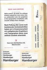
It is a fact of typographic history that the font Helvetica exists today because of Hamburgers … but not the food “Hamburgers.” Eduard Hoffmann, the creator of the ubiquitous typeface, knew the word “Hamburgers” contained the complete range of character attributes in the alphabet; he knew that from this one word the quality of a typeface design could be evaluated, that the features of its anatomy could be examined.

And so, early on in the design of the precursor to Helvetica—called Neue Haas Grotesk—Eduard Hoffmann of the Swiss-based Haas Type Foundry wrote to his designer and confident Max Miedinger, “But our first priority is the word ‘Hamburgers.’ It is the universal type founders’ word that contains all the varieties of letters.”

Helvetica is probably the most successful typeface in all of history. It is everywhere, all the time and there are reasons for this: Helvetica is neutral and easy to read; its different weights and styles effectively embody almost any meaning or message. Helvetica is plain but it is also modern and timeless.

Helvetica came about when typography and printing technology were moving from the metal casting, mechanical and letterpress era to the electronic phototypesetting, word processing, laser imaging and computer age. It rode atop this transformation and became the first truly international typeface. By the mid-1960s, Helvetica emerged as a global standard for public signage, corporate identity and communications.

Sampling of Helvetica Logos
A sampling of corporate identities that use Helvetica.

Regardless of one’s personal opinion of the esthetics and usefulness of Helvetica today, its creation and development—the people who developed it and how they developed it—is one of the most important accomplishments of twentieth century graphic arts.

Eduard Hoffmann was born on May 26, 1892 in Zurich, Switzerland. As a student, he studied technology and engineering in Zurich, Berlin and Munich with a specific interest in aviation. In 1917, the 25-year-old Hoffmann took a position under the direction of his uncle Max Krayer at Haas’sche Schriftgiesserei (Haas Type Foundry) in Münchenstein, Switzerland and made a commitment to the profession of typography. In 1937, Eduard became co-manager of the company with Krayer, and after his uncle’s death in 1944, became sole manager where he remained until his retirement in 1965.

As early as 1950, Hoffmann made a decision to introduce a new sans serif typeface into the Swiss market that could compete with those coming from the other European countries. The origins of san serif typefaces date back to the late eighteenth century where it was used with an embossing technique to enable the blind to read. The first fully developed sans serif (also known as grotesque or grotesk) made its appearance in Germany around 1825 and a French type founder first used the term sans serif (without decorative extensions) in 1830.

The sans serif types that Hoffmann wanted to compete with originally became popular and successful in the late nineteenth century. This was true of Akzidenz Grotesk of the Berlin-based H. Berthold AG type foundry, for example, which was originally designed in 1896. But there were neo-grotesk faces that had since entered the market, Bauer’s Folio and Frutiger’s Univers for example, that threatened to eclipse Hoffmann’s venture.

In 1956, as grotesk font use was surging in Europe, Hoffmann thought the timing was right to attempt a specifically Swiss variety. He contacted Max Miedinger, who had been a salesman and type designer at the Haas Type Foundry for the previous ten years, and wrote “he was the only man to design a new typeface for Haas.”

Max Miedinger
Max Miedinger

Miedinger’s role in the process was decisive and many credit him more than Hoffmann for the creation of Helvetica. It is true that Miedinger made the original hand-drawn letters of the alphabet. But the esthetic component was only one side of the value that Miedinger brought to Haas. It was his in-depth knowledge and relationship with the customers of the type foundry that made Miedinger indispensible to the success of Neue Haas Grotesk and later Helvetica.

Miedinger had access to some of the most brilliant Swiss graphic artists as well as advertising representatives from major Swiss corporations—the chemical firm J.R. Geigy AG among them—and through a painstaking and collaborative development process headed up by Hoffmann, Neue Haas Grotesk took shape.

Throughout 1957 and 1958, the two men collaborated back and forth, fine-tuning each character. The record of the exchange between Hoffmann and Miedinger has been preserved and can be followed in detail in the book, Story of a Typeface: Helvetica forever. The book includes photographic reproductions of the letters the men wrote to each other as well as Hoffmann’s project notebook.

Eduard Hoffmanns Helvetica Notebook
A page from Eduard Hoffmann’s Helvetica notebook dated November 27, 1957.

Hoffmann knew that designing a great typeface was not only about the beauty and logical construction of each individual character, even though this was an important aspect. Each character had to fit together with all the other characters in the various combinations that make letters into words. There was also the technical question of how the typeface would look at different sizes and once it was printed with ink on paper.

As Hoffmann explained in 1957, “praxis has shown that a new typeface cannot be correctly and objectively evaluated until it is in printed form. But even then, it is quite curious to find that a letter might be very satisfactory in a word, while seemingly quite out of place in another context. This makes it necessary to consider its design anew, which usually leads to unavoidable compromises.”

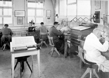
Once they were satisfied with the basic letterforms and had designed enough weights and sizes—at that time, the Haas Type Foundry was punch cutting, engraving and typecasting by hand thousands upon thousands of individual characters in metal—the men took their product to market. With the help of some well-designed promotional brochures and an initial buzz at the Graphic 57 trade fair in Lausanne, Neue Haas Grotesk became a hit. By 1959, about ten percent of the printers in Switzerland were carrying it.

Haas Type Foundry Engraving
The engraving room at the Haas Type Foundry. Lintoype ceased the type casting operations at Haas in 1989.

The Haas Type Foundry was majority-owned by the German firm D. Stempel AG. In turn, Stempel was in a contract with the multinational Linotype Corporation for the production of machine manufactured metal type forms. In order to expand the appeal of Hoffmann and Miedinger’s typeface and to bring it to the world of mass production typography, especially in the US, Linotype’s marketing department pushed for Neue Haas Grotesk to be renamed.

Linotype initially suggested that it simply be named Helvetia (Latin for Switzerland). Hoffmann felt that, although it was distinctly a Swiss product, the typeface could not have the exact same name as the country. He came up with Helvetica, which means “The Swiss Typeface,” and all involved accepted the new name developed by its creator.

Into the 1960s, Helvetica gained spectacular popularity and was adopted as the “in-house typeface” of various international corporations, many of which still use it to this day. Commentary on the significance and social driving force behind the success of Helvetica has often referred to post-war economic expansion. There was a thirst in the 1950s within the creative community for visual clues that conveyed optimism about the future. Designers wanted an excessively modern look that helped to put the bad memories of the first half the twentieth century far behind. For many, Helvetica accomplished this goal.

In 1971, Eduard established a foundation with the aim of creating a museum dedicated to the printing industry. In 1980, in the former Gallician paper mill on the Rhine, the museum opened with Hoffmann’s collection of papers on the history of the Haas Type Foundry as one of its main attractions. Eduard Hoffmann died in Basel, Switzerland on September 17, 1980.

Stanley Morison: 1889 – 1967

stanley-morison
Stanley Morison, May 6, 1889 – October 11, 1967

In 1930 Stanley Morison wrote, “Typography is the efficient means to an essentially utilitarian and only accidentally aesthetic end, for the enjoyment of patterns is rarely the reader’s chief aim. Therefore, any disposition of printing material which, whatever the intention, has the effect of coming between the author and the reader is wrong.”

This is taken from Morison’s essay First Principles of Typography, which became in the decades that followed an industry manual of book typesetting standards, especially in America. By the 1930s, Stanley Morison had acquired a remarkable depth of knowledge and experience in printing. He understood better than most the importance of the “invisible” beauty and subordination of form to function in typography.

First Principles of Typography (small)Morison’s first principle still applies today: when it comes to typographic design and style—especially in books—easing the comprehension of the text is the primary objective. “Dullness and monotony” and “obedience to convention” are preferred over “eccentricity or pleasantry” and “typographical experiment.” A text is useless if it is hard to read because it is “different” or “jolly.”

One might conclude from the above that Stanley Morison was opposed to typographic innovation, but nothing is further from the truth. Within a year of writing his tribute to typographical tradition, Morison would develop and design—in collaboration with the graphic artist Victor Lardent—one of the most widely used typefaces in history: Times New Roman.

Stanley Arthur Morison was born May 6, 1889 in Wanstead in Essex between London and Epping Forest. As a child of seven or eight, the family moved to north London. Stanley lived at this location on Fairfax Road, Harringay until he was 23 years old.

Stanley was largely self-taught. He left school at age 14 to find work after his father—who was a traveling salesman—abandoned the family. His mother was strong-willed and inspired Stanley to serious and independent study. He was influenced by her to take up philosophy and a study of ancient manuscripts (palaeography), spending his spare time at King’s Library at the British Museum.

The Imprint (small)
Stanley Morison was an editorial assistant for the “The Imprint” magazine in 1913.

At age 23, while working unhappily as a bank clerk, Stanley read a supplement published by The Times that carried an ad about the start of a new magazine on printing called The Imprint. After the first issue appeared in January 1913, he applied for and was hired as an editorial assistant. This job would prove to be the beginning of the extraordinary graphic arts career of Stanley Morison.

During World War I, Morison was imprisoned for being a conscientious objector. Following the war, Stanley underwent a conversion to Catholicism and began a study of liturgical writings, hymnals and other early church publications. In 1919, he became design supervisor for Pelican Press and in 1921 published his first typographical study: “The Craft of Printing: Notes on the History of Type Forms.”

In 1922—along with Francis Meynell, Holbrook Jackson, Bernard Newdigate and Oliver Simon—Stanley became a founding member of the type-centric Fleuron Society (a fleuron is a typographer’s floral ornament). Seven volumes of their journal called The Fleuron appeared between 1923 and 1930. Each lavish edition contained papers, illustrations, specimens and essays by contemporary authorities on typography and book design.

The Fleuron (small)
The first issue of “The Fleuron,” journal of the Fleuron Society of which Stanley Morison was a founding member.

The scholarly works contained in The Fleuron remain relevant today as the material spans all publishing forms (print and electronic) and technologies (conventional and digital). It was in this publication that Morison’s “First Principles of Typography” originally appeared.

In 1923 Stanley Morison became a typographic consultant for the Monotype Corporation. Monotype was a manufacturer of hot metal casting machines that industrialized and revolutionized in the 1880s—along with Linotype Corporation—the process of making type for print. While the Linotype machine cast complete lines of type primarily for newspaper publishing, the Monotype machine cast individual characters and was often used in book and other “fine” printing.

During the remainder of the 1920s, Morison became involved in Monotype’s program of old style type revival. Sparked by technological innovation, the first few decades of the twentieth century witnessed a typographic renaissance. At Monotype fonts such as Bodoni, Baskerville, Bembo, Centaur, Perpetua and others were reinterpreted and recut under Morison’s direction.

In 1929 Stanley Morison publicly criticized The Times for being poorly printed and typographically antiquated. Following discussions with the publisher, Morison was hired as a consultant and commissioned in 1931 to develop a new, easy-to-read typeface for the newspaper. His task was to design a font that was economical—capable of fitting more copy in a column than previous typefaces—as well as technically compatible with the printing machinery of the time.

Morison began his work with an authoritative historical survey called The typography of The Times that showed the evolution of its type. Morison presented to the publisher a folio with 42 full-size reproductions from the earliest days in the eighteenth century into the 1920s to make the case for his solution.

Tally of Types (small)
Morison’s description of the development of Times New Roman in “A Tally of Types.”

In “A Tally of Types” in 1953, Morison wrote that he “penciled the original set of drawings, and handed them to Victor Lardent, a draughtsman in the publicity department of Printing House Square,” who Stanley “considered capable of producing an unusually firm and lean line.” The drawings were then used by Monotype to cut the punches for the first set of Times New Roman types. The first issue of The Times to use the new typeface appeared on October 3, 1932.

As a historian, Morison was appreciative of the accomplishments of others before him that made his work possible. In summing up the experience with the typography of The Times, Morison explained, “Above 14,750 punches, including those corrected (a large number), were cut by Monotype Corporation for the installation at Printing House Square. … Their cutting was a triumph for the mechanism invented by Linn Boyd Benton of Milwaukee. In 1885 he adapted the pantograph principle to the mechanical cutting of the punches used for striking the matrices from which the type is cast. This invention lies at the basis of all mechanical composition, which requires at some stage the pouring of metal into a single matrix or line of matrices.”

Following the achievement of Times New Roman, Stanley Morison continued his design consulting work with Monotype and The Times for three decades. He became editor of the History of the Times from 1935 to 1952 and he was also editor of The Times Literary Supplement between 1945 and 1948. He spent his later years on typographical research. Although he was offered a knighthood in 1953 and the CBE in 1962, he declined both. He was elected a Royal Designer for Industry in 1960. He died on October 11, 1967 at the age of 78.

It is difficult to appropriately summarize the work of a figure such as Stanley Morison in this small space. Although his writings have never been brought together into a single collection or set of volumes, Morison was a prolific scholar and practitioner of the graphic arts. He was perhaps the most important theoretician, designer and historian of print in the twentieth century.

Postscript

In 1994, printing historian Mike Parker published findings that showed Times New Roman was based upon a design originally made by William Starling Burgess in 1904. A complete review of Parker’s story can be found in an article titled “The history of the Times New Roman typeface” on the FT Magazine web site (http://on.ft.com/M7kYD3). Although still controversial, The Times began in 2007 accepting the possibility of an alternative history to the one provided by Morison about the origin of the famous font. According The Times web site, Times New Roman was designed by Morison, Lardent “and possibly Starling Burgess.” In 2009, Mike Parker worked with The Font Bureau, Inc. and published a font series called Starling based upon Burgess’s original conception.