Karel Vaclav Klíč (Klietsch): 1841 – 1926

Everyone is familiar with National Geographic magazine. Published monthly and now celebrating its 125th year, National Geographic has a worldwide circulation of more than 8 million copies and appears in thirty-six languages. Widely known for the yellow rectangular border of its cover and the use of dramatic color photographs of world geography, history and culture, it is one the most popular magazines ever printed.

National Geographic

The name National Geographic is used occasionally as a printing industry euphemism. Someone might say, “It’s not National Geographic” when speaking of color reproduction expectations of other projects. What most are unaware of, however, is that National Geographic achieves such beautiful and spectacular color printing largely because of the gravure method used in the printing of its editorial pages.
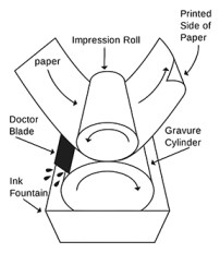
The gravure printing process

Although less common in publication printing than offset lithography, gravure printing is typically associated with magazines that have very large circulation. According to Hans Wegner, VP of Production Services at National Geographic, gravure printing provides superior color saturation and consistency, a more photographic look as well as cost advantages.

The gravure process—a form of intaglio printing—involves engraving an image carrier, typically a metal cylinder, with recessed cells. The cylinder is immersed and rotates in fluid ink. As the cylinder turns, ink fills the imaging cells and, before making contact with the paper, a doctor blade scrapes the excess ink off the cylinder in the non-image area. The paper is brought into contact with the inked cylinder by an impression roller and the ink is drawn out of the cells onto the paper by capillary action.

The high quality reproduction of gravure printing is the result of the following attributes:

  1. Very fine halftone dot sizes that emulate the grain of continuous tone photography and can reproduce greater image detail than offset printing.
  2. A CMYK color gamut than that is often wider than that of offset printing because a greater amount of ink pigment is transferred the surface of the paper.

The history of gravure printing is complex and poorly documented. Dealing with the lack of reliable historical information in his History of Industrial Gravure Printing up to 1920, Otto M. Lilien wrote, “More and more of the technical development is described with only sketchy details and it is noticeable that the references are often missing. Frequently the information contradicts itself regarding the person credited with inventions and technical improvements.”

The manual gravure printing process was created and perfected in the nineteenth century and the earliest inventions are associated with photography. In 1826, Joseph-Niécephore Niépce developed the first photomechanically etched printing plate that was made of zinc and used to print portraits. In 1852, William Henry Fox Talbot developed a method for making gravure printing plates that could transform a continuous tone picture into a halftone.

According to Lilien, Paris publisher Auguste Godchaux took out the first patent for a gravure printing press that used cylinders and printed on a web of paper in France, in 1860. Godchaux built the press and it ran for 80 years in a printing facility in Paris on Boulevard Charonne until the Nazi’s occupied the city in 1940.

Karel Klíč
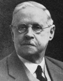
Karel Klíč (also known as Karl Klietsch), May 31, 1841 – November 16, 1926

Karel Klíč (Karl Klietsch) is the recognized inventor of modern gravure printing. Although it is sometime stated that Klíč developed all of the complex gravure processes without knowledge of the work of others, he was actually the first to bring all of them together. According to Lilien, Klíč brought together the crossline screen and the transfer of gelatine pictures to metal plates for cylinder production.

Karel Vaclav Klíč was born on May 31, 1841 in Hostinne, in the foothills of the Krkonose Mountains in the present-day Czech Republic and about 35 Kilometers from the border with Poland. The town has been known as a center of papermaking.

Klíč showed interest in the arts and at the age of fourteen was admitted to the Art Academy in Prague where he was expelled for nonconformance in 1855. He later returned to complete his studies. As a young man, Klíč worked as a draughtsman, a painter, illustrator and cartoonist. With his latter skills he worked at newspapers in Prague, Brno (Moravia) and Budapest before opening a photographic studio in Vienna, Austria in 1883.

While in Austria, Klíč joined the Photographic Society of Vienna and was exposed to many of the new developments in reproduction methods. His early attempts at photogravure techniques were exhibited with much acclaim at the annual society exhibitions in 1879 and 1880. During these years, Klíč did not reveal anything publicly about his methods. Recognizing the monetary value of the process he had perfected, Klíč sold the process to others in Vienna and London.

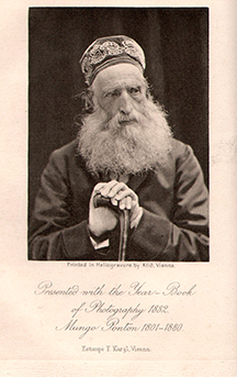
In 1880 and 1881, several of Klíč’s photos were published in an Austrian journal Photography Correspondence. In 1882 a heliogravure portrait of Mungo Ponton—a Scottish pioneer in photographic techniques and an amateur scientist—was reproduced as a special insert to the British The Yearbook of Photography and Photographic News Almanac.
Mungo Ponton
Klíč’s heliogravure photo of Mungo Ponton published as a special insert in the “Yearbook of Photography and Photographic News Almanac in 1882”

Writing about the significance of the image of Ponton, the editor of the almanac wrote, “We ought to say a word about our portrait of Mungo-Ponton, an Englishman who may well be termed the discoverer of permanent photographic printing, for he it was who proposed, in 1839, the employment of bichromate in photography. Klic’s is an etching process upon copper, an imprint from a carbon diapositive being secured upon that metal. The mode of preparing the copper is a secret, but we may mention that the process is so quick, that within four or five days an engraved plate may be produced of considerable dimensions. Of the quality of the printing our readers can judge for themselves. Suffice it to say, the process is an inexpensive one, and that during the past year alone, no less than three hundred photo-engravings were produced.”
Samuel Fawcett
Samuel Fawcett, a process worker at Storey Brothers, was co-inventor with Klíč of the industrial gravure printing method in 1895.

After one of his business associates by the name of Leonard published the details of his process in an Austrian technical journal in March 1886, Klíč left the country in frustration and traveled to England. It was during this trip that Klíč came into contact with Samuel Fawcett, a process worker at the Storey Brothers, a calico-printing firm located in Lancaster.

It is known that Klíč’s vision for gravure reproduction extended beyond single sheet photographic prints. Fawcett had been working independently in 1890 on a series of gravure experiments and his contact with Klíč was the catalyst for the development of entirely new industrial printing system.

Klíč and Fawcett, beginning in 1895 with formation of the Rembrandt Intaglio Printing Company, jointly developed the rotogravure process—modern gravure printing. The men experimented with screens of 150 and 175 lines per inch and printing on paper with machines owned by Storey Brothers and designed for printing on textiles.

The process developed by the Rembrandt Intaglio Printing Company remained secret for ten years, giving the firm lucrative monopoly on the process before any competitors emerged in the market. In 1897, while technical director of the company, Klíč left England and returned to Vienna to continue with further experimentation and invention. He came back for a short time in 1906 after he perfected a method for three-color gravure process with fine halftone screens. Karel Klíč died in Vienna on November 16, 1926.

Surveys show preference for print media

Several recent surveys and reports substantiate the fact that print is both a highly successful choice for advertisers as well as a preferred marketing media for consumers. Interestingly, according to these studies, even among young people and the affluent—where one might expect a higher rate of loyalty to electronic and social media alternatives—print is still a favored source of offers, promotions, information and news.

Millennial shoppers

On September 11, Valassis—a leader in intelligent media delivery and printed coupon advertising—announced the results of its Sixth Annual RedPlum Purse String Survey of over 5,000 shoppers taken in June and July of this year. The results provided insights into the shopping behavior of millennials: the generation of young people born between 1982 and 2004.

The Purse String Survey showed that the millennial generation relies heavily on newspaper advertising print coupons and offers in the same way that all other age groups and income levels do. The top print sources for the millennials are:

  • 33 percent from the mail
  • 21 percent from retail circulars
  • 20 percent from coupon books

While the younger generation is, of course, very active with digital advertising, they are getting their promotions to a larger degree from these sources than the rest of the population. But according to Lisa Reynolds, Valassis VP of Consumer Engagement, “The RedPlum Purse String Survey results are somewhat counter intuitive from what you might expect based on what we know about millennials … While they are heavy digital users, this group also embraces tried and true methods for savings, as much as any other age group. Promotion sensitive, they are a true testament to the use of savings from both print and digital sources.”

Millennials Share Coupons

When it comes to sharing promotions and deals with others, millennials are the most active:

  • 90% of millennials share deals with others
  • 45% of millennials share deals through social media, compared to 29% among everyone
  • 30% of millennials share deals through text, compared to 19% among everyone
  • 71% of millennials share deals through word of mouth, compared to 56% among everyone
  • 45% of millennials share or send physical coupons compared with 42% among everyone

Affluent readers

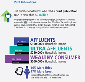
On September 19, the 2013 Ipsos Affluent Survey USA reported that affluent adults (households with and annual income of $100,000 or more) “continue to be enthusiastic consumers of traditional media,” even as their use of digital media continues to grow sharply.

The study projected that there are 62.5 million affluent adults in the US, which is up more than 6% over the past two year and represents approximately 20% of the total US population.

Affluent Adults Read Print MediaThe Ipsos survey found that 81% of affluent adults regularly read at least one of the 142 measured and reported print publications (135 magazines and 7 national newspapers).

The survey results on print readership is in contrast to the fact that affluent adults are also increasing the amount of time that they spend online each week. And they are increasing their use of smartphones, tablets and downloads of digital newspapers and magazines.

Direct mail vs. email marketing

An analysis of all Internet traffic in 2012 published by Pingdom reported that there were 144 billion email messages sent each day and that 68.8% of this was spam. Additionally, the data showed that 61% of all email was considered nonessential. Another report by HubSpot showed that three quarters of all email remains unopened and “click through” rates are below 5%.

This is in contrast to information published by the USPS in the Household Diary Study. This data from 2011 showed that the advertising mail represented 61% of all household mail or 85.1 billion pieces of print advertising entering homes in the US.

The survey showed that 78% of households either read or scan their advertising mail and only 21% say that they do not usually read their advertising mail. The USPS diary results also showed that 62% of households say they read or scan catalogs received in the home, with 13% setting them aside for later reading and only 17% discarding them without reading.

Additionally, the survey showed that households with Internet access receive more advertising mail than those without access.

Challenges to print

There continues to be a steady push by advertisers and marketers to move the behavior of the consumer away from print media to online alternatives, primarily because the cost of delivery is far lower.

A campaign recently launched by the CVS drugstore chain called “What’s your deal?” utilizes the integration of print, TV, mobile and social media channels to promote personalized offers based on previous consumer buying. The campaign offers customers who belong to the CVS ExtraCare loyalty program a personalized version of the weekly print circulars distributed through newspapers and in stores to an estimated 45 million people.

Users of the program will be able to build digital shopping lists that can be personalized based on the CVS location where they shop including the layout of the store and where they can find each product on the shelf.

According to a representative of the agency that developed the “What’s your deal?” program, “We’re trying to get people to change their behavior by going online for a much more personalized experience” rather than checking weekly circulars. “The print circular is going to be around for a while, but eventually it’s going to go away,” he added. “We have to prepare for the future.”

In the meantime, the above surveys on consumer and household behavior show that print media continues to be a preferred media for advertising, offers, information and news among the population. They also show that where print is integrated with digital and social media campaigns, its value in increased.

Herb Lubalin: 1918 – 1981

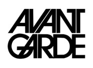
Avant Garde NameplateIn 1978, when I was a senior in high school, my art teacher gave me some graphic design magazines. Knowing I loved art and design, he told me “Hold on to these. They will be worth something one day.” What he gave me was a nearly complete set of Avant Garde, an innovative arts and culture magazine published between January 1968 and July 1971.

At the time, I could not have understood the significance of these magazines or what they were all about. So, I browsed through them a couple of times and then stuck them in a box. And there they sat for 35 years until a few months ago when I dug them out started looking through them again.

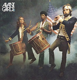
Avant Garde Number 7If you know something about the social and cultural climate in America during 1968-71, you can probably figure out what the magazine was about. For example, issue number 7 from March 1969 had a front cover photograph that is a parody of Archibald Willard’s famous patriotic painting “The Spirit of ’76”; Carl Fischer’s version of the image includes a white woman and a black man as two of the three Minutemen from the American Revolution.

You will have to look up Avant Garde magazine on the Internet for yourself to learn more about its editorial perspective. Suffice it to say that Ralph Ginzburg was the editor and Avant Garde “was extremely popular in certain circles, including New York’s advertising and editorial art directors.”

Most importantly, however, Avant Garde was a breakthrough publication creatively; during its four years of existence, it was the cutting edge of graphic design, especially typography. This is not hard to believe when you learn that the magazine’s art director was Herb Lubalin, one of the most important American graphic and type designers of the 1960s and 1970s.

*  *  *  *  *  *

Herb Lubalin in his studio in 1975

Herbert F. Lubalin was born in New York City on March 17, 1918. As a high school student he did not show a particular interest in the graphic arts, although he liked to draw. He entered art school at Cooper Union at the age of 17 where his interest in typography was nurtured.

Herb graduated in 1939 and first worked as a freelance designer and typographer. It has been reported that he was fired from a position at a display company after he requested a two-dollar raise on his weekly eight-dollar salary.

Soon thereafter, and for the next twenty-five years, Lubalin worked as an art director for advertising agencies. The New York City firms he worked for included Deutsch & Shea, Fairchild Publications, Reiss Advertising and Sudler & Hennessey. During these years, Lubalin established himself as a genius of what would be later called “typographics” or “expressive typography,” i.e. words and letters as imagery with verbal and conceptual twists.

This was achieved through a meticulous creative approach to advertisements, trademarks and logos, posters, magazines and packaging design. In 1952, Herb won a New York Art Directors Club Gold Medal as creative director at Sudler & Hennessey, the first of hundreds of awards he would receive during his career.

After leaving Sudler in 1964, he established his own graphic design consultancy called Herb Lubalin, Inc. This was the first of multiple businesses and subsidiaries that Lubalin would found in both the US and Europe over the next two decades. In 1970, along with Aaron Burns and Edward Ronthaler, Lubalin created the International Typeface Corporation (ITC), one of the world’s first type foundries that had no history in hot metal type design.

Lubalin Smith Carnase
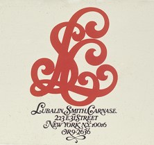
Lubalin established a partnership with Ernie Smith and Tom Carnase in 1967

Herb Lubalin achieved worldwide success as an art director and graphic designer during the “Mad Men” era (of the popular AMC TV series) of advertising. Lubalin became identified with graphic clarity and simplicity embodied in the following statement he made some years later, “Typography is a servant—the servant of thought and language to which it gives visible existence.”

In terms of the technology of type, this was the age of phototypesetting. The replacement of hot type with cold type meant that a new library of modern fonts could be developed. It also meant that type forms could be manipulated in ways that were extremely difficult, if not impossible, with the metal casting.

Although Lubalin’s ITC took up the task of preserving and reviving old classic faces such as ITC Bookman and ITC Garamond, the foundry also specialized in modern sans serif fonts such as ITC Franklin, ITC American Typewriter, ITC Kabel and ITC Bauhaus among many others.

ITC Fonts by Herb Lubalin and Others
Some of the fonts developed by Herb Lubalin and others at ITC in the 1960s and 1970s

Herb Lubalin’s relationship with Ralph Ginzburg—who was convicted in 1963 for violating US obscenity laws—was noteworthy. The two worked together on three of groundbreaking magazines: Eros (1962), Fact: (January 1964–August 1967) and the aforementioned Avant Garde.

Avant Garde magazine proved to be most significant for Lubalin, specifically for his design of the publication nameplate. The Avant Garde moniker became so popular that Lubalin, his partner Tom Carnase and the type designer Edward Benguiat developed an entire font set from it. What became the Avant Garde Gothic type design included a series of ligatures (combinations of two letters into one type element), an innovative development for a sans serif font.

Officially launched by ITC in 1970, Avant Garde Gothic became one of the most popular typefaces of the era. Although it came under criticism and was eschewed by the post-modernist graphic design community for its structural and grid-like consistency, Avant Garde Gothic was eventually included in the set of 35 base fonts on the Adobe PostScript print engine that was launched in the 1980s. For this reason, Avant Garde Gothic continues to be one of the most popular and often used alternatives to Helvetica.

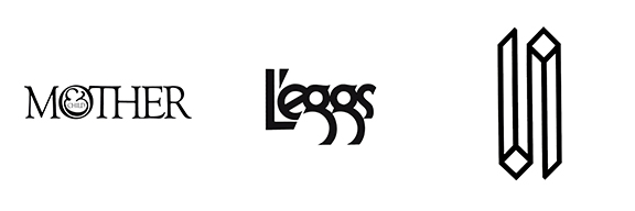
Lubalin LogosHerb Lubalin designed some of the most memorable and lasting images of expressive typography that have ever been created. His publication nameplate for “Mother & Child,” logo for L’eggs and logo for the World Trade Center are part of iconic graphic design history.

Herb Lubalin had a near legendary reluctance to talk with anyone, especially the media and trade publications, about his work and some interpreted his reserved character as a lack of intellectual acumen. However, Lubalin was a very sharp advocate of his approach to his craft and he was not averse to sharing his knowledge with those who wanted to learn, particularly students.

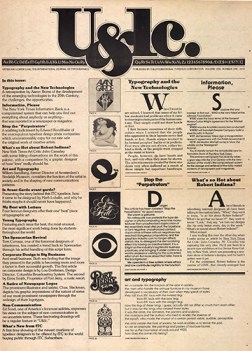
The first edition of U&lc, 1973

In 1973, Lubalin launched, became editor and art director of International Typeface Corporation’s quarterly in-house publication called U&lc (Upper and lower case). The journal became an instant force in the industry and rapidly built up a subscription circulation of 170,000 readers. It was in U&lc that some of Lubalin’s conceptions about graphic and type design can be studied and learned about.

The following statement—published in the introduction to Graphis Annual 65/66—shows that Herb Lubalin possessed a sharp, critical and iconoclastic attitude to the industry that he devoted his life to, “Advertising in the U.S.A. is a fairly stupid business. We have made it that way by underestimating the intelligence of the American people. The bulk of our output is devised to appeal to the sub-teen-age mentality of that great big consuming monster that we have created. Who’s responsible? Those of us that put absolute faith in antiquated, ineffective, stereotyped, outmoded, unreliable, unbelievable, valueless research methods such as copy testing. …  If recent statistics are any indication of the value of copy-testing, we would all be advised to spend our research money researching successful art-directors and copy-writers, knowledgeable creative people who have made their reputations not by fancy words and pretty designs, but by creating intelligent advertising that appeals to a surprisingly intelligent audience (the American people).”

Beginning in 1972, Lubalin began teaching graphic design at Cornell University and starting in 1976 he taught a course at Cooper Union where he remained until his death on May 24, 1981 at New York University Hospital.

*  *  *  *  *  *

I recently searched for copies of Avant Garde magazine on eBay and found that my high school art teacher was right about how they would be worth something. Although a full set of 14 editions is only going for several hundred dollars, I’m glad I still have my copies of an important piece of modern graphic and type design history.