Aldus Manutius: 1449/1450 – 1515

The great cultural movement called the Renaissance (rebirth) spanned the fourteenth to the seventeenth centuries. This places Johannes Gutenberg’s 1450 invention of printing early in that era. As is widely acknowledged by historians, printing was not only the most important technological achievement of the Renaissance; it was also its greatest catalyst.

Aldus Manutius
Aldus Manutius: 1449/1450 – 1515

Along with the expansion of world trade and the circumnavigation of the globe—combined with enthusiasm for Gutenberg’s innovation—printing spread rapidly from Germany to destinations across Europe and elsewhere. And, as the business and products of “mechanical writing” proliferated, the knowledge that came along with it multiplied exponentially.

Eventually, like so many printing press pebbles tossed into the global pond, the ripple waves of literacy and democracy spread and connected with one another. By the eighteenth century, the achievements of the Renaissance led to the age of Enlightenment. And so, one of the most remarkable end results of this technical and cultural transformation was the American Revolution of 1776 … but that takes us a long way from the subject of this review.

The Renaissance, especially in Italy, was shaped by humanist teachings, i.e. the notion that citizens should be educated in the humanities (language, literature, philosophy, religion and the arts). Florence, Naples, Rome, Venice and Genoa were among the centers of Italian humanism. Great collections of antique hand written manuscripts and also printed books were assembled in libraries and made available for study primarily for those of wealth and means.

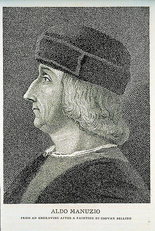
It was within this environment that Aldo Manuzio (Aldus Manutius is Latinized) was born in Bassiano, Italy about 100 kilometers south of Rome. The precise date of his birth is not known. It has been surmised that he was born in 1449 or 1450 from the preface to a book published by Aldus’ grandson, Aldus, The Younger, in 1597.

Very little is known about Aldus’ early life. In his The Rudiments of Latin Grammar published in 1501, Aldus mentions he was trained in Latin at a young age. This information—along with the fact that he had an ancestor that was a Bishop—indicates that his family was well off.

Aldus left Bassiano for Rome, perhaps as young as 15 years of age, to be educated as a humanist scholar. His classical studies in Latin continued in Rome for eight years at which time he moved to Ferrara to conduct studies in Greek. Sometime around 1479 or 1480, having established himself as a scholar of the highest quality, the King of Carpi hired Aldus to become the teacher of his nephews. It was during his time in Carpi that Aldus developed his interest in publishing and printing.

By the 1400s, Venice was a center of world commerce much like New York City might be considered today; everything important was happening there. And so, it was to this Italian center of so many things that Aldus, at the time in his late 30s, decided to relocate and start a publishing enterprise.

There is almost no information available about Aldus’ activity during his first five years in Venice. It has been deduced that he spent this time preparing and setting up a viable publishing business—learning the book market and printing technique—in a very competitive environment. Printing arrived in Venice by way of Germany twenty years earlier and there were well-known firms already operating by the time Aldus launched his enterprise.

A page from Aldus printing of Aristotle
A page from one of the 5 volume set of “Aristotle” published by Aldus between 1495 and 1499

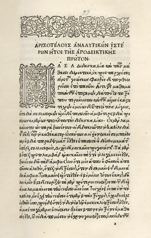
Aldus’ initial activity—and this would prove to be his most important accomplishment—was to edit and republish authoritative editions of the classics of literature. The initial project, a reissue of the Greek Grammar of Constantine Liscaris in 1495, was the first volume to be published under Aldus’ name although Andrea Torresani’s press likely did the printing.

A big breakthrough came in that same year with the publication in Greek of the first of a five-volume folio edition of the works of Aristotle. It would take four years to complete the project. This work has been referred to as the “greatest scholarly and printing achievement of the fifteenth century.” Aldus then went on to edit and publish Thucydides, Sophocles and Herodotus in 1502, Xenophon’s Hellenics and Euripides in 1503 and Demosthenes in 1504. In the decade before his death, Aldus also published editions of Latin and Italian classics. 

Aldine Press printers mark
The Aldine Press trademark symbolizing the adage “Festina lente” (Make haste slowly)

By 1496, had his own printing operation and began using various forms of “at Aldo’s” to signify the source of his publications as what later became known as the Aldine Press. In 1498, Aldus began using the Aldine Press trademark—the emblem of the dolphin wrapped around the anchor that symbolized the Latin phrase “Festina lente” (Make haste slowly)—on all of his works. At this point Aldus turned his attention to innovations in the forms of print, the first big contribution being in typography.

The typography of print as it arrived from Germany was in the Gothic form of heavy, “gross” lettering as seen in the Gutenberg bible. By 1470, Nicholas Jenson—who had come to Venice from France—had transformed the printed word and created the Renaissance book with his slender roman typeface and capital letters.

Title page from Virgil Opera with italics
Title page from Virgil’s Opera, the first book published in the Aldine italic typeface

Aldus began with Jenson’s typeface and reworked it into his own style for the Greek classics. His desire was to make the fonts look like the work of human handwriting. This effort would ultimately lead to the development of the “italics” that emulated cursive writing and also became known at times as the Aldino typeface. Francesco Griffo, to whom Aldus later paid tribute, performed the actual artistry of cutting the slanted italic. The first book that contained Aldus’ italic font was the 1501 Aldine Press edition of Virgil’s Opera.

The early period of printing—from 1450 to 1500—is often referred to as the “incunabula” or cradle of printing. At that time, most books were printed in folio format, i.e. page sizes of approximately 14.5” by 20” (the pages in the Gutenberg bible are approximately 17” x 24.5”). These were very large books that could be read wherever they were located; they were not portable.

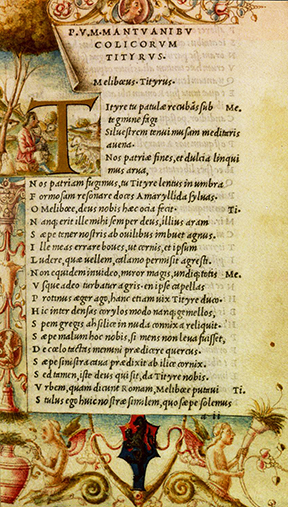
This is when Aldus made another historic advancement. As explained by Helen Barolini in her Aldus and his Dream Book, “The real revolution, the moment of true divulgation of the printed word that impelled Western society … came when Aldus brought out his edition of Virgil’s Georgics in elegant, octavo format that was to become the staple of the Aldine press and Aldus’ trademark.”

Comparison of folio to octavo book dimensions
A comparison of folio and octavo book dimensions, courtesy ILAB.
Aldus created the first octavo book.  

The octavo format is approximately 7.25” x 10,” something very close to what would be found today in a bookstore. Aldus produced the very first modern book that was small enough and inexpensive enough for someone to take with them almost anywhere.

Aldus’ other innovations included a unique method for bookbinding sometimes referred to as “binding in the Greek style” and advancements in punctuation such as the creation of the semicolon and the modern comma.

Aldus Manutius married Maria, the daughter of Andrea Torresani—the owner of a printing firm with whom he had worked early on in Venice—in 1505. Aldus died on February 6, 1515. His brothers-law took over the Aldine press and ran it until 1533 when Aldus’ third son Paulus Manutius assumed control of the business. It is believed that the Aldine Press published more than 1,000 titles in the hundred years that ended in 1595.

The scholar, humanist, publisher and printer Aldus Manutius was a monumental figure of the Renaissance. He was a force for the expansion of literacy and knowledge for everyone. Fortunately, his books have survived and there is a substantial record of his work including his own words that were often printed in the preface of Aldine Press books. In the Thesaurus Cornucopiae of 1496, Aldus wrote:

“My only consolation is the assurance that my labors are helpful to all … so that even the ‘book-buriers’ are now bringing their books out of their cellars and offering them for sale. This is just what I predicted years ago, when I was not able to get a single copy from anyone on loan, not even for one hour. Now I have got what I wanted: Greek volumes are made available to me from many sources … I do hope that, if there should be people of such spirit that they are against the sharing of literature as a common good, they may either burst of envy, become worn out in wretchedness, or hang themselves.”

Herb Lubalin: 1918 – 1981

Avant Garde NameplateIn 1978, when I was a senior in high school, my art teacher gave me some graphic design magazines. Knowing I loved art and design, he told me “Hold on to these. They will be worth something one day.” What he gave me was a nearly complete set of Avant Garde, an innovative arts and culture magazine published between January 1968 and July 1971.

At the time, I could not have understood the significance of these magazines or what they were all about. So, I browsed through them a couple of times and then stuck them in a box. And there they sat for 35 years until a few months ago when I dug them out started looking through them again.

Avant Garde Number 7If you know something about the social and cultural climate in America during 1968-71, you can probably figure out what the magazine was about. For example, issue number 7 from March 1969 had a front cover photograph that is a parody of Archibald Willard’s famous patriotic painting “The Spirit of ’76”; Carl Fischer’s version of the image includes a white woman and a black man as two of the three Minutemen from the American Revolution.

You will have to look up Avant Garde magazine on the Internet for yourself to learn more about its editorial perspective. Suffice it to say that Ralph Ginzburg was the editor and Avant Garde “was extremely popular in certain circles, including New York’s advertising and editorial art directors.”

Most importantly, however, Avant Garde was a breakthrough publication creatively; during its four years of existence, it was the cutting edge of graphic design, especially typography. This is not hard to believe when you learn that the magazine’s art director was Herb Lubalin, one of the most important American graphic and type designers of the 1960s and 1970s.

*  *  *  *  *  *

Herb Lubalin in his studio in 1975

Herbert F. Lubalin was born in New York City on March 17, 1918. As a high school student he did not show a particular interest in the graphic arts, although he liked to draw. He entered art school at Cooper Union at the age of 17 where his interest in typography was nurtured.

Herb graduated in 1939 and first worked as a freelance designer and typographer. It has been reported that he was fired from a position at a display company after he requested a two-dollar raise on his weekly eight-dollar salary.

Soon thereafter, and for the next twenty-five years, Lubalin worked as an art director for advertising agencies. The New York City firms he worked for included Deutsch & Shea, Fairchild Publications, Reiss Advertising and Sudler & Hennessey. During these years, Lubalin established himself as a genius of what would be later called “typographics” or “expressive typography,” i.e. words and letters as imagery with verbal and conceptual twists.

This was achieved through a meticulous creative approach to advertisements, trademarks and logos, posters, magazines and packaging design. In 1952, Herb won a New York Art Directors Club Gold Medal as creative director at Sudler & Hennessey, the first of hundreds of awards he would receive during his career.

After leaving Sudler in 1964, he established his own graphic design consultancy called Herb Lubalin, Inc. This was the first of multiple businesses and subsidiaries that Lubalin would found in both the US and Europe over the next two decades. In 1970, along with Aaron Burns and Edward Ronthaler, Lubalin created the International Typeface Corporation (ITC), one of the world’s first type foundries that had no history in hot metal type design.

Lubalin Smith Carnase
Lubalin established a partnership with Ernie Smith and Tom Carnase in 1967

Herb Lubalin achieved worldwide success as an art director and graphic designer during the “Mad Men” era (of the popular AMC TV series) of advertising. Lubalin became identified with graphic clarity and simplicity embodied in the following statement he made some years later, “Typography is a servant—the servant of thought and language to which it gives visible existence.”

In terms of the technology of type, this was the age of phototypesetting. The replacement of hot type with cold type meant that a new library of modern fonts could be developed. It also meant that type forms could be manipulated in ways that were extremely difficult, if not impossible, with the metal casting.

Although Lubalin’s ITC took up the task of preserving and reviving old classic faces such as ITC Bookman and ITC Garamond, the foundry also specialized in modern sans serif fonts such as ITC Franklin, ITC American Typewriter, ITC Kabel and ITC Bauhaus among many others.

ITC Fonts by Herb Lubalin and Others
Some of the fonts developed by Herb Lubalin and others at ITC in the 1960s and 1970s

Herb Lubalin’s relationship with Ralph Ginzburg—who was convicted in 1963 for violating US obscenity laws—was noteworthy. The two worked together on three of groundbreaking magazines: Eros (1962), Fact: (January 1964–August 1967) and the aforementioned Avant Garde.

Avant Garde magazine proved to be most significant for Lubalin, specifically for his design of the publication nameplate. The Avant Garde moniker became so popular that Lubalin, his partner Tom Carnase and the type designer Edward Benguiat developed an entire font set from it. What became the Avant Garde Gothic type design included a series of ligatures (combinations of two letters into one type element), an innovative development for a sans serif font.

Officially launched by ITC in 1970, Avant Garde Gothic became one of the most popular typefaces of the era. Although it came under criticism and was eschewed by the post-modernist graphic design community for its structural and grid-like consistency, Avant Garde Gothic was eventually included in the set of 35 base fonts on the Adobe PostScript print engine that was launched in the 1980s. For this reason, Avant Garde Gothic continues to be one of the most popular and often used alternatives to Helvetica.

Lubalin LogosHerb Lubalin designed some of the most memorable and lasting images of expressive typography that have ever been created. His publication nameplate for “Mother & Child,” logo for L’eggs and logo for the World Trade Center are part of iconic graphic design history.

Herb Lubalin had a near legendary reluctance to talk with anyone, especially the media and trade publications, about his work and some interpreted his reserved character as a lack of intellectual acumen. However, Lubalin was a very sharp advocate of his approach to his craft and he was not averse to sharing his knowledge with those who wanted to learn, particularly students.

The first edition of U&lc, 1973

In 1973, Lubalin launched, became editor and art director of International Typeface Corporation’s quarterly in-house publication called U&lc (Upper and lower case). The journal became an instant force in the industry and rapidly built up a subscription circulation of 170,000 readers. It was in U&lc that some of Lubalin’s conceptions about graphic and type design can be studied and learned about.

The following statement—published in the introduction to Graphis Annual 65/66—shows that Herb Lubalin possessed a sharp, critical and iconoclastic attitude to the industry that he devoted his life to, “Advertising in the U.S.A. is a fairly stupid business. We have made it that way by underestimating the intelligence of the American people. The bulk of our output is devised to appeal to the sub-teen-age mentality of that great big consuming monster that we have created. Who’s responsible? Those of us that put absolute faith in antiquated, ineffective, stereotyped, outmoded, unreliable, unbelievable, valueless research methods such as copy testing. …  If recent statistics are any indication of the value of copy-testing, we would all be advised to spend our research money researching successful art-directors and copy-writers, knowledgeable creative people who have made their reputations not by fancy words and pretty designs, but by creating intelligent advertising that appeals to a surprisingly intelligent audience (the American people).”

Beginning in 1972, Lubalin began teaching graphic design at Cornell University and starting in 1976 he taught a course at Cooper Union where he remained until his death on May 24, 1981 at New York University Hospital.

*  *  *  *  *  *

I recently searched for copies of Avant Garde magazine on eBay and found that my high school art teacher was right about how they would be worth something. Although a full set of 14 editions is only going for several hundred dollars, I’m glad I still have my copies of an important piece of modern graphic and type design history.

Christopher Latham Sholes: 1819 – 1890

Christopher Latham Sholes Christopher Latham Sholes: February 14, 1819–February 17, 1890

I recently visited the location in Milwaukee where the typewriter was invented. At the corner of Fourth and State Streets a historical marker reads, “At 318 State Street, 300 feet northeast of here, C. Latham Sholes perfected the first practical typewriter in 1869. Here he worked with Carlos Glidden, Samuel W. Soulé and Matthias Schwalbach in the machine shop of C. F. Kleinsteuber.”

With Kleinsteuber’s work shop long gone, the marker stands on the property of US Cellular Arena, former home of the Milwaukee Bucks and several other professional sports teams. The 12,700-seat indoor arena was built in 1968. The Bucks and the other teams moved across State Street to the newer 18,000-seat BMO Harris Bradley Center … built a mere twenty-five years ago.

The modern surroundings of the typewriter’s birthplace are a reminder of how much time has passed since Sholes’ invention “freed the world from pen slavery.” Fortunately, a surviving photo of Kleinsteuber’s machine shop provides a glimpse into what life was like for Milwaukeeans between the Civil War and the automobile.

Kleinsteubers Machine Shop Photo of Kleinsteuber’s machine shop where Sholes, Glidden, Soulé and Shwalbach invented and perfected the first practical typewriter in 1869.

Christopher Latham Sholes was born February 14, 1819 in Mooresburg in Montour County, Pennsylvania, not far from the country seat of Danville. Sholes was born in a cellarless loghouse, eighteen feet square, a story and a half and with four windows.

After his family moved to Danville, Christopher’s mother Catherine Cook Sholes died in 1826 when he was seven. His father Orrin Sholes was a cabinetmaker and he had a workshop in town. While attending Henderson’s school in Danville, Christopher worked in his father’s cabinet shop. After graduation at age fourteen, he was apprenticed to the printing trade as a shop “devil” on the Danville Democratic Intelligencer.

By the time Sholes achieved master printer status at age eighteen, his family decided to move to Green Bay, Wisconsin. Encouraged to make the 750-mile trek by President Andrew Jackson’s proclamation of public land sales, the Sholes were among the frontline of settlers who relocated to the Territory of Wisconsin.

Christopher’s older brother Charles had established himself as a printer and political figure in the area. Prior to the arrival of the family, Charles had become the publisher and editor of the Green Bay Democrat. The elder Sholes would go on, following Wisconsin statehood in 1848, to serve in both houses of the state legislature and as well as mayor of Kenosha.

With a combination of his brother’s influence and his own exceptional talents, Christopher was appointed official printer and took charge of the House Journal of the Wisconsin Territorial Legislature. At age twenty, he became editor of the Wisconsin Enquirer, a Madison publication owned by his brother.

In 1840, Christopher moved to Southport (later Kenosha). He launched and became editor of the Southport Telegraph. The paper took its name from the invention of Samuel Morse. Sholes recognized the telegraph as a breakthrough communications technology that would improve the speed of news distribution. In 1844, he also became town postmaster.

Inevitably, like his brother, Christopher entered politics. He served two terms (1848-49 and 1956-57) in the state senate and one term in the assembly (1852-53).  In 1860, Sholes moved to Milwaukee where he became postmaster and commissioner of public works. He was also at different times editor of the Milwaukee Daily Sentinel and the Milwaukee News.

Sholes’ inventive genius was sparked by business needs. His first invention was for printing the address of subscribers into the margin of newspapers, an early form of what we now call “variable data printing.” He also worked with fellow inventors Samuel W. Soulé (machinist) and Carlos S. Glidden (attorney) on a machine for automatically numbering the pages of blank books and for sequentially numbering checks. Sholes obtained US Patents in 1864 for these inventions as well as one for a combination shoe brush-shoe scraper he invented along with C. F. J. Moller in 1866.

By the 1860s, many people were interested in developing, investing in or inventing a “Machine for Writing with Type or Printing on Paper or Other Substance” as one such system was called. The race was on to see who could come up with a viable, personal and portable alternative to the four hundred year old relief-printing process associated with Johannes Gutenberg.

Attempts had been made to conceptualize and even produce a typewriter going back to the 1700s. Englishman Henry Mill received a patent from Queen Anne in 1714 that called for “impressing or transcribing letters singly or progressively one after another, as in writing, where all writing whatsoever may be engrossed in paper or parchment so neat and exact as not to be distinguished from print; …” However, as promising as it sounded, Mill left behind no drawings or record of any existing machine to go along with what was a breakthrough idea.

Sholes Proof of Concept Sholes proof of concept device (this model is a reconstruction, the original has been lost).

Sholes was inspired to solve the technical riddle of the typewriter after he saw the July 6, 1867 issue of Scientific American. The SA article reported an invention that had been exhibited at the London Society of Arts by John Pratt (later known as the Pterotype or “winged type”) of Centre, Alabama.

The SA editors captured the implications of what would become later Sholes’ invention: “Legal copying and writing and delivery of sermons and lectures, not to speak of letters and editorials, will undergo a revolution as remarkable as that effected in books by the invention of printing, and the weary process of learning penmanship in schools will be reduced to the acquirement of the art of writing one’s own signature and playing on the literary piano above described, or rather on its improved successors.”

Sholes vision for the typewriter was a natural extension of his numbering machine inventions of 1864. The proof of concept was a primitive system of wood frame, glass platen and brass bar attached to a Morse telegraph “key.” It produced the letter “w” over and over again by striking through a piece of carbon onto a sheet of paper against the glass.

After receiving an enthusiastic response from those who saw the concept, Sholes worked with Soulé, Glidden and the engineer Matthias Schwalbach throughout the summer and fall of 1867 to develop the first working typewriter. This machine used a keyboard that looked similar to that of a piano and it had a typewriter ribbon to transfer the image to paper. On June 23, 1868, Sholes, Glidden and Soulé received a patent for the design and it is recognized as the first practical typewriter.

07253_2003_001.tif Typewriter Patent drawing 6/23/1868 The front page of the October 1867 Sholes, Glidden and Soulé patent submission for “Improvements in Typewriting Machines”

The innovations represented by this invention are too numerous to explain in detail here. As the patent—filed on October 11, 1867—explains, “Its features are a better way of working the type-bars, of holding the paper on the carriage, of moving and regulating the movement of the carriage, of holding, applying and moving the inking ribbon, a self adjusting platen, and a rest or cushion for the type-bars to follow.” However, the inventors acknowledged the advances of others before them and filed the patent for “improvement in type-writing machines,” not the invention of the typewriter itself.

Mention should be made here of the QWERTY keyboard about which much has been written. The record shows that the keyboard design underwent an evolution beginning with a straightforward listing of numbers and letters of the alphabet. Upon testing and subsequent design improvements—coinciding with the collaboration of the inventors with investor James Densmore—it was seen that frequent jamming of the type bars was a barrier to practical use of the machine.

US207559.pdf The QWERTY keyboard as it was first presented in the Sholes patent of 1878

Sholes worked with the Densmore’s brother Amos, an educator, to make a statistical analysis of the most frequently used letter combinations. From there Sholes changed the keyboard design such that common letter pairs were separated by a “lag time” and the instance of type bar jams was reduced. The resultant QWERTY keyboard remains in use today even though these mechanical considerations are no longer present.

Something must also be said of Sholes’ character. While he was a man of significant talents and influence—Sholes left his position as editor of the Milwaukee Sentinel to accept an appointment by President Abraham Lincoln as Collector of the Port of Milwaukee—he was also a man of great principles and humility. An active opponent of slavery, Sholes was an abolitionist and founding member of Lincoln’s Republican Party. He supported the case of Joshua Glover that challenged the Fugitive Slave Act.

Historians universally recognize the magnanimity of Sholes and his preoccupation with progress over personal gain and recognition. It is a fact that he sold his invention to Remington (the Civil War gun manufacturer) for mass production and gladly accepted a one-time payment of $12,000 instead of a royalty contract.

Christopher Latham Sholes suffered throughout his life from persistent health issues that were likely the product of the harsh conditions of his upbringing. He died on February 17, 1890, after a long bout with tuberculosis, and was buried in an unmarked grave in Milwaukee’s Forest Home Cemetery. An effort was mounted in the early twentieth century to appropriately recognize Sholes and his grave was marked with a monument. It says “Dedicated by the young men and women of America in grateful memory of one who materially aided in the world’s progress.”