Genesis of the GUI

Thirty-five years ago Xerox made an important TV commercial. An office employee arrives at work and sits down at his desk while a voice-over says, “You come into your office, grab a cup of coffee and a Xerox machine presents your morning mail on a screen. … Push a button and the words and images you see on the screen, appear on paper. … Push another button and the information is sent electronically to similar units around the corner or around the world.”

Xerox 1979 TV Commercial
Frame from the Xerox TV commercial in 1979

The speaker goes on, “This is an experimental office system; it’s in use now at the Xerox research center in Palo Alto, California.” Although it was not named, the computer system being shown was called the Xerox Alto and the TV commercial was the first time anyone outside of a few scientists had seen a personal computer. You can watch the TV ad here: http://www.youtube.com/watch?v=M0zgj2p7Ww4

The Alto is today considered among the most important breakthroughs in PC history. This is not only because it was the first computer to integrate the mouse, email, desktop printing and Ethernet networking into one computer; above all, it is because the Alto was the first computer to incorporate the desktop metaphor of “point and click” applications, documents and folders known as the graphical user interface (GUI).

Xerox Alto Office System

The real significance of the GUI achievement was that the Xerox engineers at the Palo Alto Research Center (PARC) made it possible for the computer to be brought out of the science lab and into the office and the home. With the Alto—the hardware was conceptualized by Butler Lampson and designed by Chuck Thacker at PARC in 1972—computing no longer required arcane command line entries or text-based programming skills.

The general public could use the Alto because it was based on easy-to-understand manipulation of graphical icons, windows and other objects on the display. This advance was no accident. Led by Alan Kay, inventor of object-oriented programming and expert in human-computer interaction (HCI), the Alto team set out from the beginning to make a computer that was “as easy to use as a pencil and piece of paper.”

Basing themselves on the foundational computer work of Ivan Sutherland (SketchPad) and Douglas Engelbart (oN-Line System), the educational theories of Marvin Minsky and Seymour Papert (Logo) and the media philosophy of Marshall McLuhan, Kay’s team designed an HCI that could be easily learned by children. In fact, much of the PARC team’s research was based on observing students as young as six years old interacting with the Alto as both users and programmers.

Xerox Alto SmallTalk desktop
An example of an Alto graphical user interface

The invention of GUI required two important technical innovations at PARC:

  1. Bitmap computer display: The Alto monitor was vertical instead of horizontal and, with a resolution of 606 by 808 pixels, it was 8 x 10 inches tall. It had dark pixels on a light gray background and therefore emulated a sheet of letter-size white paper. It had bit-mapped raster scan as a display method as opposed to the “character generators” of previous monitors that could only render alphanumeric characters in one size and style and were often green letters on a black background. With each dot on its display corresponding to one bit of memory, the Alto monitor technology was very advanced for its time. It was capable of multiple fonts and could even render black and white motion video.
  2. Software that supported graphics: Alan Kay’s team developed the SmallTalk programming language as the first object-oriented software environment. They built the first GUI with windows that could be moved around and resized and icons that represented different types of objects in the system. Programmers and designers on Kay’s team—especially Dan Ingalls and David C. Smith—and developed bitmap graphics software that enabled computer users to click on icons, dialogue boxes and drop down menus on the desktop. These functions represented the means of interaction with documents, applications, printers, and folders and thereby the user derived immediate feedback from their actions.

Alan Kay, Dan Ingalls and David C. Smith worked on the software programming and graphical user interface elements of the Xerox Alto

The Alto remained an experimental system until the end of the 1970s with 2,000 units made and used at PARC and by a wider group of research scientists across the country. It is an irony of computer and business history that the commercial product that was inspired by the Alto—the Xerox 8010 Information System or Star workstation—was launched in 1981 and did not achieve market success due in part to it’s $75,000 starting price ($195,000 today). As a personal computer, the Xerox Star was rapidly eclipsed by the IBM-PC, the very successful MS-DOS-based personal computer launched in 1981 without a GUI at a price of $1,595.

It is well known that Steve Jobs and a group of Apple Computer employees made a fortuitous visit to Xerox PARC in December 1979 and received an inside look at the Alto and its GUI. Upon seeing the Alto’s user interface, Jobs has been quoted as saying, “It was like a veil being lifted from my eyes. I could see the future of what computing was destined to be.”

Much of what Jobs and his team learned at PARC—in exchange for the purchase of 100,000 Apple shares by Xerox—was incorporated into the unsuccessful Apple Lisa computer (1982) and later the popular Macintosh (1984). The Apple engineers also implemented features that further advanced the GUI in ways that the PARC researchers had not thought of or were unable to accomplish. Apple Computer was so successful at implementing a GUI-based personal computer that many of the Xerox engineers left PARC and joined Steve Jobs, including Alan Kay and several of his team members.

In response to both the popularity and ease-of-use superiority of the GUI, Microsoft launched Windows in 1985 for the IBM-PC and PC clone markets. The early Windows interface was plagued with performance issues due in part to the fact that it was running as a second layer of programming on top of MS-DOS. With Windows 95, Microsoft developed perhaps the most successful GUI-based personal computer software up to that point.
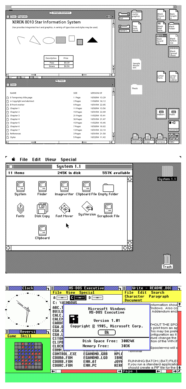
First desktops: Xerox Star (1980), Apple Macintosh (1984) and Microsoft Windows (1985)

Already by 1988, the GUI had become such an important aspect of personal computing that Apple filled a lawsuit against Microsoft for copyright infringement. In the end, the federal courts ruled against Apple in 1994 saying that “patent-like protection for the idea of the graphical user interface, or the idea of the desktop metaphor” was not available. Much of Apple’s case revolved around defending as its property something called the “look and feel” of the Mac desktop. While rejecting most of Apple’s arguments, the court did grant ownership of the trashcan icon, upon which Microsoft began using the recycling bin instead.

When looking back today, it is remarkable how the basic desktop and user experience design that was developed at Xerox PARC in the 1970s has remained the same over the past four decades. Color and shading have been added to make the icons more photographic and the folders and windows more dimensional. However, the essential user elements, visual indicators, scroll bars, etc. have not changed much.

With the advent of mobile (smartphone and tablet) computing, the GUI began to undergo more significant development. With the original iOS on the iPhone and iPod touch, Apple relied heavily upon so-called skeuomorphic GUI design, i.e. icons and images that emulate physical objects in the real world such as a textured bookcase to display eBooks in the iBook app.

Comparison of iOS 1 to iOS 7 user interface

Competitors—such as those with Android-based smartphones and tablets—have largely copied Apple’s mobile GUI approach. Beginning with iOS 7, however, Apple has moved aggressively away skeuomorphic elements in favor of flattened and less pictorial icons and frames, etc.

Multi-touch and gesture-based technology—along with voice user interface (VUI)—represent practical evolutionary steps in the progress of human-computer interaction. Swipe, pinch and rotate have become just as common for mobile users today as double-click, drag-and-drop and copy-and-paste were for the desktop generation. The same can be said of the haptic experience—tactile feedback such as vibration or rumbling on a controller—of VR and gaming systems that millions of young people are familiar with all over the world.

It is safe to say that it was the pioneering work of the research group at Xerox PARC that made computing something that everyone can do all the time. They were people with big ideas and big goals. In a 1977 article for Scientific American Alan Kay wrote, “How can communication with computers be enriched to meet the diverse needs of individuals? If the computer is to be truly ‘personal,’ adult and child users must be able to get it to perform useful activities without resorting to the services of an expert. Simple tasks must be simple, and complex ones must be possible.”

Frederic Goudy: 1865 – 1947

Frederic W. Goudy 1865 – 1947

Making it through our present-day technology transition is surely challenging. We live and work with one foot in the brave new digital, mobile and touch world while the other foot is in ye olde analog, wired and paper world.

Have you done any of the following lately?

  • Talk or text on your smartphone while letting your landline home phone ring without picking it up.
  • Purchase and download an album only to realize later that you already own the CD.
  • Open every piece of US mail while ignoring or deleting the email cluttering your inbox.
  • Check your Facebook newsfeed constantly while not having time to read or even open the daily newspaper.
King Crimson’s 1969 album “In the Court of the Crimson King” contains the track “21st Century Schizoid Man”

We are bombarded with so much information and have so many messages and redundant media it’s a wonder we get anything done! Our bifurcated and overloaded culture evokes the title of a 1969 King Crimson song: “21st Century Schizoid Man.”

When looking back through history, however, it becomes clear that our present condition is not entirely unique. Previous generations have experienced disruptive and even devastating change. It is a fact that every age is both cause and effect; a moment in time between past and future with a host of unpredictable retreats, twists and turns.

Some may ask: isn’t the present different because the pace of change is becoming quicker? This is true but, in relative terms, the rate of change has always been logarithmic from one generation to the next. The phenomenon of accelerated development embodied in Moore’s Law (the number of transistors on an integrated circuit doubles every two years) is frequently applied to all past and present technological progress.

* * * * *

In reviewing the life of Frederic Goudy—the most important American type designer in the first half of the twentieth century—we see a man who thrived during an era of terrific change. Born at the conclusion of the Civil War, Goudy lived through the industrialization of society and two World Wars. Without a formal education, self-taught and often under difficult circumstances, Goudy became a prolific type designer who was known the world over for his accomplishments. Significantly, Frederic Goudy drew his first alphabet at age 30 and began his career as a professional type designer at the age of 46.

Frederic William Goudy was born on March 8, 1865 about 125 miles south of Chicago in a town called Bloomington, Illinois. As a youngster Fred spent time in the Bloomington library reading Mark Twain and browsing the illustrated Harper’s Weekly magazine. He developed the ability to trace and replicate wood engravings in pencil. Although, he did not excel at mathematics, Fred gained an interest in machines such as the lathe and the pantograph.

Fred’s father, John Goudy, was a school administrator and later a real estate man. He moved the family to four different towns in Illinois in the 1870s and early 1880s. In 1883, the family relocated to the Dakota Territory where John started a business in connection with homestead claims. Living in the prairie hamlet of Highmore near an Indian Reservation and with just two years of high school education behind him, Fred went to work as a clerk in his father’s real estate company.

In 1889, Frederic left Highmore and set out on his own. First going to Minneapolis and then Springfield, Illinois, he worked as a bookkeeper in the real estate offices. During these years, Fred gained experience with advertising and layout of newspaper ads. At twenty-eight years old, Fred moved to Chicago and worked for various offices writing advertising copy and designing ads with local printers.

An example of the esthetics of American typography in the late 1800s

In the 1890s, there was no such thing as an advertising industry and there were very few advertising agencies. Newspapers and magazines were filled with garish promotional ads with very bad typography and florid graphics. At this time, Fred started swimming against the tide of generally murky and unreadable printing. In 1893, he founded a magazine called “Modern Advertising” as a means of generating business. Although the publication did not last, Fred gained important experience with the type production and printing processes.

Around 1895, Goudy became influenced with the works of William Morris—the English poet, author, craftsmen and designer—and the Arts and Crafts movement. In collaboration with a Chicago English teacher C. Lauron Hooper, Goudy decided to start his own printing business along the lines of Morris’ Kelmscott Press in England. He would later say of this time, “When I became inoculated with printers’ ink, I was never again the same.”

The young Frederick Goudy in the late 1800s.

As an amateur, Goudy began experimenting with type designs and developed his hand lettering skills. After a short time in Detroit working for a weekly called The Michigan Farmer, Goudy returned to Chicago and worked on advertising for Marshall Field, The Inland Printer, The Pabst Brewery and Hart Schaffner and Marx. He also designed book covers for The Lakeside Press and Rand-McNally. All Goudy’s type designs through this period were for advertising purposes.

By the turn of the century, Goudy wanted to follow Morris’ lead and print the finest books in America. To do so he believed needed to design his own typeface. In 1903, Frederic Goudy made printing history with the establishment of The Village Press in Park Ridge, Illinois and the creation of The Village Type, his first fine book face. The Village Type was the very first American typeface to be cut and caste from free hand, original drawings from a type designer.

Village Type
An example of Village Type, the first American type face to be designed from free hand drawings, designed by Frederic Goudy in 1903

In 1904, Frederic and his wife Bertha moved The Village Press to Hingham, Massachusetts to become part of The Hingham Society of Arts and Crafts and be surrounded by other craftsmen. In 1906, the Goudy’s moved their printing business to New York City. It was during a trip to England in 1909 and then a trip to the Continent in 1910 that Goudy focused himself upon the scholarship and history of typography.

In 1911, according to his own account, Frederic Goudy became a professional type designer with the creation of Kennerley Old Style. Named for his business associate, publisher and Englishman Mitchell Kennerley, Goudy designed the font specifically for the publication of H.G. Wells’ “The Door in the Wall and Other Stories.” Kennerley Old Style was hit in England and through it Goudy suddenly became associated internationally with great type design. It would take some years more for his work to become recognized in America.

Title page to The Door in the Wall
The title page to H.G. Wells’ “The Door in the Wall,” the first appearance of Kennerley Old Style and the beginning of Goudy’s professional type design

From this point forward, Frederic Goudy devoted his energies to type design and his hand lettering and printing work receded into the background. Over five decades, Goudy designed 122 typefaces, an enormous accomplishment in the era of hot metal typography. Among Goudy’s popular typefaces are:

  • Copperplate Gothic (1905)
  • Goudy Old Style (1915)
  • Hadriano (1918)
  • Italian Old Style (1924)
  • Trajan (1930)
  • Berkeley Old Style (1938)

A significant technology factor in the emergence of type design as a profession—making it possible for someone like Frederic Goudy to achieve success—was the invention by Linn Boyd Benton in 1884 of the pantographic engraver. This device, which represented the industrialization of metal type production, enabled foundries to cut matrices from enlarged drawings. Prior to this development, the making of type was largely the work of handicraft punch cutters and not that of designers. At the age of 60, Goudy acquired his own matrix-cutting machine on which he engraved and cast perhaps some of his greatest work.

During his career, Goudy wrote extensively on type design, lettering, typographic style and history. His works “The Alphabet” (1918) and “The Elements of Lettering” (1922) remain important resources, that latter containing explanatory notes on the considerations and influences behind some of his typeface designs. He founded the journal “Ars Typographica” in 1918 and he became the art director for Lanston Monotype Corporation in 1920 where he remained until his death.

Mirtchell Kennerley and Frederic Goudy
Frederic Goudy (right) with publisher Mitchell Kennerley

Frederic Goudy was famous during his lifetime. He was a rugged man, a widely read commentator on design and esthetics and a popular speaker who was approached for his opinion on many topics, some far from his field of expertise. He was known for his larger-than-life personality, as a raconteur and he could be counted on for comments with a punch line. It is said that Goudy was the originator of the statement, “Anyone who would letterspace blackletter would shag sheep,” although he probably used a different word for the Britishism “shag.”

For some of his competitors, Goudy’s self-promotion was a problem. Historically, type designers had never before named their works after themselves; Goudy used his name in about 20 of his typefaces. Goudy’s love for typography is summed up in his favorite broadside designed and produced for a Chicago exhibition in 1933:

I AM TYPE! Of my earliest ancestry neither history nor relics remain. The wedge-shaped symbols impressed in plastic clay by Babylonian builders in the dim past foreshadowed me: from them, on through the hieroglyphs of the ancient Egyptians, down to the beautiful manuscript letters of the mediaeval scribes, I was in the making.

With the golden vision of the ingenious Gutenberg, who first applied the principle of casting me in metal, the profound art of printing with movable types was born. Cold, rigid and implacable I may be, yet the first impress of my face brought the Divine Word to countless thousands.

I bring into the light of day the precious stores of knowledge and wisdom long hidden in the grave of ignorance. I coin for you the enchanting tale, the philosopher’s moralizing and the poet’s fantasies; I enable you to exchange the irksome hours that come, at times, to everyone, for sweet and happy hours with books—golden urns filled with all the manna of the past. In books, I present to you a portion of the eternal mind caught in its progress through the world, stamped in an instant and preserved for eternity. Through me, Socrates and Plato, Chaucer and Bards become your faithful friends who ever surround you and minister to you.

I am the leaden army that conquers the world; I am Type! 

Frederic W. Goudy died at his home in Marlboro-on-Hudson, New York on May 11, 1947. He is buried next to his wife Bertha in Evergreen Cemetery in Chicago.

The book called “The Book”

The American Association of Publishers recently reported that year-over-year e-book sales had fallen by nearly 5% through mid-2013. The “flattening” of e-book sales has been underway for several years and the latest figures come as no surprise. The exponential growth rates of the e-book market that began in 2008—peaking at 254% in the first quarter of 2010—could not be sustained indefinitely. As Harper-Collins CEO Brian Murray noted last November to Publishers Weekly, “Nothing grows by triple digits for too long.”

The Book: A Global History published by Oxford University Press

There are dynamic and complex reasons for the e-book market slowdown: the popularity of individual titles, sales of dedicated e-reader devices vs. tablets, recognition by readers and publishers of titles that fit one format vs. another, etc. Meanwhile, one byproduct of these changes is that the decline in printed book sales—particularly hard cover books—has also begun to slow. It seems that some kind of equilibrium is being achieved between printed books and their digital cousins. Industry experts say that this is a repetition of the pattern of development that occurred when paperbacks (1930s) and audio books (1970s) first came into use.

The following is a summary of the recent AAP book sales figures by format:

Format               Jan-Jun 2013           Jan-Jun 2012            Change
Hardcover            $978.1 million            $1,063.8 million           -8.0%
Paperback            $953.5 million            $1,023.3 million           -6.8%
E-book                 $766.8 million           $805.3 million              -4.8%
Total                   $2,698.4 million      $2,892.4 million        -6.7%

One important aspect to note is that within an overall environment of declining book sales, e-book sales as a percent of the total is continuing to grow (from 27.8% in 2012 to 28.4% in 2013).

The inflection point in the e-book market is an appropriate moment to take note of the publication earlier this year of the volume The Book: A Global History by Oxford University Press. Edited by Michael F. Suarez and H.R. Woudhuysen, The Book contains 54 essays in two sections: Thematic Studies (21 essays) that deal with the origins of written communications, the ancient history of books and the technologies of book production and Regional and National Histories of the Book (33 essays) that cover book history in many countries in Europe, Asia, Australia and the Americas.

Oxford Companion to the BookThe new volume is a concise edition of the highly acclaimed Oxford Companion to the Book published in 2010. That work by the same editors is 1,327 pages, comes in two vivid burgundy bound volumes with gold lettering, costs $325 and is clearly library reference material.

As Suarez and Woudhuysen state in the introduction to the new smaller volume, “Encouraged by the commercial and critical fortunes of The Oxford Companion to the Book (2010), its General Editors were nonetheless chastened by the fact that its costliness prevented many from purchasing the two-volume work of 1.1 million words. … It is our hope that the publication of this volume will make a valuable collection of bibliographical and book-historical scholarship—ambitious in its scope and innovative in its reach—accessible to a broad audience of general readers and advanced specialists alike.”

One can tell from these two sentences that this is not a book to be read for entertainment. In any case, The Book: A Global History—in spite of its pedanticism and academic erudition—is an important resource. The research and scholarship enable those in modern day print communications to gain a deeper understanding of their profession and its social, technical and economic origins and development over many centuries.

For example, in a significant point in the introduction, the editors describe the term “book” as a synecdoche, i.e. a figure of speech that represents all other textual communications forms. They write, “Naturally, the use of the term ‘book’ in our title in no way excludes newspapers, prints, sheet music, maps or manuscripts … in every European language the word for ‘book’ is traceable to the word for ‘bark,’ we might profitably think of ‘book’ as originally signifying the surface on which any text is written and, hence, as fitting shorthand for all recorded texts.”

It is of course not possible to summarize the entirety of the new volume here, so below are a few highlights followed by some concluding thoughts:

  • Writing Systems
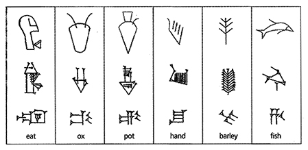
The evolution of early writing systems.

The very first essay by Andrew Robinson is about the origin of human writing systems. It should come as no surprise that the birth of writing is thought to have taken place in what is now known as the “cradle of civilization” in Mesopotamia sometime in the late 4th millennium BC. The impulse for the first writing system was the need for record keeping associated with trade. As Andrews writes, “the complexity of trade and administration had reached a point where it outstripped the power of memory among the governing elite. To record transactions in an indisputable, permanent form became essential.” One theory holds that the system began with the exchange of clay tokens and that this was later substituted with two-dimensional symbols written in clay. Of course, another origin of writing is the Ice Age symbols found in caves in southern France that date back 20,000 years. These images, however, are considered “proto-writing” because they do not conform to the scientific definition of writing provided by the noted Sinologist John DeFrancis as a “system of graphic symbols that can be used to convey any and all thought.”

  • The Book as Symbol

In essay number 7, Brian Cummings treats the book as an object within different historical contexts. He writes, “A book is a physical object, yet it also signifies something abstract, the words and the meanings collected within it. Thus, a book is both less and more than its contents alone.” During ancient times, books were considered sacred and access was restricted to a priestly class. Writing was itself considered a spiritual power and consumption of the written words also a mystical act. Later, Plato posited that writing was inferior and untrustworthy in comparison to the knowledge within the mind. In biblical times, “the scrolls” (Torah), “the tablets” (Ten Commandments) and “the scriptures” (The Bible) emerged as those writings that embodied divine power, law and ordinance. Cummings writes, “The incorporation of the holy book into ritual—the raising of the book, or carrying of it in procession, or kissing of the book or kneeling before it—is only the most obvious example of this.” These practices exist today in the courtroom or inaugural “swearing-in” and “taking the oath” of witnesses and officials who place their hand upon the Bible. Another more modern and historically significant treatment of books was the infamous Nazi burning of “degenerate” books in Berlin’s Opernplatz in 1933.

  • The Electronic Book
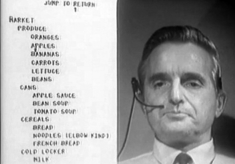
Engelbart Demonstrating NLS
Douglas Engelbart demonstrating the NLS on December 9, 1968

The essay by Eileen Gardiner and Ronald G. Musto on the e-book was revised and expanded from the Oxford Companion to the Book of 2010 and this fact expresses the rapid development of the new form. Of particular note is the essay’s summary of the background to present-day e-books. In 1945, Vannevar Bush provided the earliest documented vision for proto electronic books in what he called the Memex. This hypothetical system would store the entire contents of scientific literature and had pages, page-turners, annotation capability, internal and external links, storage, retrieval and transmission of documents. But, while Bush conceived of the Memex on microfilm, the first truly electronic book concept came in 1965 with the “hyperlinking,” “hypertext” and “hypermedia” vision of Ted Nelson. Nelson’s idea was first demonstrated—now famously referred to as “The Mother of All Demos”— by Douglas Engelbart. The system was called NLS (for oNLine System) and was developed by the Stanford Research Institute. Engelbart demonstrated in combination for the first time anywhere on December 9, 1968 the following: email, teleconferencing, video-conferencing and the mouse. The future of hypertext from this point forward merges directly with the emergence of the personal computer and later the World Wide Web, i.e. Apple HyperCard by Bill Atkinson in 1987, the emergence of CD-ROM books in 1992, online and searchable texts accessible with the Mosaic/Netscape web browser in 1993.

As mentioned earlier, The Book: A Global History is an important resource for bibliophiles and anyone seeking thorough knowledge of the history of print communications. Going through the volume, readers gain a better understanding world history. It seems that books, both their antecedents and descendants, are intermingled with the history of all civilization from the end of human pre-history to the present.

With the development and adoption of e-books—combined with wireless and mobile communications—it is possible to envision a future where print-on-paper books are recognized as relics of a distant past. But such an eventuality would also require a development well beyond the present e-book reader and mobile media experience along with solving many other complex problems. While great strides have been made, we are still at the very beginning of the transition from the completely analog world of books to the completely digital world of instantaneous and infinite access to all information, knowledge and culture.